
How to show integrations on your dev tool homepage?
Every dev tool needs to integrate with other libraries in the space.
And you want to show how well integrated with the ecosystem you are.
But you ctually want to do a bit more than that.
You want devs to see how easy / flexible / clean it would be for them to use it.
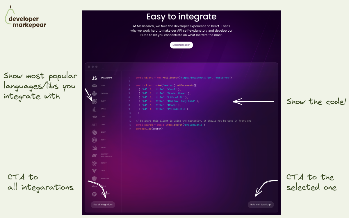
That is why instead of showing just logos from your ecosystem it is good to show the code too.
Meilisearch does that beautifully:
I am sure this is getting more clicks than just a list of logos.
A docs header worth a thousand words.
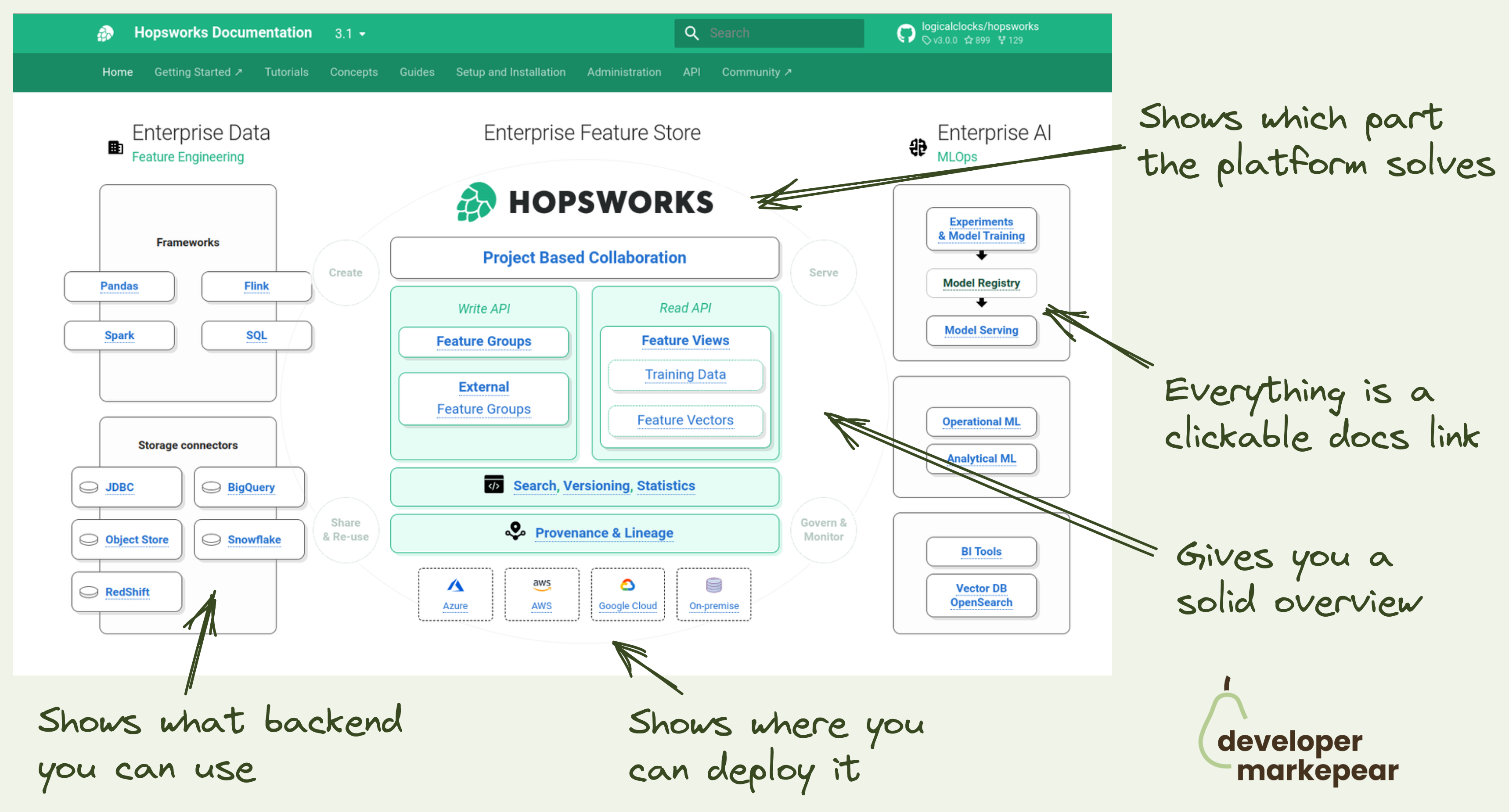
For a dev platform or infrastructure tool it is hard to explain where you fit, what you do quickly, and how you connect to existing components quickly.
Hopsworks docs team does a great job here.
So instead of using words, they use a diagram:
All of that in a single diagram.
Now that is a dev-focused header visual.

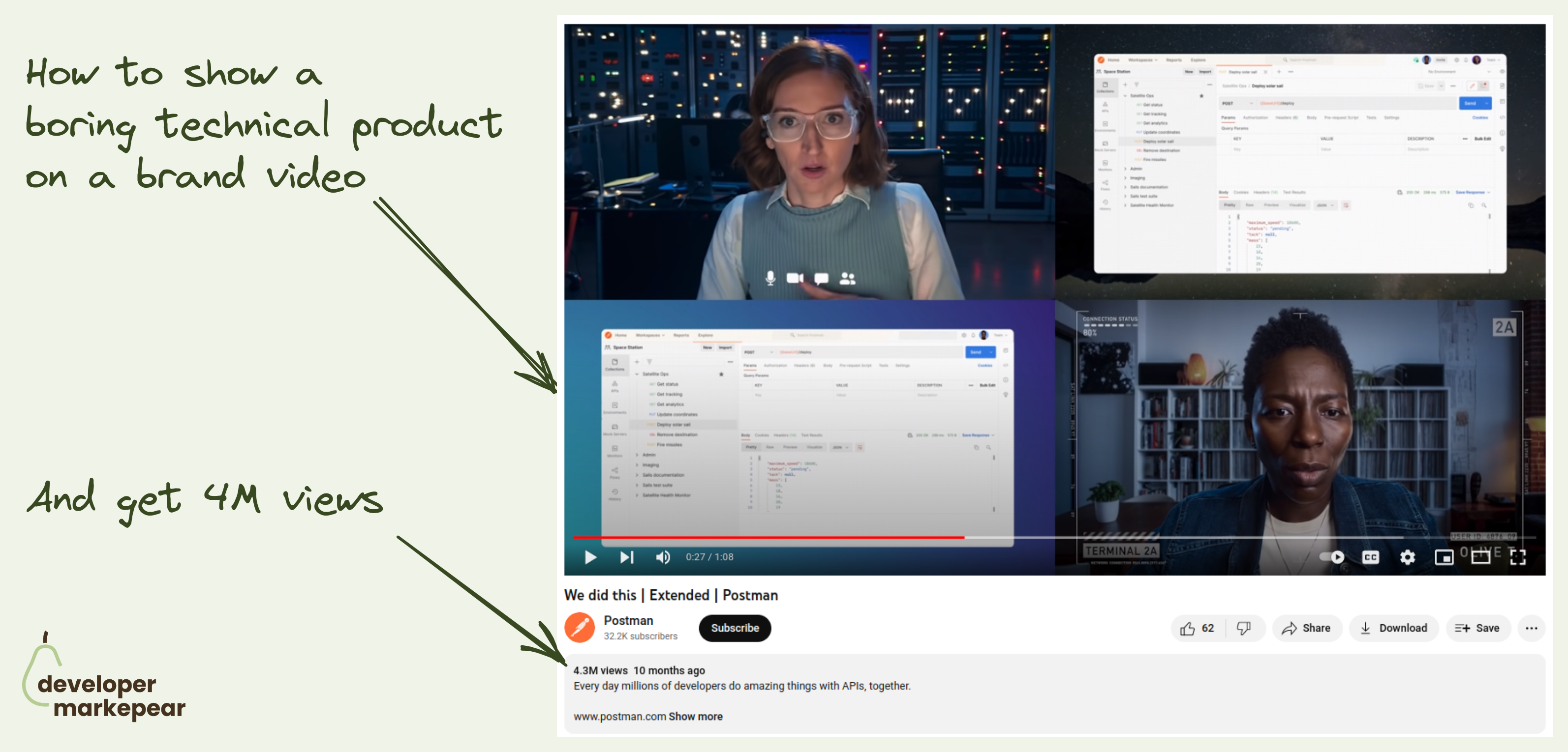
How to do a dev-focused brand video and get 10M+ views?
Making a memorable brand video is hard.
Doing that for a boring tech product is harder.
Doing that to the developer audience is next level.
Postman managed to create not one but three of those brand videos that got from 4M to 10M youtube views.
The videos I am talking about are:
So what did they do right?
Honestly, I am not exactly sure what special sauce they added but those are just great videos that you watch.
And I definitely remember them and the company which is exactly what you want to achieve with brand ads.

How do you show "save time" to devs?
It is often hard as it is not objective.
But there are options.
Spotlight does it beautifully by showing two implementations next to each other solving the same task.
It is obvious which is faster and saves time.
Great stuff!

Sometimes your pricing is just complex. But you can still make it work.
If you want devs to convert, make it possible for them to estimate the cost.
@Mux does it nicely with a calculator:
What is crucial is that the calculator dimensions need to be understandable and familiar to the reader.:
The goal of this is to make it possible for a person to get an estimate right here right now.
Not have to setup a meeting with half the team to figure your pricing out.

With infrastructure tools, it is notoriously difficult to show people the value quickly.
To really see it they would need to set up everything at their company infra, create dashboards for their use case, and so on.
A lot of work.
That is why creating a sandbox experience is a good way of giving people a taste.
I like the way Axiom calls it a playground and says "Play with Axiom" and "Launch playground".
This copy is good because:

Digital Ocean went for an ad for the Hactoberfest in a tricky place.
To keep it in the medium that fits YouTube shorts they:
I think doing YouTube shorts is an interesting opportunity in a yet unsaturated market (as of 2022).
And doing ads that fit that medium so nicely is an art.
Good job DO!

Great example of programmatic SEO from Snyk.
They created a page called snyk advisor.
It is a repository of pages about open-source packages.
Each page is created automatically out of publicly available information.
Enhances it with Snyk-generated security scans and reports.
It builds awareness for other Snyk products in the security space.
A lot of those pages rank high in google for the {package} keyword which is incredible.
And when people land on the package report page the CTAs to Snyk products push conversions.
How to do a dev-focused brand video and get 10M+ views?
Making a memorable brand video is hard.
Doing that for a boring tech product is harder.
Doing that to the developer audience is next level.
Postman managed to create not one but three of those brand videos that got from 4M to 10M youtube views.
The videos I am talking about are:
So what did they do right?
Honestly, I am not exactly sure what special sauce they added but those are just great videos that you watch.
And I definitely remember them and the company which is exactly what you want to achieve with brand ads.
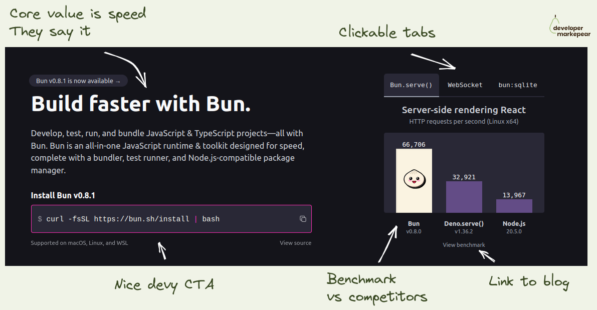
If your dev tool's USP is that it is faster -> Show it in the header
I like how folks from Bun focus on the fact that they are a faster library.
They show the benchmark as the key visual on the homepage header.
I love it.
If you think about it how else do you really want to show that you are faster?
This is believable, especially with a link to the benchmark so that I can dig deeper.
They show competitors, they don't pretend they don't exist.
And they talk about being faster left right and center.
I mean, they drive this "we are faster" home for me.
If that was important to me, I'd check it out.

An interesting option to push people to read the next article.
You use a slide-in triggered on a 75% scroll with a "read next" CTA in the bottom left.
On the aggressive side for sure but when the article you propose is clearly technical it could work.
And if your articles are not connected to the product explicitly you do need some ways to keep people reading and see more of your brand.

In dev tools, you really can solve the problem for a narrow market and extend to adjacent markets over time.
Use that -> Snyk did.
Their value proposition stayed pretty much the same for 7 years!
"Find and fix vulnerabilities in open-source software you use."
But the market they served got so much bigger over time:
Again, their core value prop is the same in 2023 as it was in 2016.
But their target market (and revenue share) grew by... a lot ;)
Isn't that just beautiful marketing-wise?
So the takeaway is this:
Start narrow, solve the problem, and extend to other frameworks/languages/tech can still work.
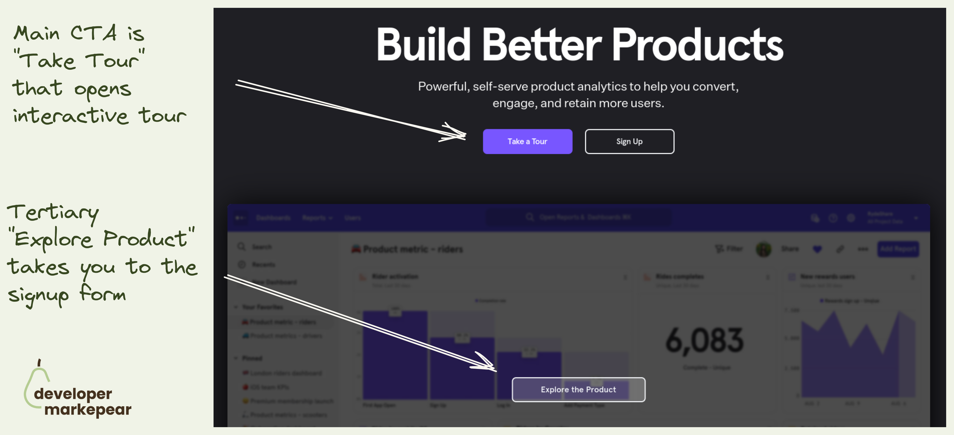
Mixpanel primary CTA is to take an interactive tour.
They take you to a 30min video + a guided UI tour.
Not a signup.
That is because with products that have long time to value (like analytics, observability etc) dev will not see value in the first session.
I mean to really see value you need to see real data, real use cases. And if you were to actually test it would take weeks.
That is why many companies do demos. But demos have their own problems (and most are bad).
Interactive tools make it possible for me to explore the value without talking to anyone.
I love this option.

Memes that resonate with your ICP (in this case website backend devs who use PostgresSQL).
Content like this helps people find their tribe.
And then those memes can get folks to follow your account.
If you mix your content well you can then push them further down the funnel.
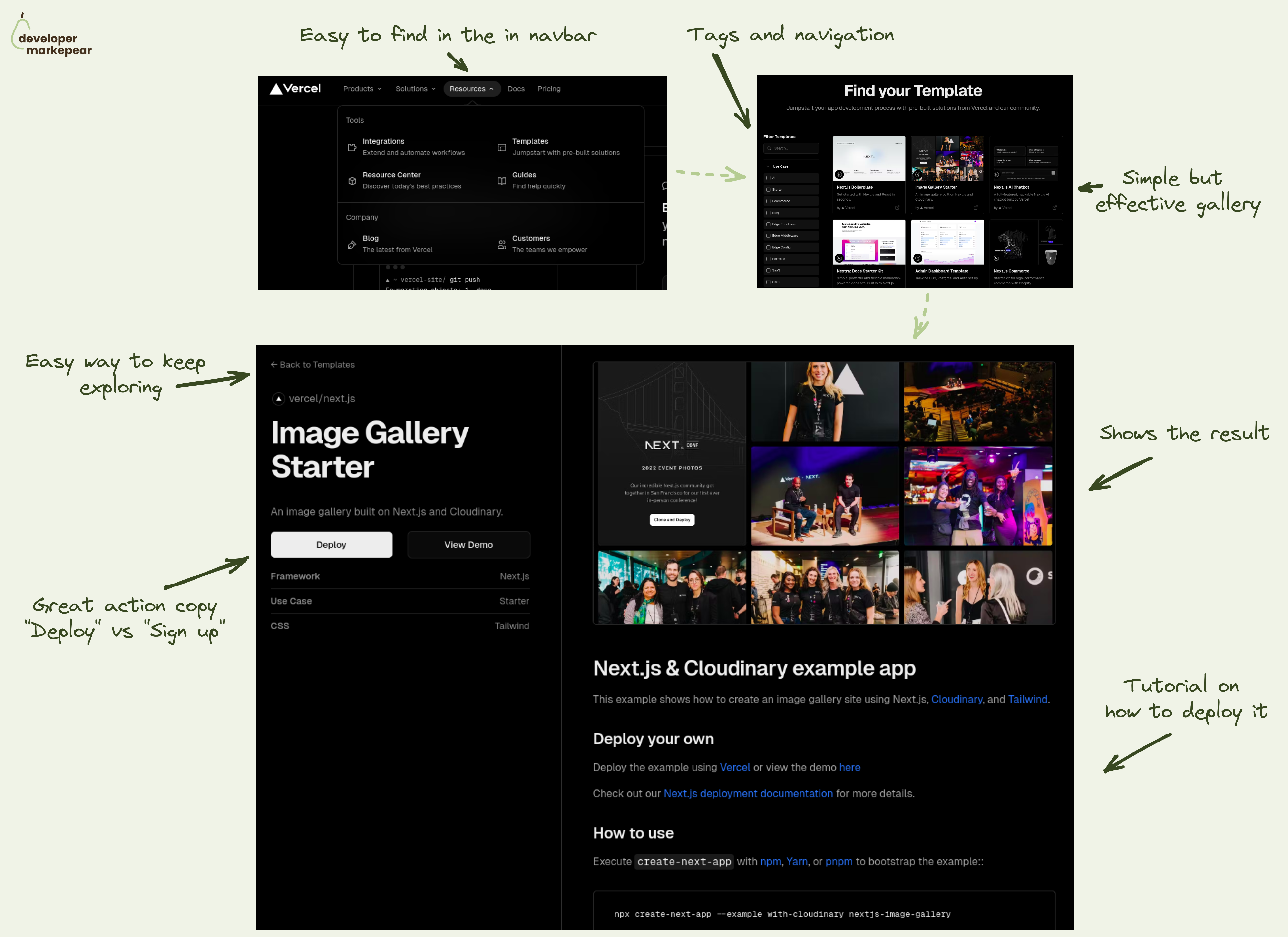
Well done templates gallery from Vercel.
For developer-focused products, having an examples/templates/code samples gallery can be a powerful growth lever.
✅ It helps people:
Just a great touchpoint in the developer journey.
💚 And Vercel does this one really well IMHO.
They start with an easy-to-find CTA in the navbar resources section. Bonus points for adding one-liner descriptions that make it clear what is on the other side of the click.
On the templates library page, they give you solid use case navigation with tags. And each template tile has a result thumbnail and a one-liner description. The beauty of this is in the simplicity and what they didn't put in here.
Each template page shows the result, gives you a tutorial on how to use this, and clear CTAs to either see this live or deploy yourself. Bonus points for the "Deploy" action copy (instead of "Sign up").
Kudos to the Vercel team. They are one of my favorite inspirations.
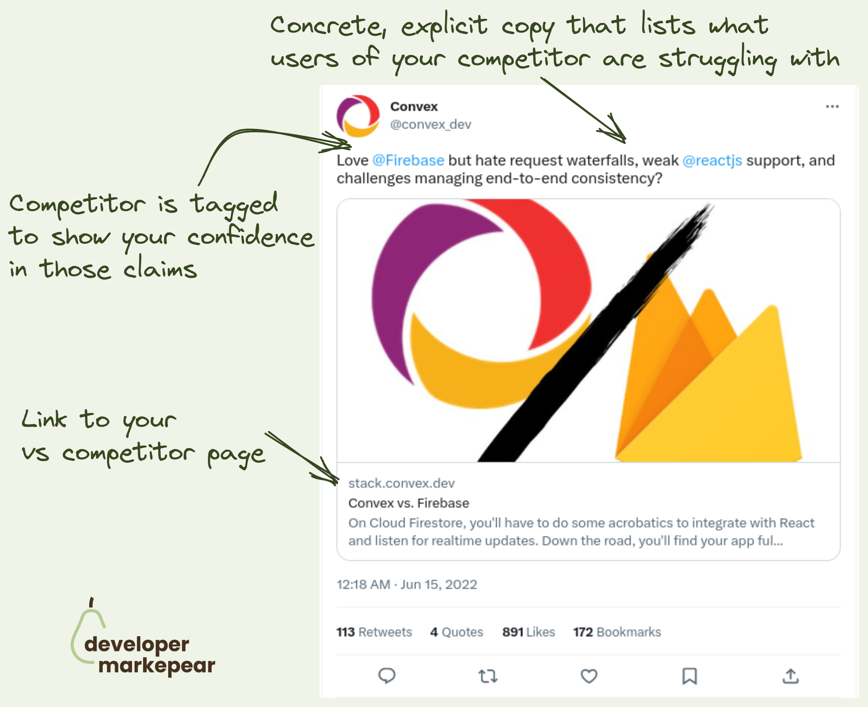
VS competitor ads are hard to pull off with devs. Not impossible though. 👇
So the problem is that:
@Convex does it really nicely here:
And even though this is by a "aggressive" competitor marketing hundreds of devs liked/bookmarked this tweet.
Good job!
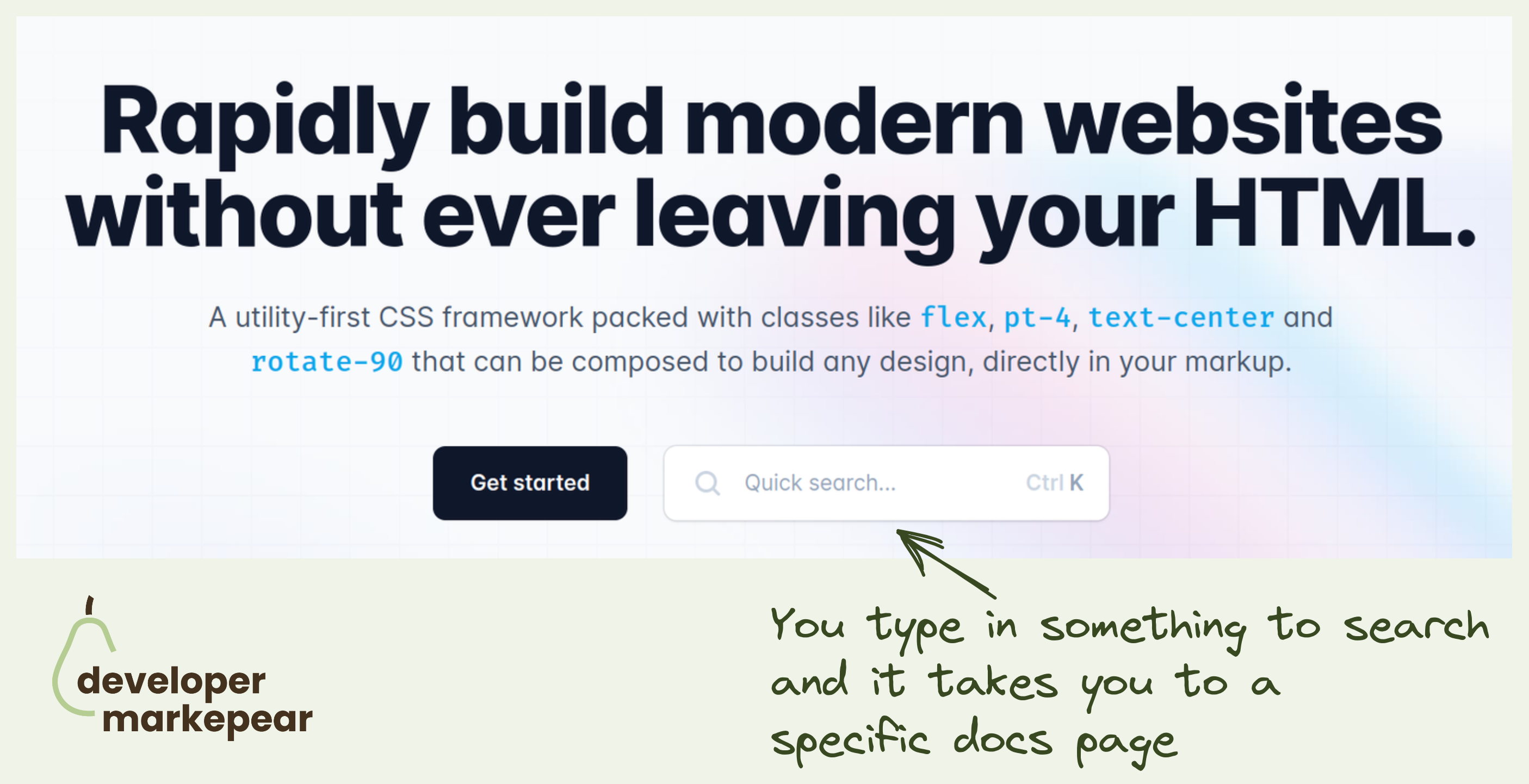
"See docs" is one of my favorite secondary CTA on dev-focused pages.
TailwindCSS takes it to the next level by inserting docs search right into the header CTA.
This takes devs directly to the page they are interested in rather than have them try and find things for themselves.
They could have searched the docs in the docs, of course.
But this is just this slightly more delightful developer experience that TailwindCSS is known for.

Articulate a deeper thought.
Sometimes you want to tell the world something but you don't know how.
When somebody articulates what you were thinking you just want to share that with them.
This is what this tweet is about.
A deeper thought with some parallel examples to back it up.
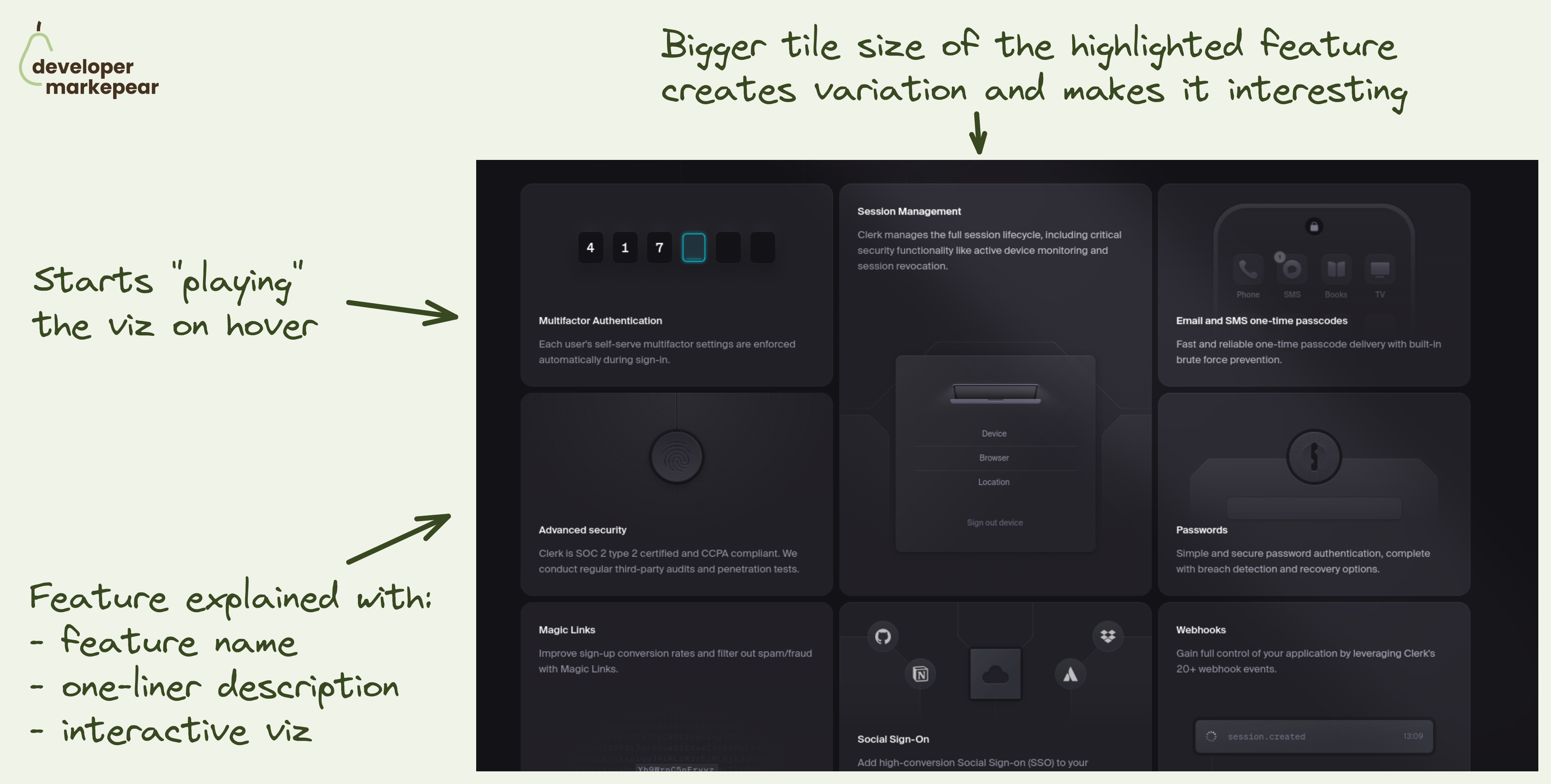
How to present many features at once?
Sometimes your dev tool has many features/products that you want to show.
❌ Showing all of them as separate sections doesn't work with more than 3. It just gets too long very quickly.
✅ You can go with the tabs pattern where each tab has copy+visual for a feature.
💡 But there is another option that makes a ton of sense when you have many features to show.
Interactive tiles of different sizes.
💚 I like the implementation of that pattern coming from Clerk:
That pattern can work really well on blogs or learning centers too but I think we're going to see more of it on dev tool websites.
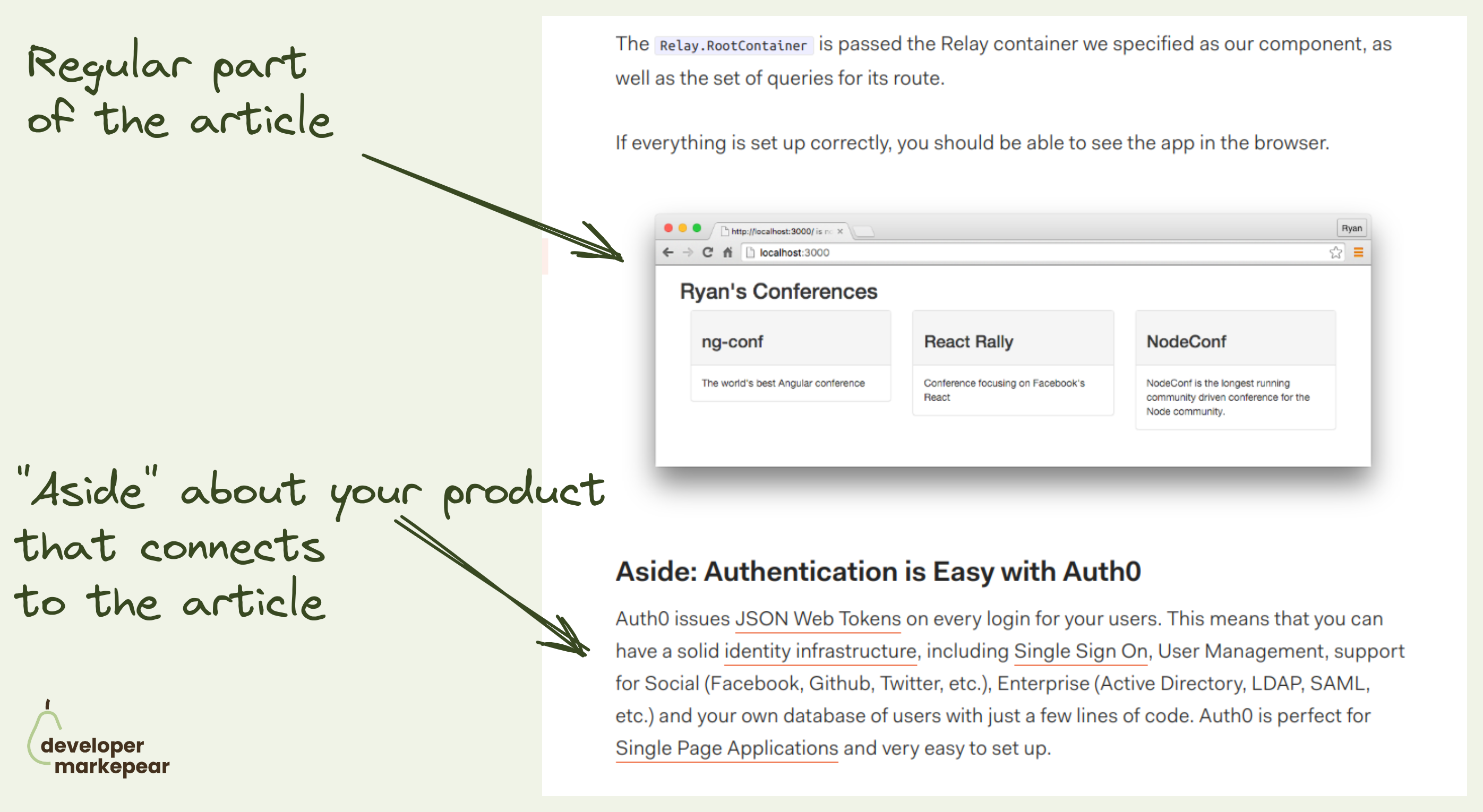
A classic dev tool blog call to action that is somewhat underused these days.
Was going through Martin Gontovnikas blog and found a post from a couple of years back.
He called this "Aside CTA" and the idea is this:
Why this can work well with devs is:
Definitely a classic that is worth trying.
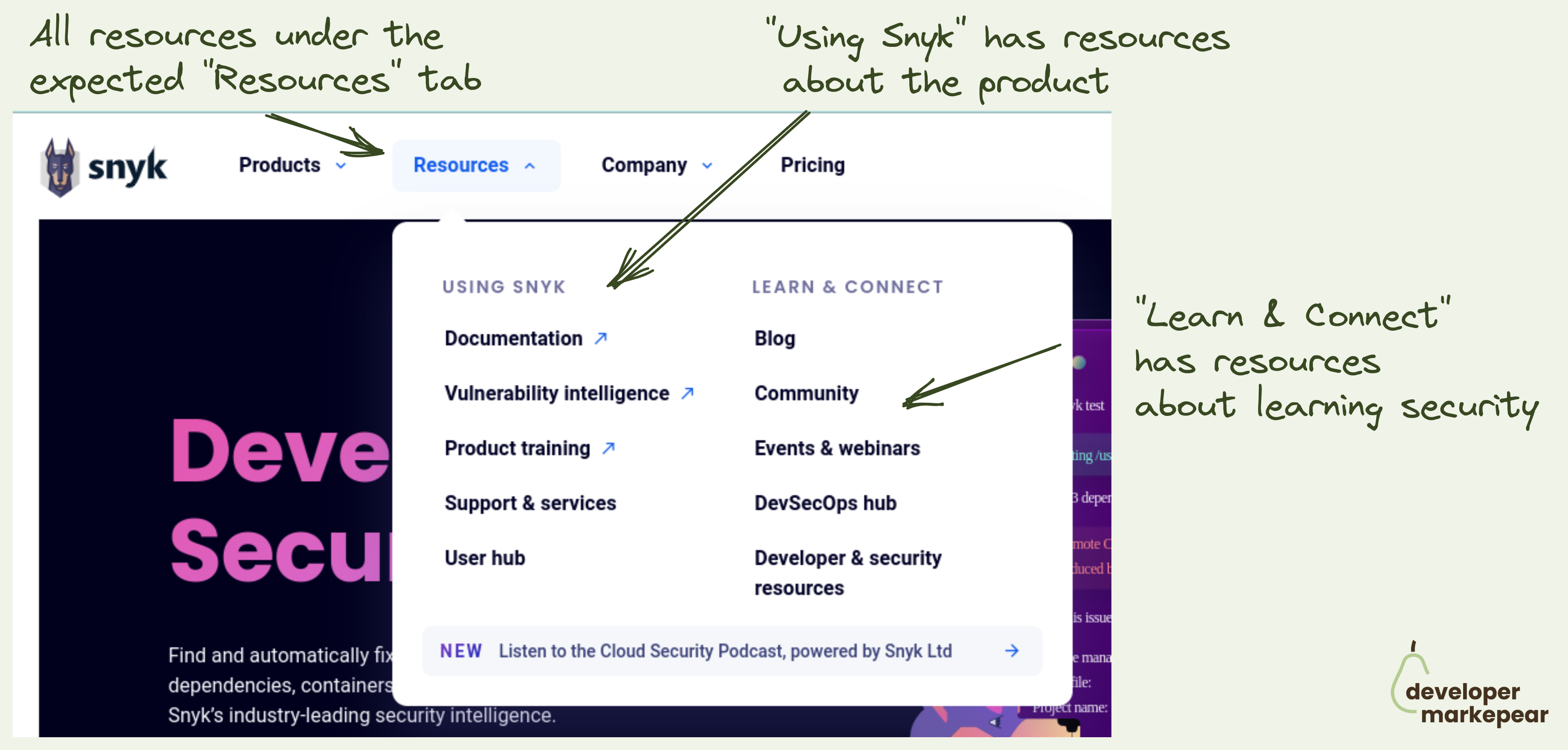
The "Resources" tab is the most loved and hated tab for developer marketers.
Ok so the common problem is that you have lots of different resources:
You want to showcase them in the navbar but where do you put them?
Under product? Company? Docs?
How to make sure that people don't go to your blog to read about your product just to find out that you talk about the industry problems there?
Enter the "Resources" tab. The "Miscellaneous" of the navbar world.
And typically it is just crammed with all stuff that doesn't fit anywhere. Just like any respectable misc folder would.
How do you deal with that?
Snyk approached it in a clear and logical way:
I love this (and already stole the idea for our site).
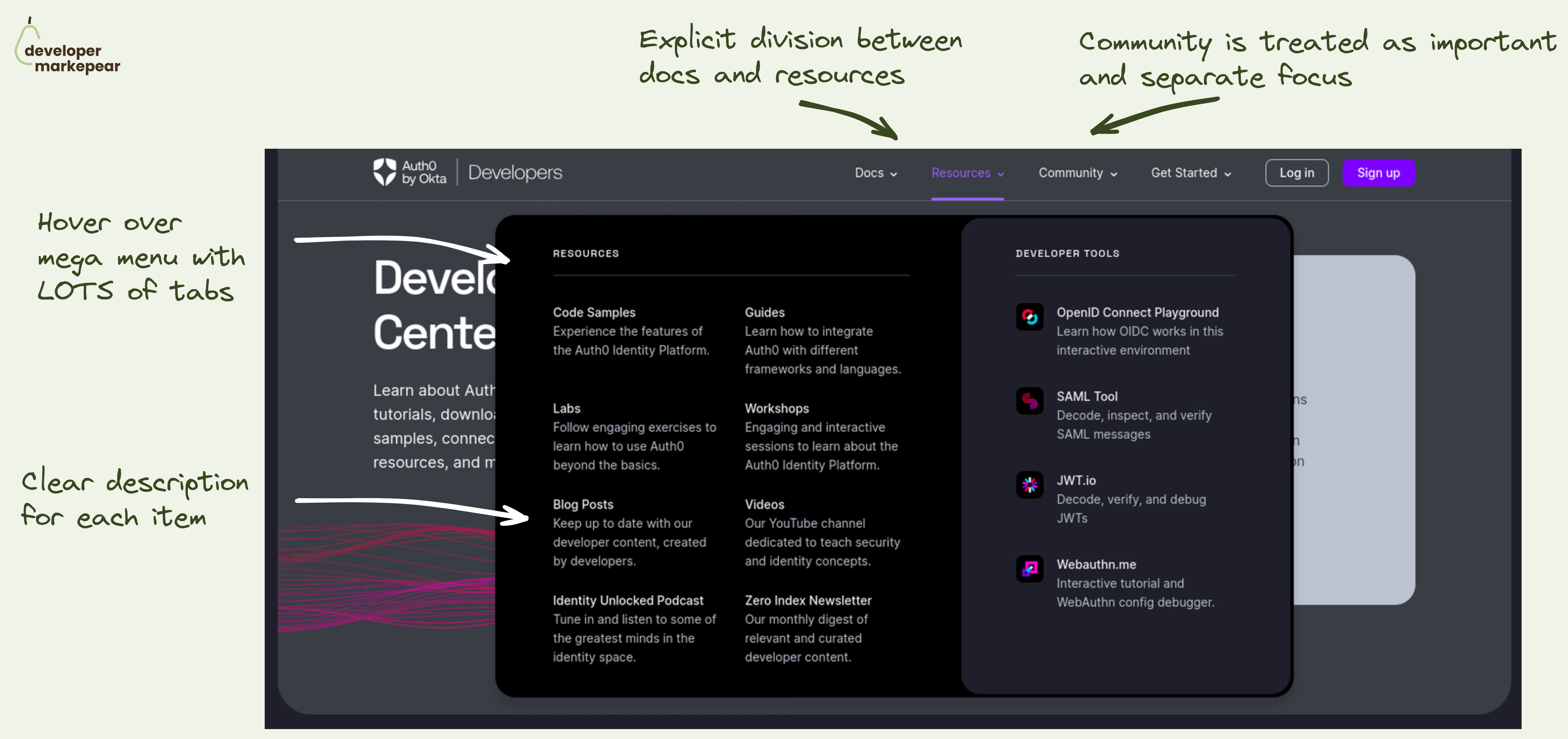
Navbar is a hugely important conversion lever on the dev-facing website. I saw it move the needle by x times in some cases/conversion events.
So, what does a good one look like?
Auth0 did a great job on their developer portal. But the learnings can be applied to your marketing website too.
What I like:
That makes it easy for devs to explore. Without having to click out to see what each tab/item means. And when devs know what you mean they are more likely to actually click out. And convert.
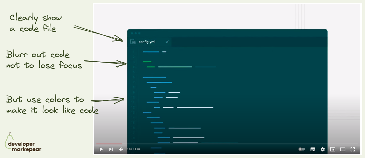
Showing code and UI in an explainer video is always a dance and rarely ends well.
You want to show the code to make it devy.
But you don't want to show everything not to overwhelm.
The same goes for UI which should look like your UI.
But show only what is necessary.
It's a struggle but CircleCI does it really nicely in this explainer:
They do the same for the UI later in the video.Just a really clean way of explaining things. Nice!
Say what you do and how you do it.
What:
How:
CTA (bonus):

Sometimes your product just wins on price.
I like how New Relic owns it on this page:
After reading this I'd trust them to give me a solid price estimate and that it will likely be cheaper than Datadog.
Obviously price is not the only reason why we choose tools, but if that was a problem I had with Datadog, they have my attention.

One of the top-performing conversion flows in dev-focused articles.
"Aside CTA" in the "How to do {jobs to be done}" article.
You know the drill:
And Export SDK executes it (almost) perfectly:
One thing that could be tested and changed is putting this "Aside CTA" mid-article and not at the end (tip from Martin Gontovnikas).
A good thing to try if you are running the "How to do {jbtd}" article strategy.
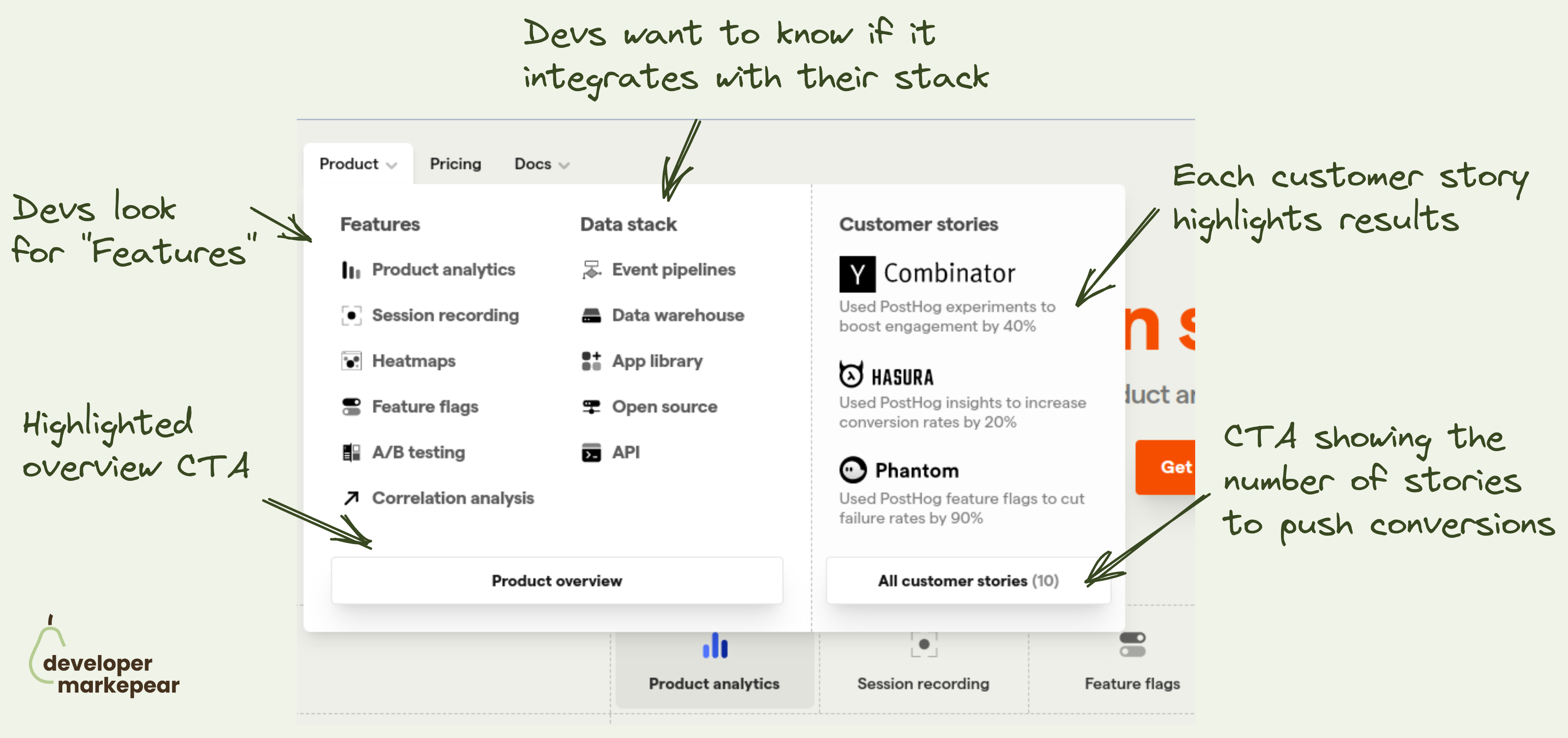
How to design the navbar product tab? This is what @PostHog does 👇
Figuring out what to put in the navbar is tricky:
The "Product" tab is especially tricky.
It can get overloaded with a ton of content.
I like how Posthog approached it:
I like it.

A freaking developer TV.
They took this "be a media company" to the next level.
They created entire TV around their company, audience, and products.
I respect people really going all in.

Sometimes you have an article, report, or event you want to drive people to.
And it is important that they read it.
What Plaid did here is an interesting way of putting it right in the hero section without making it overwhelming or distracting.
I like it.

How to present benchmark results masterclass from RavenDB
The biggest problem with the software benchmarks that you run is?
People don't trust you. Especially when the results are good.
𝗬𝗼𝘂 𝗷𝘂𝘀𝘁 𝗻𝗲𝗲𝗱 𝘁𝗼 𝗯𝘂𝗶𝗹𝗱 𝘁𝗵𝗮𝘁 𝘁𝗿𝘂𝘀𝘁. 𝗢𝗻𝗲 𝗼𝗳 𝘁𝗵𝗲 𝘄𝗮𝘆𝘀 𝗶𝘀 𝘁𝗵𝗿𝗼𝘂𝗴𝗵 𝘁𝗿𝗮𝗻𝘀𝗽𝗮𝗿𝗲𝗻𝗰𝘆.
People from RavenDB do it by:
This looks solid because it feels like I could re-run what they did myself.And so I trust them and I probably won't ;)

Devs are builders.
Make your home page for builders.
Go directly into the "how" instead of the way.
Many devs when they land on your home page, already know the "why".
I love that it:

I like how they use the black dot to show the mouse movements in the UI.
Simple but powerful and clear.

Most dev tools have two deployment options:
And then companies present it on their pricing page with some flavor of two tabs.
And you need to name them somehow.
And how you describe those things sometimes adds confusion for your buyers:
I like how nice and simple solution Retool used on their pricing page:
Explicit, obvious and to the point.
Love it.

Hacker News developer audience doesn't love promotion to put it mildly.
But some dev tool companies manage to make this audience their biggest ally.
Fly.io is one of those companies.
And they had a super successful product launch a few years back.
So how did they do it?
Let's go through these in detail.
Who are you? Why should I listen?
What is the problem really?
What does your product do and how does it work?
Speak "dev to dev"
By doing it this way you have a chance of gaining love from the prolific HN crowd.
Fly.io definitely did, and is still reaping rewards with constant HN exposure.
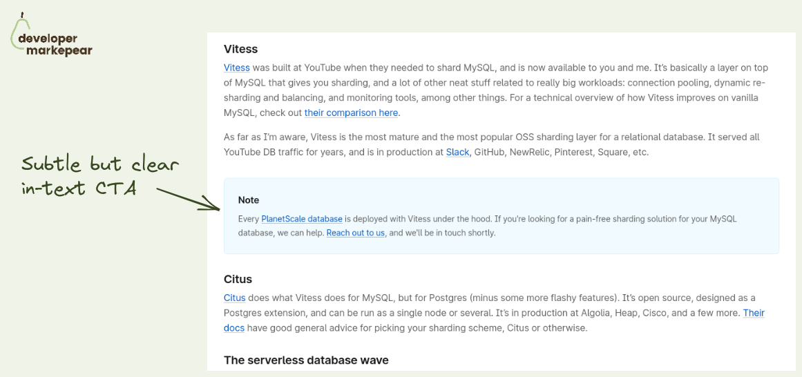
Subtle but effective dev blog CTA -> info box.
Basically a plain article in-text CTA but there is something special about it.
It looks like a docs info box.
It is not a "buy now" style call to action but rather a subtle "you may want to know about X" push.
But for it to really feel like an info box it needs to connect to the section of the section of the article around it.
Otherwise, it will just feel like an intrusive ad anyway.
PlanetScale does a great job here.
They link the part of the article about the sharding library Vitess with their product that was built on top of it.
It feels natural and I am sure it gets clicks and if not then product awareness.

I like the design of this crosshead.

I like those sidebar CTAs from Auth0.
They go with a sticky Table of Contents which gives a better reading experience.
They put two CTAs below that TOC:
Solid job.

What CTAs should you choose for your open-source project homepage?
Was always wondering what is my default.
There are many options: "See docs", "Get started", "Sign up", "Start X"
But in open-source you want people to start playing with it, install it.
So what should you choose?
Recently came across Astro homepage and loved what they chose.
"Get started"
Install code
Whatever I choose I will actually get my hands dirty.
I think this will be my default from now on.

"How fast do you ship?"
Not many dev tools answer that on their homepage. PostHog does.
In a typical (enterprise) sales process, people often ask:
And you show them the roadmap or get someone from the product on the next call.
But I haven't yet seen dev tools talk about it on their homepage.
But why not?
Devs who want to buy self-serve want to know it almost just as much.
After all, they won't be able to twist your arm to build that custom feature cause "we are your biggest client and we need it".
I like it, it builds trust, it shows me you are transparent,
And it shows me that those features I can see on the public roadmap will come true.

I like that this is both strong and subtle.
It comes right after I've delivered a smell of value with a technical intro.
And I can see that there is more value to come after thanks to the table of contents.
The CTA itself feels like an info box in the docs rather than a typical subscribe CTA.
Good stuff.
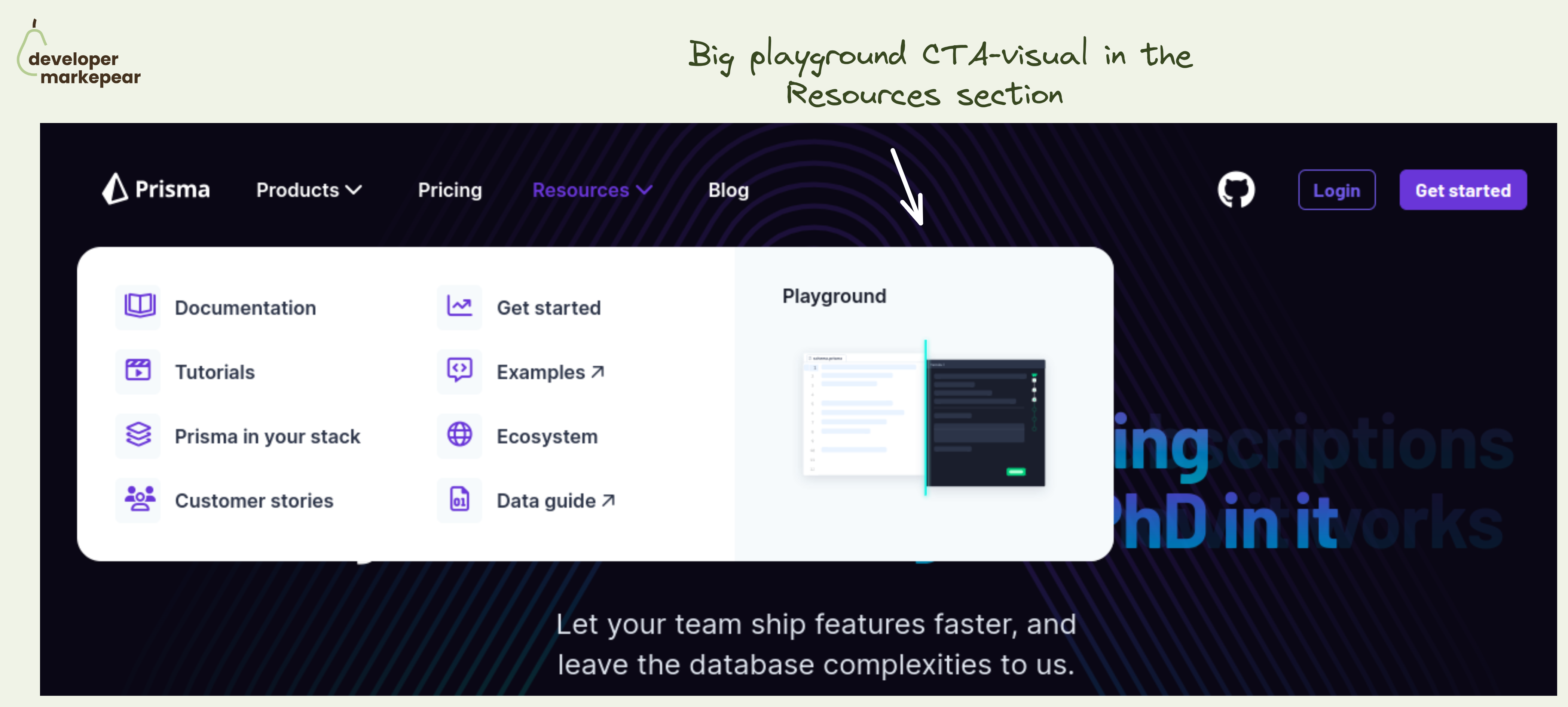
Simple yet powerful CTA in the navbar resources section.
The resources section in the navbar is mostly navigational. Well, the entire navbar is ;)
But you always have that one action that is more impactful than others.
💚 And I think that a Plauground is a great option. You get people to see how your product works. You let people play with it and see for themselves.
Not many next actions can be as impactful as getting people to experience the product.
Especially if you are a heavier infra tool that people cannot really test out in that first session. I mean, you won't really create a realistic example of your core database in 15 minutes to see how that new tool that you just saw works.
🔥 Making this CTA "big and shiny" and showing a glimpse of what will happen after clicking is great too.
🤔 2 changes I'd test out:
But the core idea behind making the playground your core navbar resource section CTA is just great.

This body cross-section is just awesome.
It makes it obvious that I can connect it to my workflow.
This is a must for dev-focused pages imho.
What I like:
- there are many integrations listed
- I can see the code and that it is easy to use
- The CTA is to integration docs, awesome!

Nice and clean code example.
Clear copy, what it does etc.
Calls to action with links to Github and website.
Really long code example which looks great when clicked on.

I love this copy. It answers:
It doesn't talk about the value as it is obvious to devs.
Obviously, it will save time and make things safer.
Don't talk about it.

Algolia gets over 80% of referral traffic from a single free tool they created called Search Hacker News.
But why does it work so well for them?
Hacker News doesn't really have a native search experience.
Algolia gives devs an amazing search experience out of the box.
So folks from Algolia created their own website where you can search Hackernews... with Algolia search engine.
Of course, when you click on "Search by Algolia" you get directed to the website and can learn how to set up a similar search, which you have just used yourself.
What I love about this:
And looking at the results it delivers.

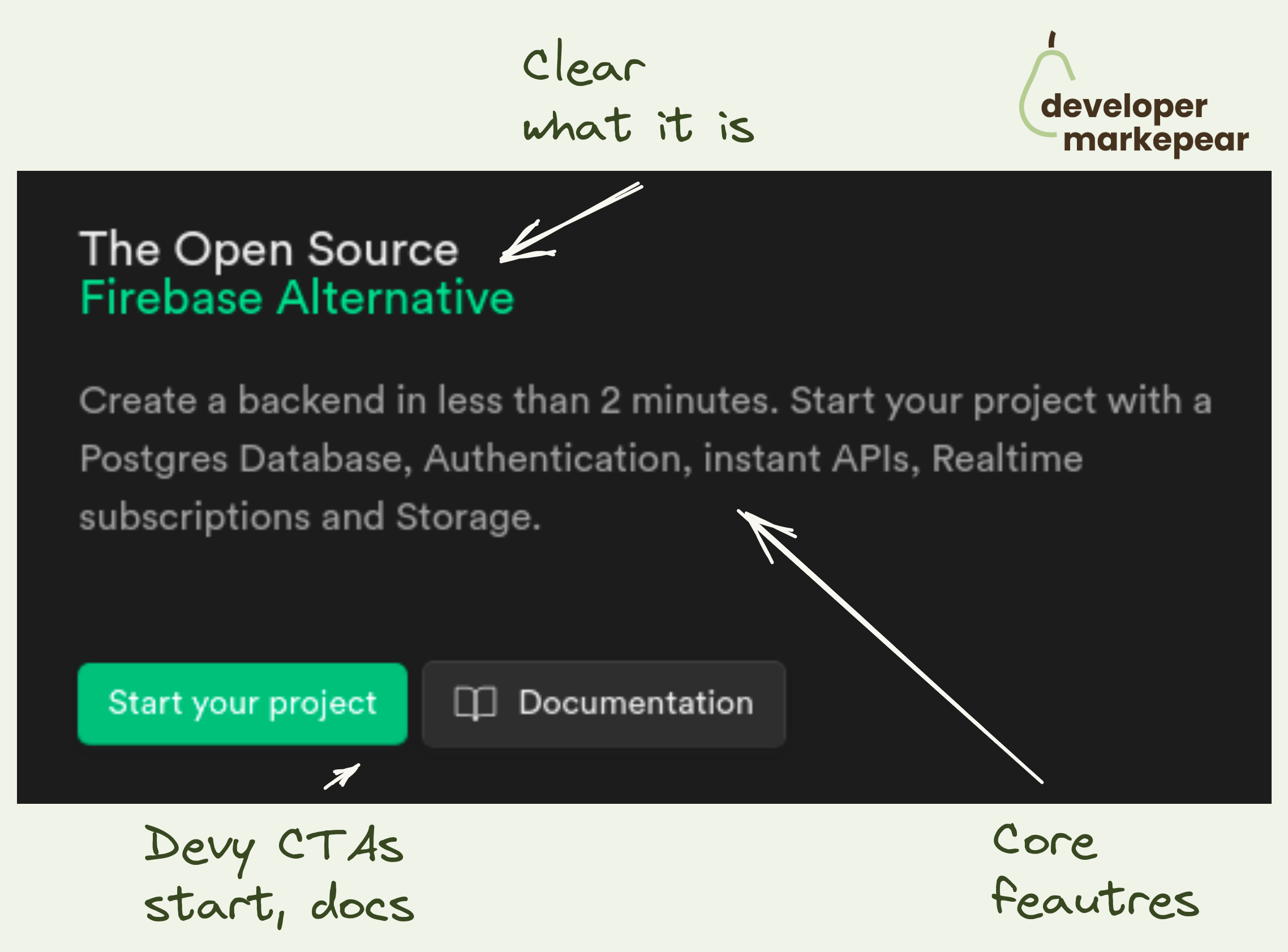
Mux does a few things beautifully in this header.
Value proposition:
Animated visual that is really good for dev tools:

Devs like diagrams.
When you explain a complex concept in one diagram it is just very shareable.
If you are interested in reading more there is an entire "blog post" when you click see more.
Just a very solid content format.
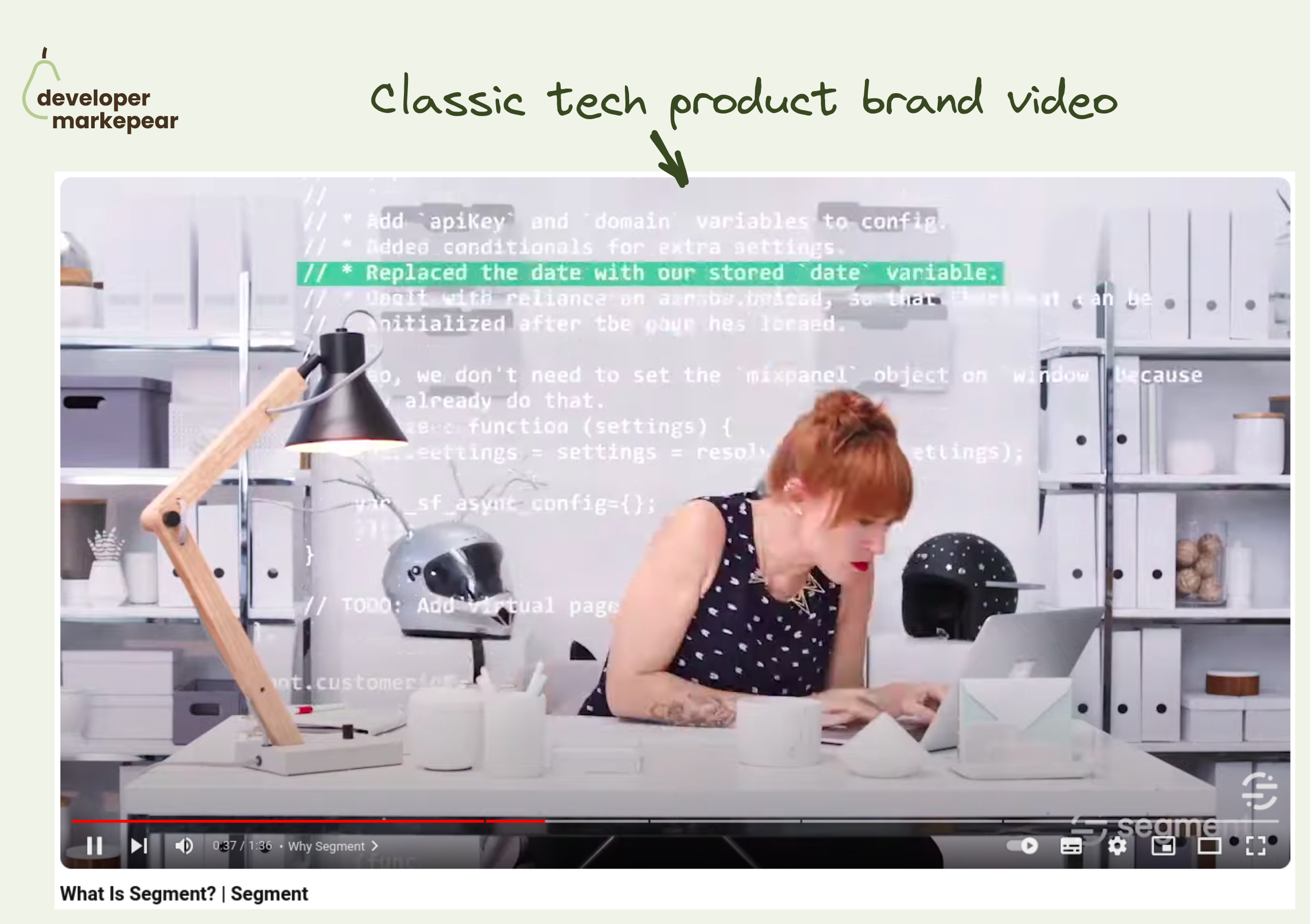
Came across this classic What is Segment brand video while watching an interview with one of the folks behind it, Maya Spivak (she is awesome btw).
What I like about it is that:
• it is fun, not formal, builds rapport
• it introduces the core problem the tool solves
• it shows the tech and explains it in a way that is simple but not simplistic
And it follows a flavor of the classic AIDA format:
Putting all that in 90 seconds is hard.
And even though this video is 4 years old it could easily still work today IMHO.
Really solid baseline to s̶t̶e̶a̶l̶ get inspired by ;)
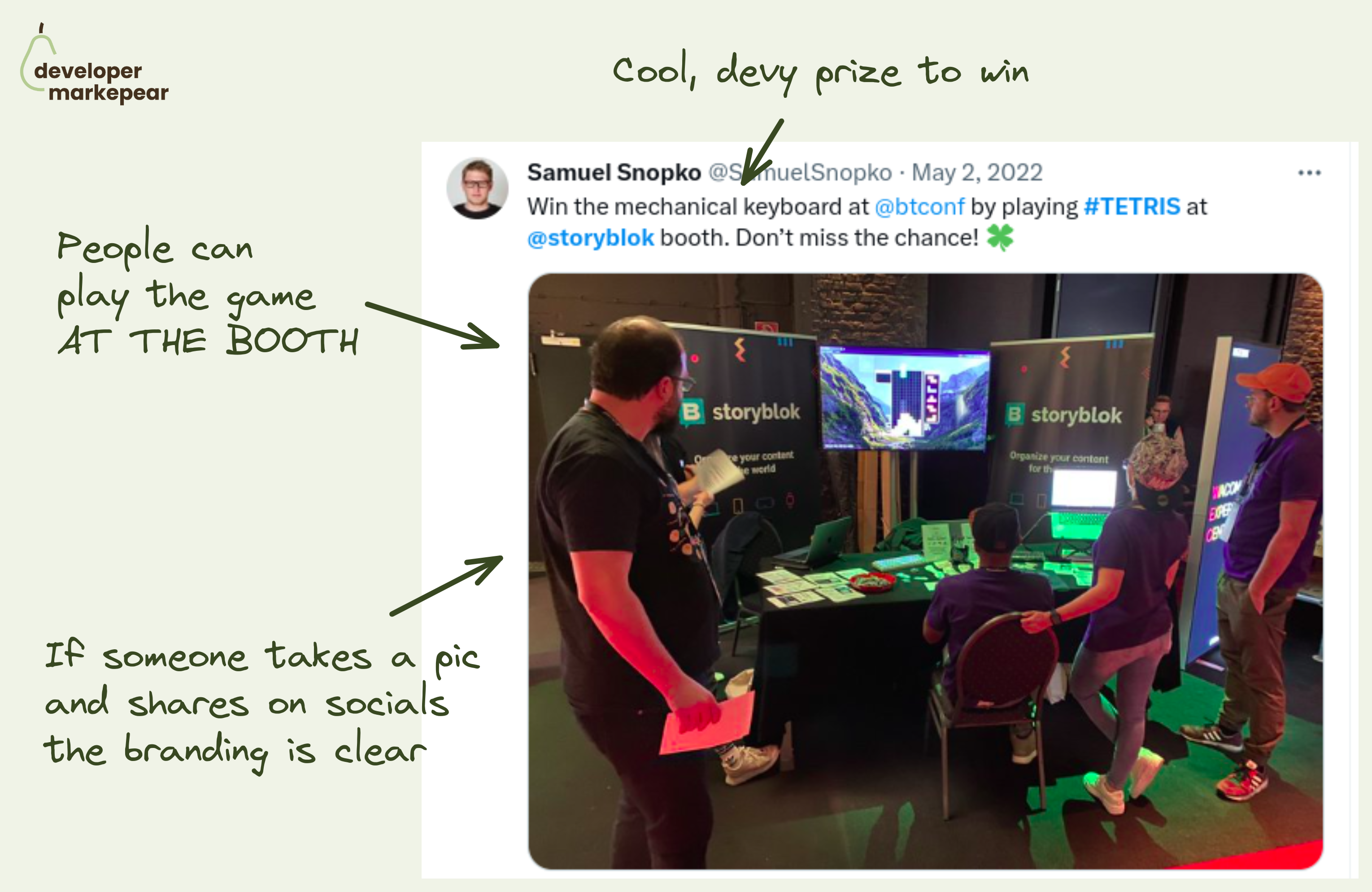
Conference activation idea: Tetris competition at the booth.
It is hard to get devs to your booth if all you offer is a "do you want to see a quick demo" spiel.
You need to get a bit more creative than that.
💚 The team at Storyblok ran a Tetris competition:
Afaik it was a big hit and I can definitely see why.
📒 A few more notes:
btw, I read about it on DX Tips. You want to check out that article on dev conferences from DX Tips

Adding CTA in dev-focused articles is hard.
You don't want to be too pushy, but you do want to get conversions.
DigitalOcean strikes a great balance with its in-text article CTA design.
They make this CTA look like an info box that you'd typically see in the documentation.
It is clear that it is a Digital Ocean CTA but it doesn't feel pushy.
It feels like a piece of potentially useful information.
Love it.

Simple and powerful messaging.
They say what they do. Zero fluff.
They make it easy for devs by explaining how they are different than (obvious) competitors.
They add a little developer-focused social proof.
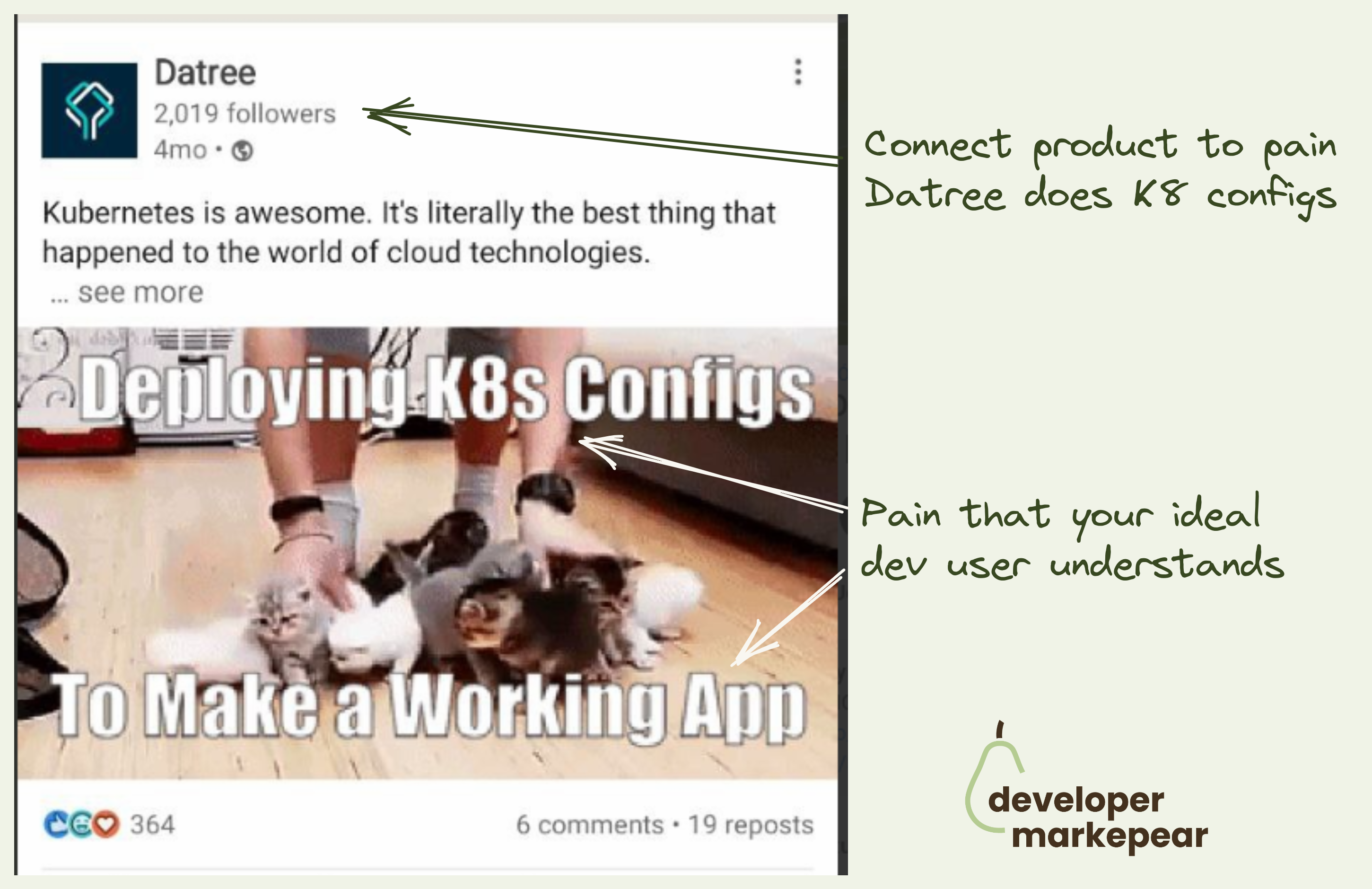
Memes are good top-of-funnel, awareness-type content.
Many companies use them on socials as they can "go viral".
But.
You need to either:
I like how Datree connects it to the product here.
They are a Kubernetes configuration tool and talk about exactly that here.
They do that with jargon too "k8", "config". When used well it can help you belong to the tribe you are marketing to.

Many dev tools have complex pricing and packaging.
Say your dev tool/platform has many product offerings.
And you offer usage-based pricing but also enterprise plans but also per-product options, and additional customizations.
But you want to present it in a way that is manageable for the developer reading your pricing page.
Mux solves it this way:
Extended headers on pricing pages are not common as they add friction.
But sometimes adding friction is exactly what you need to do.
Mux managed to make this page (and their offering) easy to navigate by adding a little bit of friction at the beginning.
Maybe you don't browse plans right away but at least you don't waste energy (and attention) on the parts of the page that doesn't matter to you.
Good stuff.
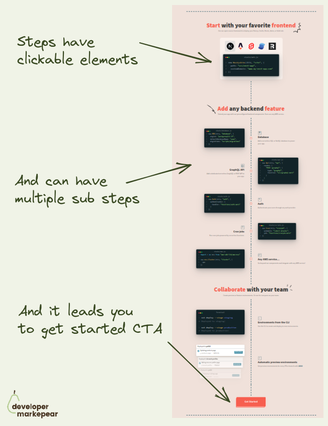
I like this idea of showing how your dev tool works.
With developers, you almost have to explain how it works on your homepage.
Many products do some version of Step 1 -> Step 2 -> Step 3 -> Success.
I really like how @SST approached it with a timeline.
I find it more engaging than those disconnected steps.
And when I follow this journey the final and logical step is to try it out. Get started.
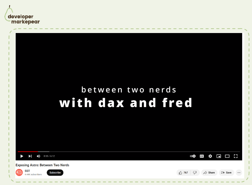
This is one of the most interesting content pieces I have seen in dev tools recently 👇
Comes from @SST and believe it or not is a comedy video created to promote integrations.
That's right.
So SST integrated with Astro and instead of creating "just another how-to use X+Y" video they created this:
It was a fun brand play but got way more views than a tutorial ever could.
And it connected with their audience in a human way that will be remembered (and shared).
Nice.
Great SEO tactic.
What folks from Cronitor did is:
This can be used for many dev-focused tools as by definition they use commands which can be templated.
I've heard about it originally from Harry Dry over at https://marketingexamples.com/seo/cronitor

There are a lot of boring vendor t-shirts at conferences.
And they get boring results.
I like this bold design from GitGuardian:
Nice.

Copy that lands makes a huge difference in dev tool website conversion.
Earthly proved it with this "tiny" change.
So I am a huge believer in good copy.
Not the clever one but the one that is written with words that your customers use.
That is rooted in product and research.
But I often hear devs or founders say things like "it's just copy".
It is not "just copy" it is your message, it is your positioning.
It is the difference between "cool, let's try it" and "now for me, whatever".
So some time ago I came across this article from the Earthly CEO Vlad Ionescu.
He shared that at some point they decided to run this A/B test with just a "tiny" change.
They changed the word "CI" -> "Build" across the homepage.
And their core website conversion doubled.
So next time you work on website copy give it some more thought and you may be surprised that "just copy" made a huge difference.

Thinking about your next conference giveaway idea?
How about a coconut? Datafold did just that!
Coconut + logo burned on it + a person who can open them up
=
A memorable, shareable, fresh (literally), and wholesome conference experience.
And I bet it didn't cost an arm and a leg too.
It goes to show how creativity matters when planning those things.
Thinking about doing a similar thing in Poland... with potatoes of course ;)

I love that it is static and it blurs everything I don't need to get the concept.
For the dev audience, static graphics, when done well, are better than
Tell me what you do in 1 sec, not 60

Handing #1 dev obstacle: "We can do it ourselves".
Check it out from second 0:35:
"I bet you're like
We can do it ourselves, it's not that hard.
We know what we're doing.
First, I hear you.
Second, are you sure?"
This is mastery.
Pointing out ignorance without alienating people.

Interesting dev blog CTA idea from V7.
CTAs in technical articles is a tricky subject:
I like how V7 approached it here:
What I'd change/test is making this CTA not a generic value prop but something closely connected to the rest of the article.

Great flow of the explainer.
Starts with the outcome "Build search UX".
Goes straight to code and 1-2-3-results format.
Explains every snippet of code as it is added.
Ends with a nicely presented result: a working search on a website.
No voiceover just code and screenshots.
And it's only 45 sec !!!

What to say when you have many products?
Dev tool companies over time grow from one product to suite of products to platforms with products built on top of the core one.
The result is that it is harder to communicate without going full-on fluff mode (my fav "built better software faster").
But for most companies, there is this core capability/product where people start. The entry product. Why not use that?
I really liked what Stripe did on their docs page here:
Even though this is docs, the same applies to homepages and other dev comms.
If you have many products, figure out what is the most important one, the one where most people enter. Focus on that. "Upsell" to other products later.

How to write a "What is {MY CORE KEYWORD}" article that gets to the top of HackerNews? 👇
First of all, almost no one succeeds at that as you write those articles for SEO distribution, not HN distribution.
To get an SEO-first article on HN your content quality bar needs to be super high.
But you can do it.
PlanetScale managed to get their "What is database sharding and how does it work?" on the orange page (kudos to Justin Gage!).
Here is what was interesting about that article:
𝗦𝘂𝗽𝗲𝗿 𝘁𝗼 𝘁𝗵𝗲 𝗽𝗼𝗶𝗻𝘁 𝗶𝗻𝘁𝗿𝗼.
• ❌ No "In today's fast-paced data-driven world enterprises work with data" stuff.
• ✅ Just "Learn what database sharding is, how sharding works, and some common sharding frameworks and tools."
𝗛𝗶𝘁𝘁𝗶𝗻𝗴 𝗸𝗲𝘆𝘄𝗼𝗿𝗱𝘀 𝘄𝗵𝗶𝗹𝗲 𝗯𝘂𝗶𝗹𝗱𝗶𝗻𝗴 𝗿𝗮𝗽𝗽𝗼𝗿𝘁 𝘄𝗶𝘁𝗵 𝘁𝗵𝗲 𝗱𝗲𝘃 𝗿𝗲𝗮𝗱𝗲𝗿.
💚 Speaking peer to peer, not authority-student:
• "You’ve probably seen this table before, about how scaling out helps you take this users table, all stored on a single server:"
• "And turn it into this users table, stored across 2 (or 1,000) servers:"
• "But that’s only one type of sharding (row level, or horizontal). "
𝗨𝘀𝗶𝗻𝗴 𝗷𝗮𝗿𝗴𝗼𝗻 𝗮𝗻𝗱 𝘂𝗻𝗱𝗲𝗿𝘀𝘁𝗮𝗻𝗱𝗶𝗻𝗴 𝘆𝗼𝘂𝗿 𝗮𝘂𝗱𝗶𝗲𝗻𝗰𝗲
Things like:
• "Partitioning has existed – especially in OLAP setups"
• "Sifting through HDFS partitions to find the missing snapshot "
𝗔𝗰𝘁𝘂𝗮𝗹𝗹𝘆 𝗲𝘅𝗽𝗹𝗮𝗶𝗻𝗶𝗻𝗴 𝘁𝗲𝗰𝗵𝗻𝗶𝗰𝗮𝗹𝗹𝘆 𝗵𝗼𝘄 𝘁𝗵𝗶𝗻𝗴𝘀 𝘄𝗼𝗿𝗸
🔥 Look at the section "How database sharding works under the hood" with subsections:
• Sharding schemes and algorithms
• Deciding on what servers to use
• Routing your sharded queries to the right databases
• Planning and executing your migration to a sharded solution
🎁 𝗕𝗼𝗻𝘂𝘀: 𝗽𝗹𝘂𝗴 𝗶𝗻 𝘆𝗼𝘂𝗿 𝗽𝗿𝗼𝗱𝘂𝗰𝘁 𝗴𝗲𝗻𝘁𝗹𝘆
Section "Sharding frameworks and tools" shares open-source tools (every dev, but HN devs in particular like OS projects).
And there as an info box, you have the info that Planetscale comes with one of those OS projects deployed.
Just a beautifully executed piece of content marketing.
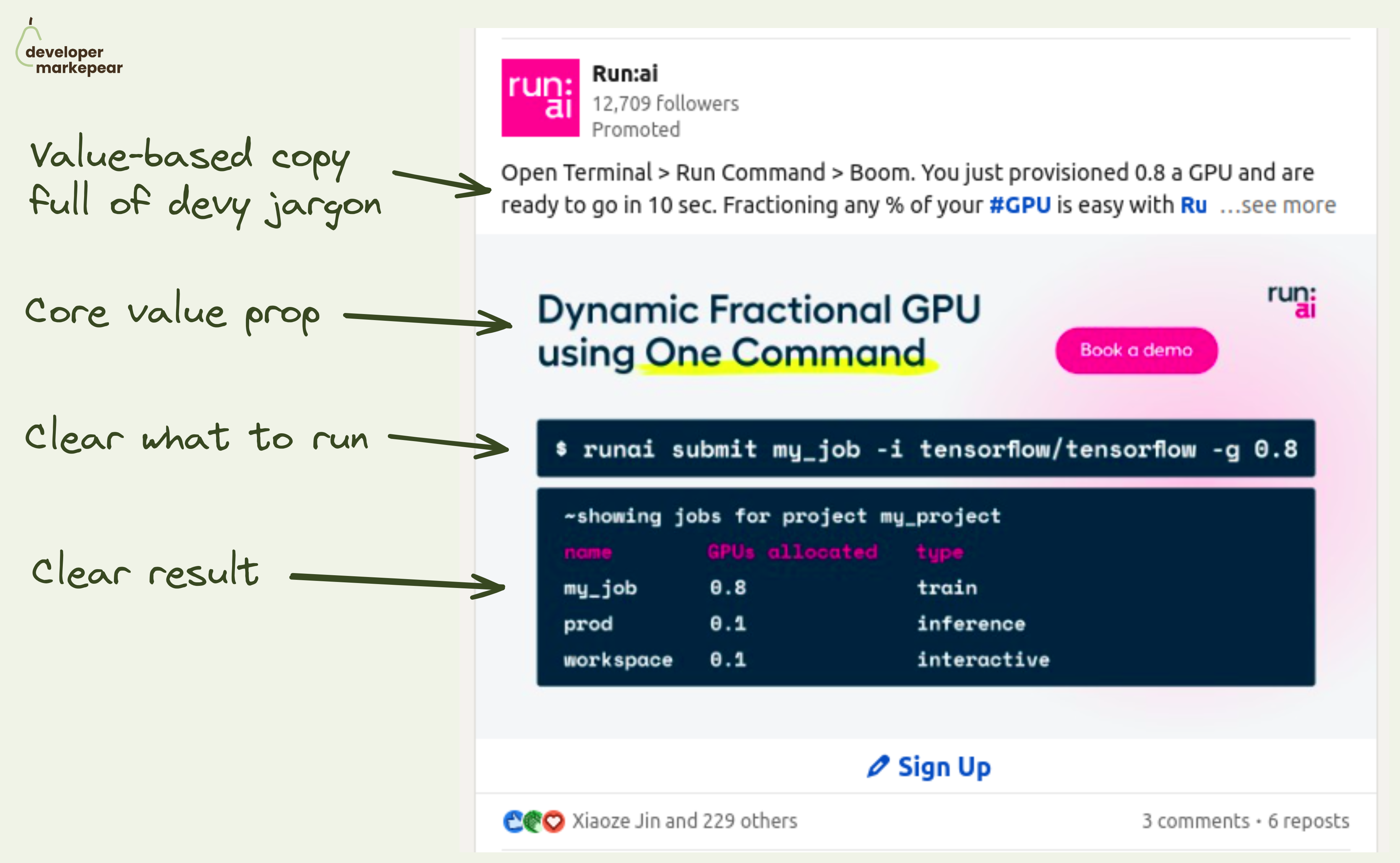
𝗔𝘁𝘁𝗿𝗮𝗰𝘁𝗶𝘃𝗲 𝗮𝗱 𝗰𝗿𝗲𝗮𝘁𝗶𝘃𝗲 𝗳𝗼𝗿 𝗮𝗻 𝗶𝗻𝗳𝗿𝗮 𝗽𝗿𝗼𝗱𝘂𝗰𝘁 𝘁𝗵𝗮𝘁 𝗿𝘂𝗻𝘀 𝗶𝗻 𝗮 𝘁𝗲𝗿𝗺𝗶𝗻𝗮𝗹?
Hard, but Run.ai did that.
Infra products are not "obviously cool".
There is no shiny UI, no happy people wearing your sneakers,
So what do you show on your ads?
First off, the rules still apply:
• Catch your audience's attention
• Say what you do in their language
• Better yet, show how it actually does it
And Run.ai ai and MLOps infra tool managed to create a beautiful Linkedin ad IMHO:
• They catch attention with the code visual
• They say what they do quickly with "Dynamic Fractional GPU using One Command"
• They extend on that in the post copy with an action-driven "Open Terminal -> Run Command -> Boom"
• The code shows what it feels like to use the tool
• And it shows you the result -> fractional GPUs
Job well done!

Is this brand campaign 💩 or ❤️?
I like it a lot actually.
It gets attention, it is memorable, it gets reactions.
And It does speak to a product message: that you have better developer experience than other tools.
It definitely beats flavors of "5x developer productivity".

What to put in the header when your dev tool does a lot?
I like how Appsmith approaches it.
In their case, they have multiple use cases they want to showcase.
But you could use the same idea for many features or products.
Show multiple clickable tabs:
A bonus idea is the "Try cloud" | "Self-hosted" CTA.
It communicates right away that you can deploy that dev tool anywhere.
If the self-hosted deployment is important to your customers let them know.
You don't want them to look for it and drop from the page trying to find the FAQ.
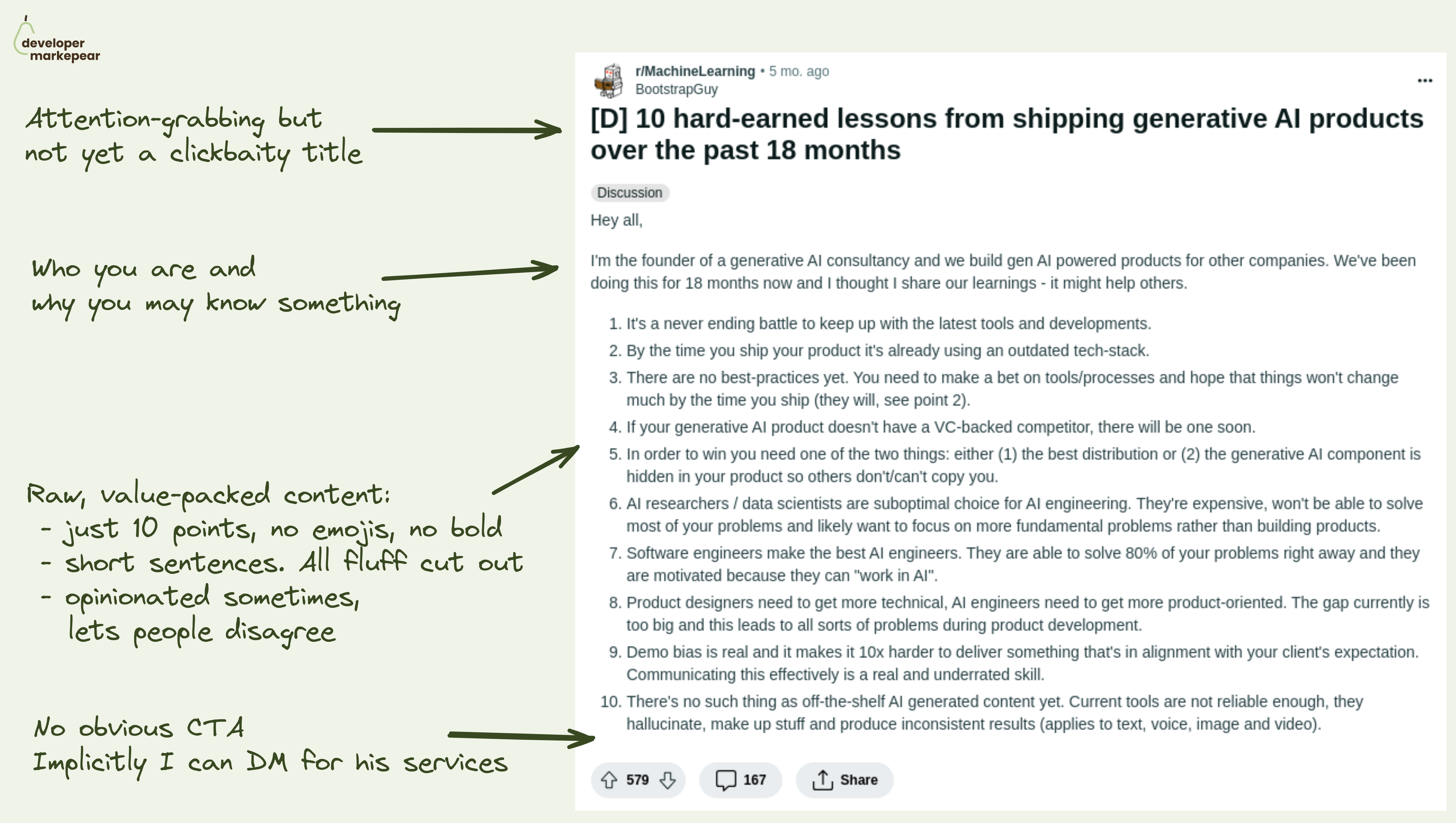
Nicely done Reddit post that went viral on r/MachineLearning.
Reddit dev communities are notoriously hard to market in.
You need to have something really valuable to say to that dev crowd.
But even if you do, it is so easy to screw it up and get trolled or downvoted for "obvious promo".
I know that from experience. So painful to watch.
This is a really nice example of how to do it right:
Try something like that next time you post and see what happens.
Obviously, it is nearly impossible to do when:
But then why would you even post something?
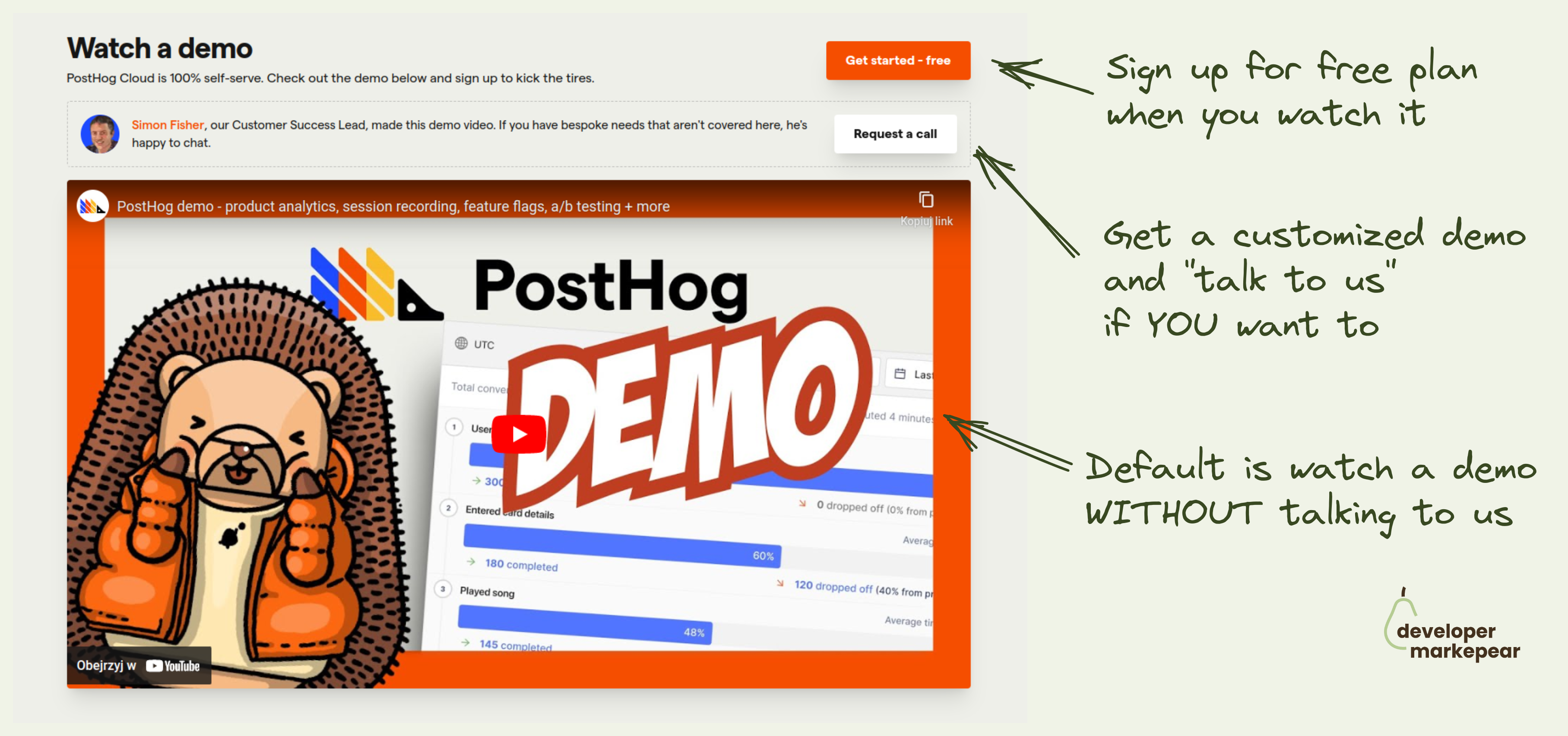
Devs have a love/hate relationship with "Book a demo" call to action.
Mostly hate though.
Especially if what they want is:
Let's just say that sitting through an hour demo call with a salesperson just to get the pricing is not what most devs love to do with their time.
But there are moments in the buyer journey when devs do want to have that live session:
Then, having a live session/demo is the fastest way to move forward.
@PostHog handles this dev journey reality nicely with:
This approach solves both scenarios really nicely.

I love the design of this crossover section on the Tailwind homepage.
I see the code and the result next to each other.
I see how I can get that result with code.
It is interactive and catches my attention.
It makes me feel inspired.
Great job Tailwind team!

I like how it has a proper "hero section" feel to it but it adds a developer-focused twist:
The rest of the Readme is great as well but the hero section is gold imho.

This is a simple but great header imho:
Love it.
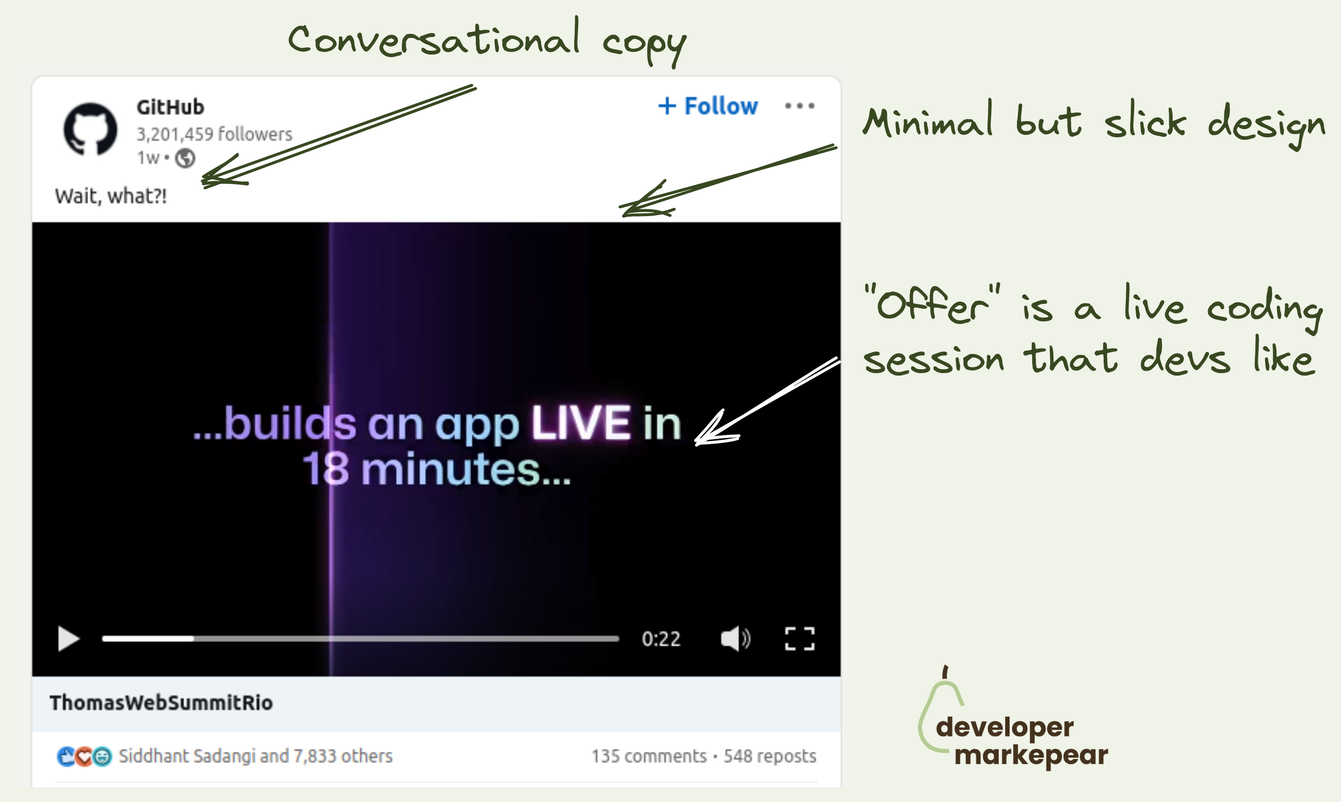
7k likes on an event promo post to the dev audience.
I don't think I've ever seen 7k likes on a developer company post on Linkedin.
Ok, this is Github, but still.
This is a 26sec video where they go:
This is a job well done:
And they could have done:
This is how to promote an event. LOVED IT!

With/without is a classic marketing campaign theme.
AhoyConnect does it nicely in this ad.
Obviously, not everyone loves memes.
But many devs do.
Those who do may smirk -> smirk builds brand affinity.

How to run developer-focused Reddit ads that get upvoted?
Reddit is well known for anti-promotional sentiments.
Just post something along the lines "you can solve that with our dev tool" and see.
So running ads on Reddit feels even more like a no-no.
Especially if you add problems with bot clicks and attribution as most devs will have some sort of blocks.
But you know your audience is on Reddit.
And for some of us, it may very well be the only social platform they are on.
So what do you do?
This is how @Featureform approached it to get almost 100 upvotes on an ad:
If you are going for brand awareness rather than a direct conversion those types of ads can work very well.
I liked it for sure.
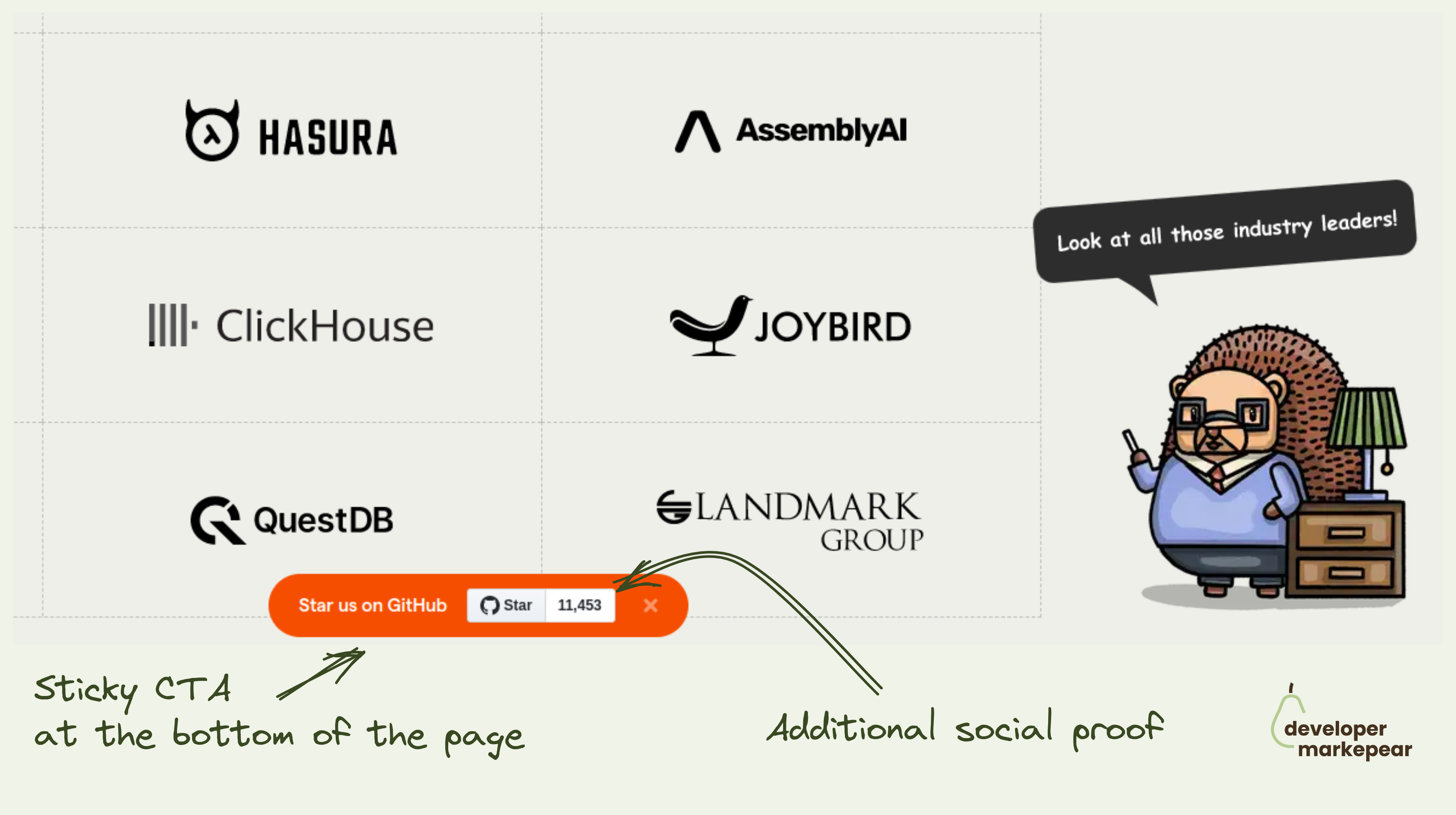
OK, the best way of getting GitHub stars is by creating a project that solves real developer problems well.
I assume you have done that already and the metric that people love to hate ⭐ is growing organically.
What do you do now?
I mean you got to ask people in one way or another.
Many companies put it in their navbars or hello bars.
Posthog adds a sticky banner at the bottom of the page that follows you as you scroll.
It also shows a start count which at their size (11k + stars) acts as social proof.
You can close it and the next time you visit the page it will be off not to push too much.
I like the concept makes sense to test it out this way imho.

How easy it is to get started is a big conversion factor for any dev tool.
Devs want to test things out and if it is hard to do they will be gone testing a competitor that made it easy.
And so a good how-to section on your homepage can make a big difference in getting devs to that first experience.
Appsmith does it beautifully with their 1-2-3 How-to section:
It is so engaging and just beautifully designed. And the CTA to additional resources like integrations, widget library, and docs make the message land. I do believe it is easy to set this up.
Great pattern to copy-paste imho.
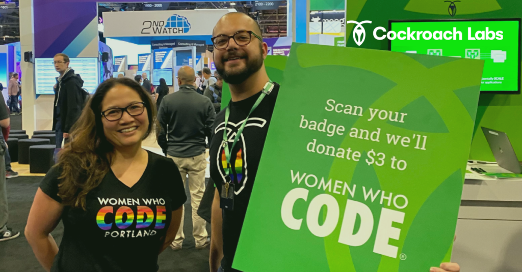
What if your next swag was a donation? That's what Cockroach Labs did.
Ok, so the typical way of doing swag at a conference is to give out t-shirts for badge scans.
And then folks either wear them or throw them away (or keep wearing them when they should have thrown them away but that is another story).
After the conference you take leftovers with you, ship them home or, you guessed it, throw them away.
A lot of throwing away for a badge scan if you ask me.
Cockroach Labs decided to do something completely different.
They donate a few $ to a great charity @Women Who Code for every badge scan they get.
I love it.
An extra benefit (and where the idea originated) is that with this, you can do virtual badge scans too.

The problem with presenting API is that it is hidden. It gets the job done in the background.
So it is not "attractive" in the way some other dev tools can be.
But you can:
That is how Mux, video API, solves it.
Found this awesome crossover on their homepage.
They give you:
Love it!

An ad that doesn't feel like an ad.
I like that this is almost a meme.
But it still explains what the company does.
Love it.

When selling dev tools you typically have 3 "buyer" levels:
Individual dev:
Team lead:
Org lead:
How does Postman solve it?:
They even go the extra mile. Something I didn't see too often.
They understand their customer's reality and identified one more level between Org and Team.
Basically a department-level unit that probably has multiple teams but is not at the organization/enterprise level.
I really like what they did hear. Solid.

Very nice design solution on the homepage.
Classic communication of the world before using your tool and the world after.
Really liked how it felt messy before.
And is nice and clean after.

Interactive product tours are all the rage.
But how do you make them work for the dev audience?
How do you deal with:
That is hard.
But Vercel somehow made it.
This is by far the best product tour I have seen so far.
What I love:
This product tour is what dev tool startups will aspire to for years (or months ;) ) to come.
Mark my words.

I love this dev tool header copy from Neon.
❌ They could have gone with "We make your data fly" or "10x your database developer efficiency" or other stuff like that.
💚 Instead, they spoke in a clear dev-to-dev language:
Simple, clear, and to the point. No fluffs given. Love that.
"But we are selling to the boss of a boss of that developer user persona"
Then let that dev champion understand what you are doing and bring it to their boss.
"But we are going pure top-down"
Then does that boss of a boss of a boss actually evaluate your infra tool themselves or send their architect?
Maybe 90% of your site traffic is the buyer-persona CTO. But my bet is, it isn't even 1%.

Just an awesome billboard/ad format for a dev too company coming from Vercel.
What I like about it is:
Simple and beautiful.
Btw, they actually run similar ads on Reddit and it makes a lot of sense IMHO.

Linked GitHub logo in the navbar
Adding CTA to your GitHub repo makes your company look more dev-friendly.
If you have a ton of stars I'd show those as well to play that social proof card.
But even without it, I think it's a good way to get more traffic to your repo and get those stars :)

Newsjacking is a great marketing tactic.
Especially when you can connect it nicely to your product.
And GitGuardian, a tool for secrets management does it beautifully here.
They ran a story on how Toyota suffered from a data breach.
Because they didn't manage their GitHub secrets properly.
Brilliant.
The idea behind this conversion play is to put an "Aside CTA" that is unrelated to the content early in the article.
And get that clicked.
But obviously, if you do that it will be pushy and intrusive.
So?
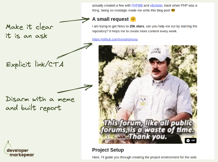
Nevo David from Novu shared this idea on one of the podcasts:
Btw, Nevo says that cat memes work best.

Vs pages are a classic SaaS marketing.
But I like how Ably adjusts them to the developer audience:

Great above the fold
The subheader explains the value proposition.
Header handles major objections:
Then we have 3 CTAs but they are super focused on devs:
Then it goes on to explain how it works with a simple, static graphic.
This whole thing makes me feel peaceful.

Classic Auth0 campaign coming back in 2023.
I love how simple and powerful this message is.
You can outsource a dull but important problem of authentications to them.
That is all the say.
But it is enough to get you interested and understand what they do.

Nice post format.
I like it for dev tools that have both API and UI components.
You show code and what it produces in one view.
You can add additional things to the vis part of it for more context.
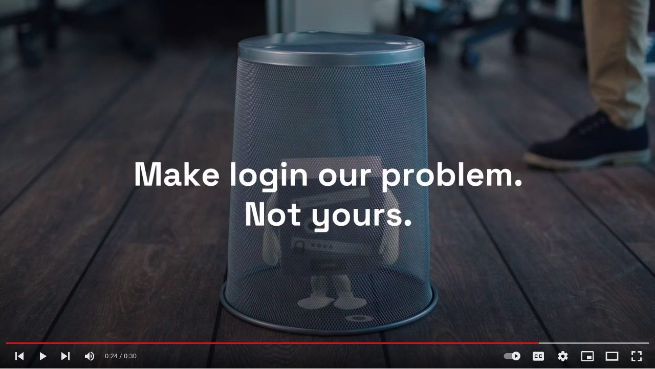
Make login our problem. Not yours.
This is a beautiful messaging of Auth0 solution.
Login
Simple explanation of what it does/gives you.
Simplified of course
Our problem. Not yours.
You "outsource" this boring but important problem to someone else.
It also has a feel of SaaS in there.
They will take care of it.
Your dev tool is faster/more scalable/more X -> show it with benchmarks.
For some tools the entire unique selling point is that they are faster.
You build your messaging around that, put a flavor of "fastest Y for X" in the header and call it a day.
But devs who come to your website cannot just take your word for it. They need to see it, test it.
For some tools it is possible to just see it for themselves, get started.
But you cannot expect devs to really take a database or an observability platform for a spin.
As to test the speed or scalability on realistic use case you need to...
... set up a realistic use case. Which takes a lot of time.
But you can set that use case and test it for them. With benchmarks.
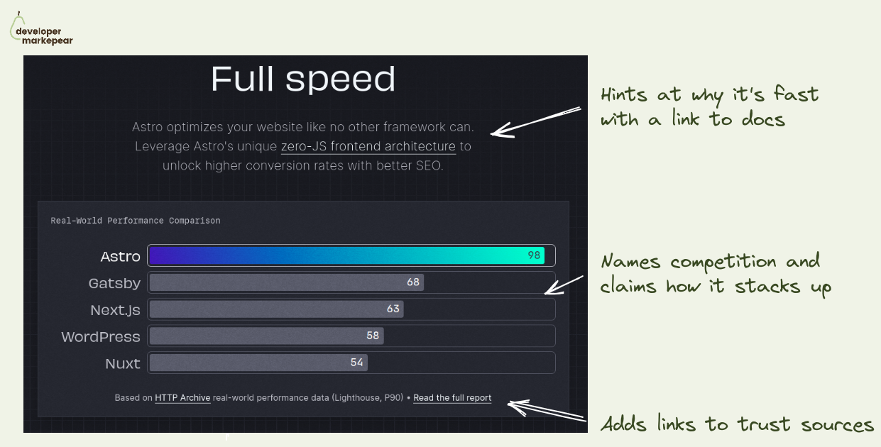
I really like how Astro approached it:
If your usp is that you are faster/more scalable/ more whatever. Back it up. This is the nr 1 thing devs on your website need to trust you with to move forward.
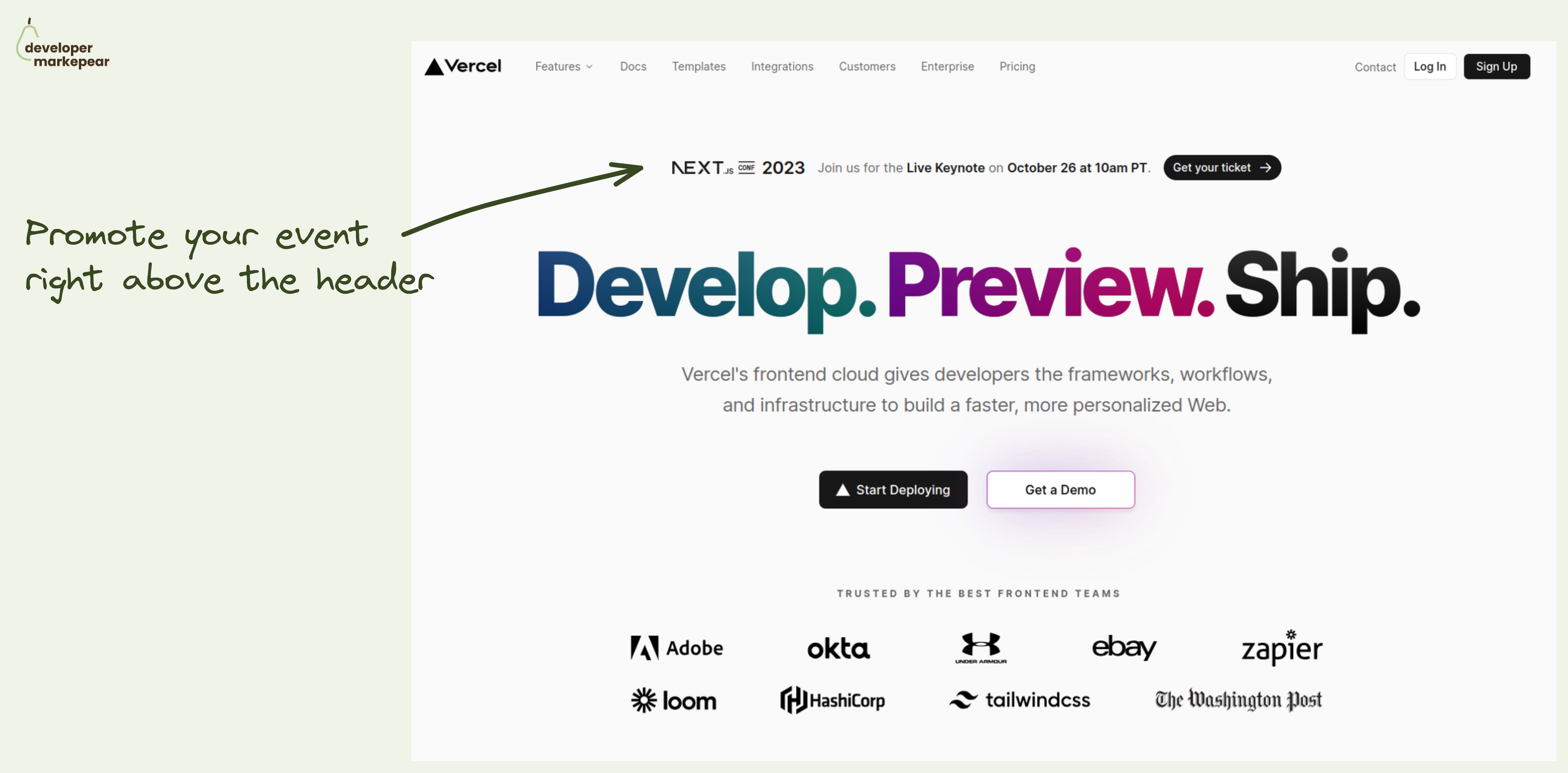
How to promote your important company event? How about right there in the header.
A typical approach to promoting events on your site is to have them in the Hello bar (right above the navbar). This is a solid option of course.
But what if this is a super duper important event that you really want to push?
Put it in the header.
The header is the most viewed part of the most visited page on your site.
Doesn't get much better than that.
But you don't want to distract people from your value propositions and main CTAs too much.
How do you do that?
This is how Vercel did with last year's NEXT.js conf.
Nice execution on that pattern.

Show how product components fit together.
A good diagram is such a good solution to that.
They use the same colors and eyebrow copy that was used for body sections.
It all clicks now, I get the full picture.
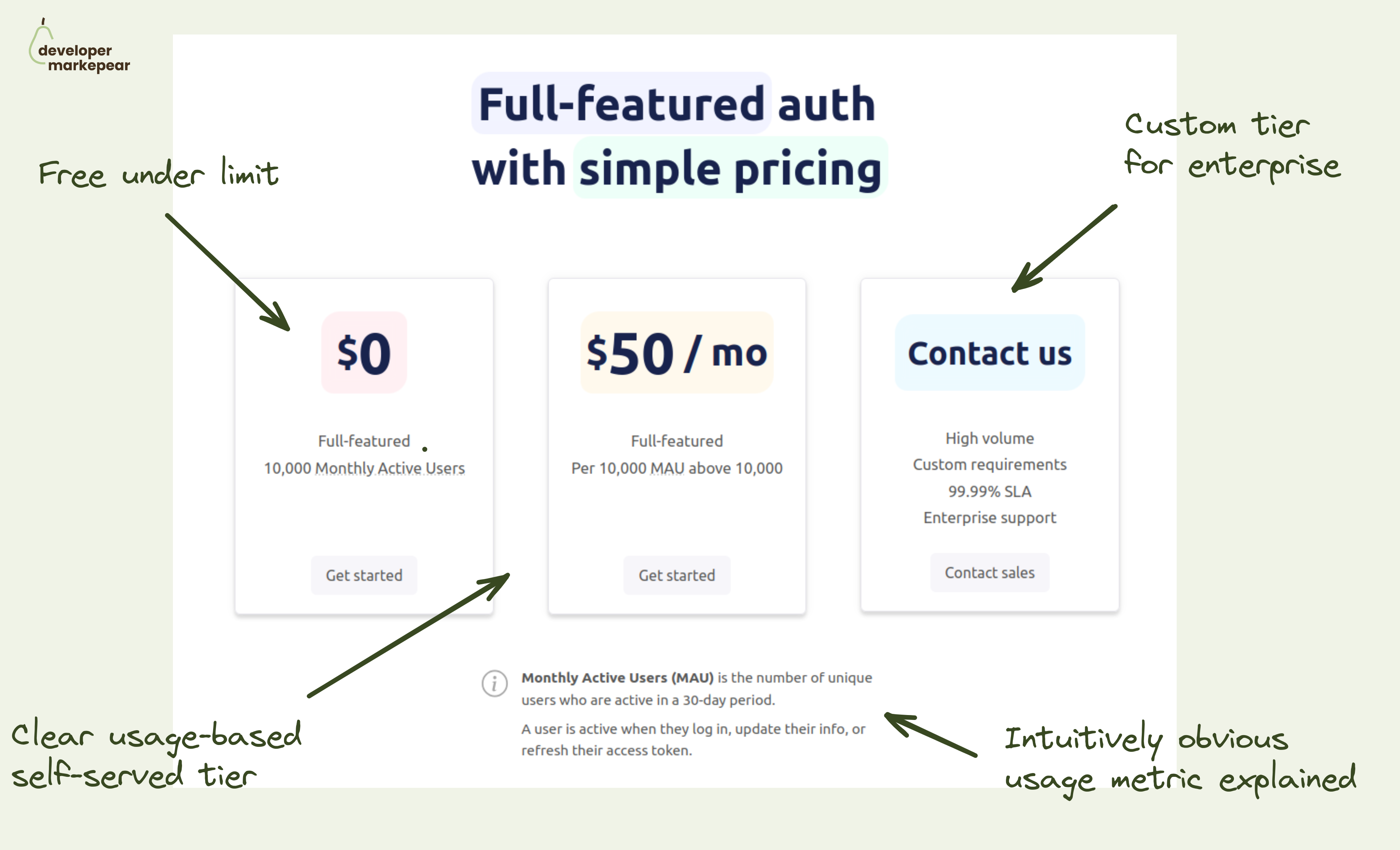
How do you make your dev tool pricing simple?
I really like this one.
Saw someone share a pricing page from Userfront some time ago and really liked it. They changed it now but I really like the thinking behind the older version.
It is just remarkably simple while hitting all the boxes:
Just a very good baseline.

A great example of a dev-focused Linkedin post format from Khuyen Tran 👇
What I like about this:
Just great job!

I love this simple design.
They show:
Simple, and powerful imho.