
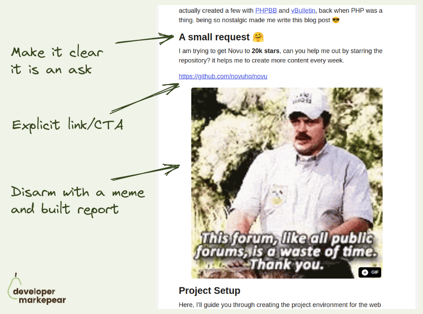
The idea behind this conversion play is to put an "Aside CTA" that is unrelated to the content early in the article.
And get that clicked.
But obviously, if you do that it will be pushy and intrusive.
So?
Nevo David from Novu shared this idea on one of the podcasts:
Btw, Nevo says that cat memes work best.
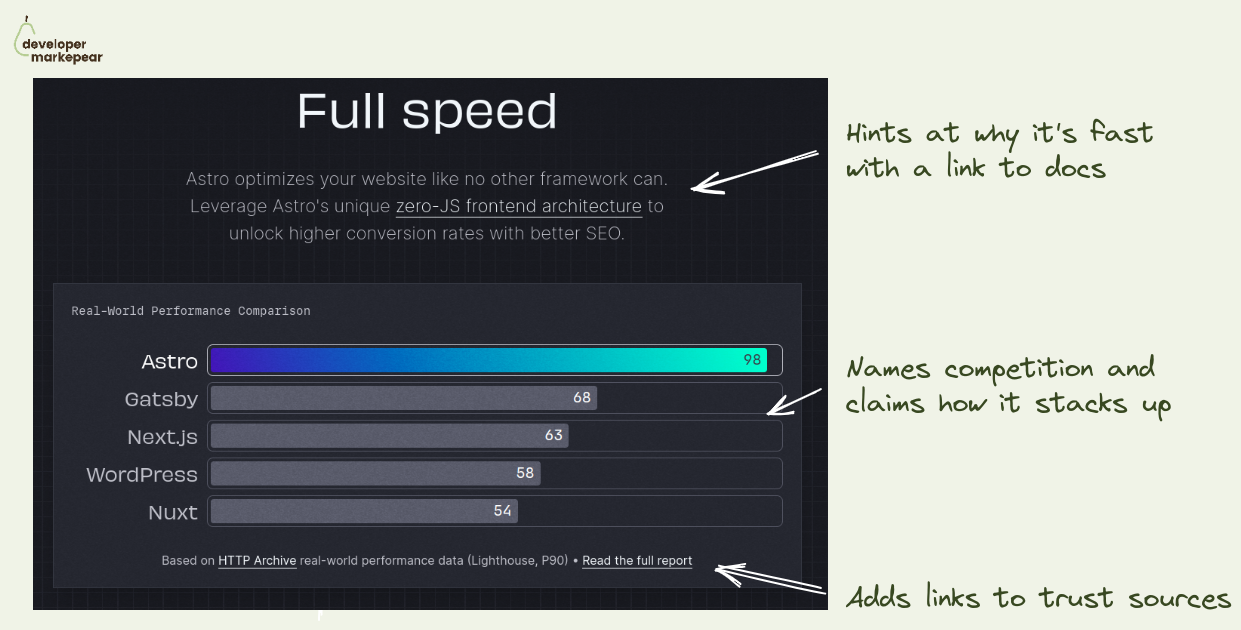
Your dev tool is faster/more scalable/more X -> show it with benchmarks.
For some tools the entire unique selling point is that they are faster.
You build your messaging around that, put a flavor of "fastest Y for X" in the header and call it a day.
But devs who come to your website cannot just take your word for it. They need to see it, test it.
For some tools it is possible to just see it for themselves, get started.
But you cannot expect devs to really take a database or an observability platform for a spin.
As to test the speed or scalability on realistic use case you need to...
... set up a realistic use case. Which takes a lot of time.
But you can set that use case and test it for them. With benchmarks.
I really like how Astro approached it:
If your usp is that you are faster/more scalable/ more whatever. Back it up. This is the nr 1 thing devs on your website need to trust you with to move forward.
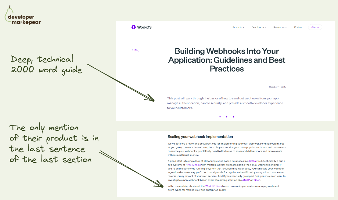
This is how you write dev tool JTBD blog posts.
Masterclass of writing this type of content from @WorkOS imho.
Deep 2000 word guide that explains how to add webhooks the your application.
Goes into examples, best practices, everything.
One thing it doesn't do?
It doesn't push the product left right and center.
In fact, the only CTA is hidden in the very last sentence of the very last section.
Why?
Because most likely, the reader's intent is around understanding the problem at this point.
They want to understand what adding webhooks to their app really means from the practitioner's standpoint.
And they did that beautifully.
Could you have pushed the product a bit more? Sure.
But by answering the actual questions devs came here for they managed to build trust.
And I am sure got their fair share of click-throughs and signups anyway.
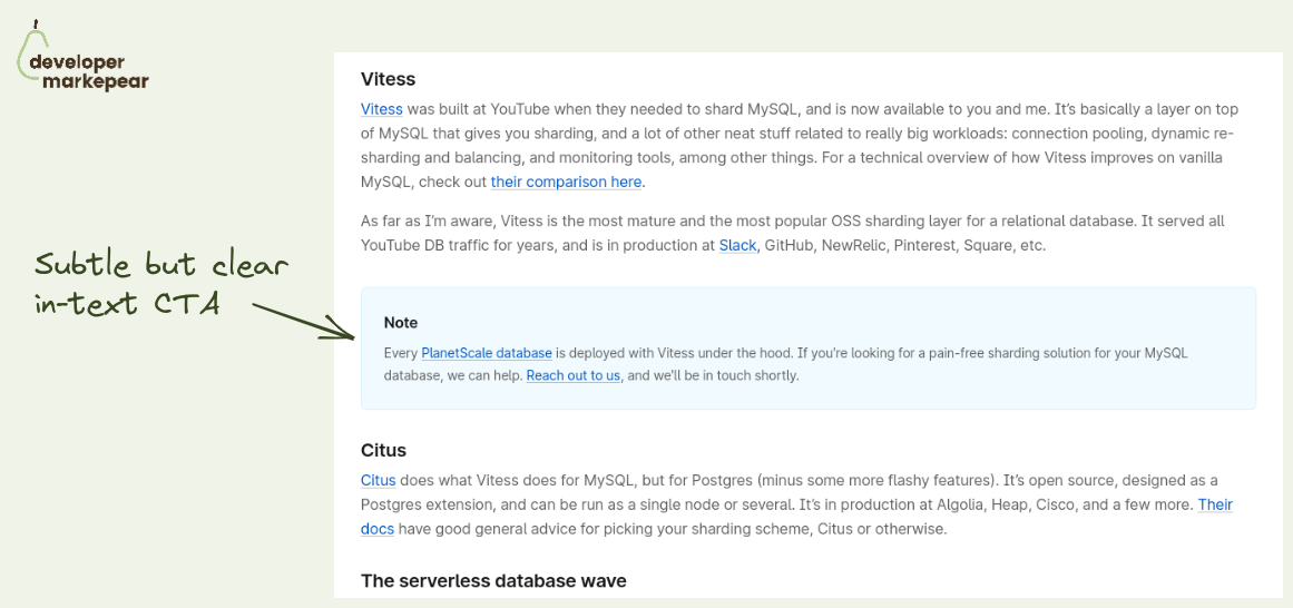
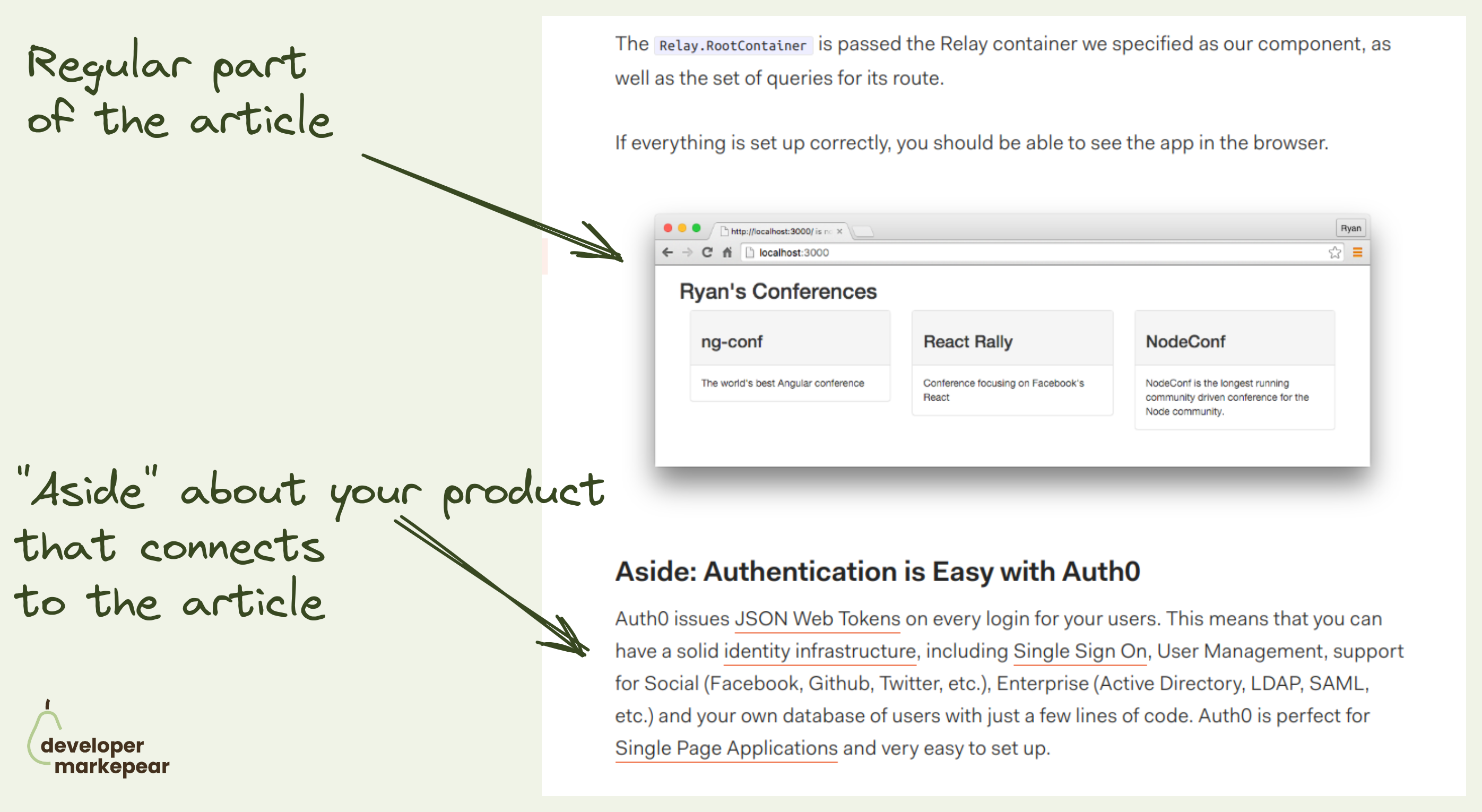
Subtle but effective dev blog CTA -> info box.
Basically a plain article in-text CTA but there is something special about it.
It looks like a docs info box.
It is not a "buy now" style call to action but rather a subtle "you may want to know about X" push.
But for it to really feel like an info box it needs to connect to the section of the section of the article around it.
Otherwise, it will just feel like an intrusive ad anyway.
PlanetScale does a great job here.
They link the part of the article about the sharding library Vitess with their product that was built on top of it.
It feels natural and I am sure it gets clicks and if not then product awareness.

Pushing cold blog readers to try your tool rarely works.
So you need a transitional CTA, something that worms them up.
But it needs to be aligned with the goals of the reader.
And I think pushing folks to a community discord is a solid option.
I like the copy "Discuss this blog on Discord" as it is very reader-focused.
Some folks read the article and have more questions.
They want to discuss it somewhere.
And while you could just do a comments section, a community gives you more options to get people closer to the product.

What to put in the header when your dev tool does a lot?
I like how Appsmith approaches it.
In their case, they have multiple use cases they want to showcase.
But you could use the same idea for many features or products.
Show multiple clickable tabs:
A bonus idea is the "Try cloud" | "Self-hosted" CTA.
It communicates right away that you can deploy that dev tool anywhere.
If the self-hosted deployment is important to your customers let them know.
You don't want them to look for it and drop from the page trying to find the FAQ.

I like those sidebar CTAs from Auth0.
They go with a sticky Table of Contents which gives a better reading experience.
They put two CTAs below that TOC:
Solid job.

What CTAs should you choose for your open-source project homepage?
Was always wondering what is my default.
There are many options: "See docs", "Get started", "Sign up", "Start X"
But in open-source you want people to start playing with it, install it.
So what should you choose?
Recently came across Astro homepage and loved what they chose.
"Get started"
Install code
Whatever I choose I will actually get my hands dirty.
I think this will be my default from now on.
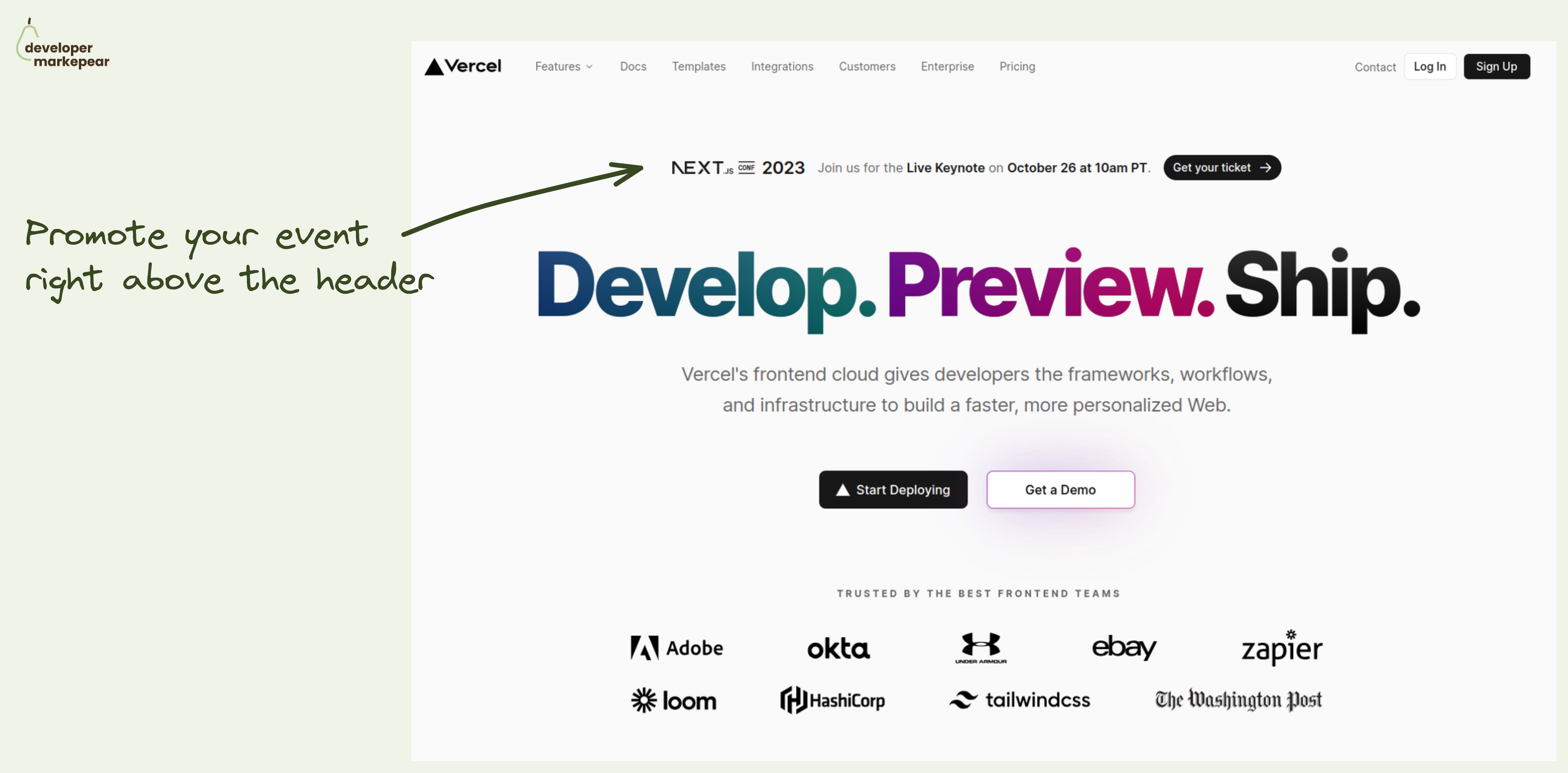
How to promote your important company event? How about right there in the header.
A typical approach to promoting events on your site is to have them in the Hello bar (right above the navbar). This is a solid option of course.
But what if this is a super duper important event that you really want to push?
Put it in the header.
The header is the most viewed part of the most visited page on your site.
Doesn't get much better than that.
But you don't want to distract people from your value propositions and main CTAs too much.
How do you do that?
This is how Vercel did with last year's NEXT.js conf.
Nice execution on that pattern.

Great above the fold
The subheader explains the value proposition.
Header handles major objections:
Then we have 3 CTAs but they are super focused on devs:
Then it goes on to explain how it works with a simple, static graphic.
This whole thing makes me feel peaceful.
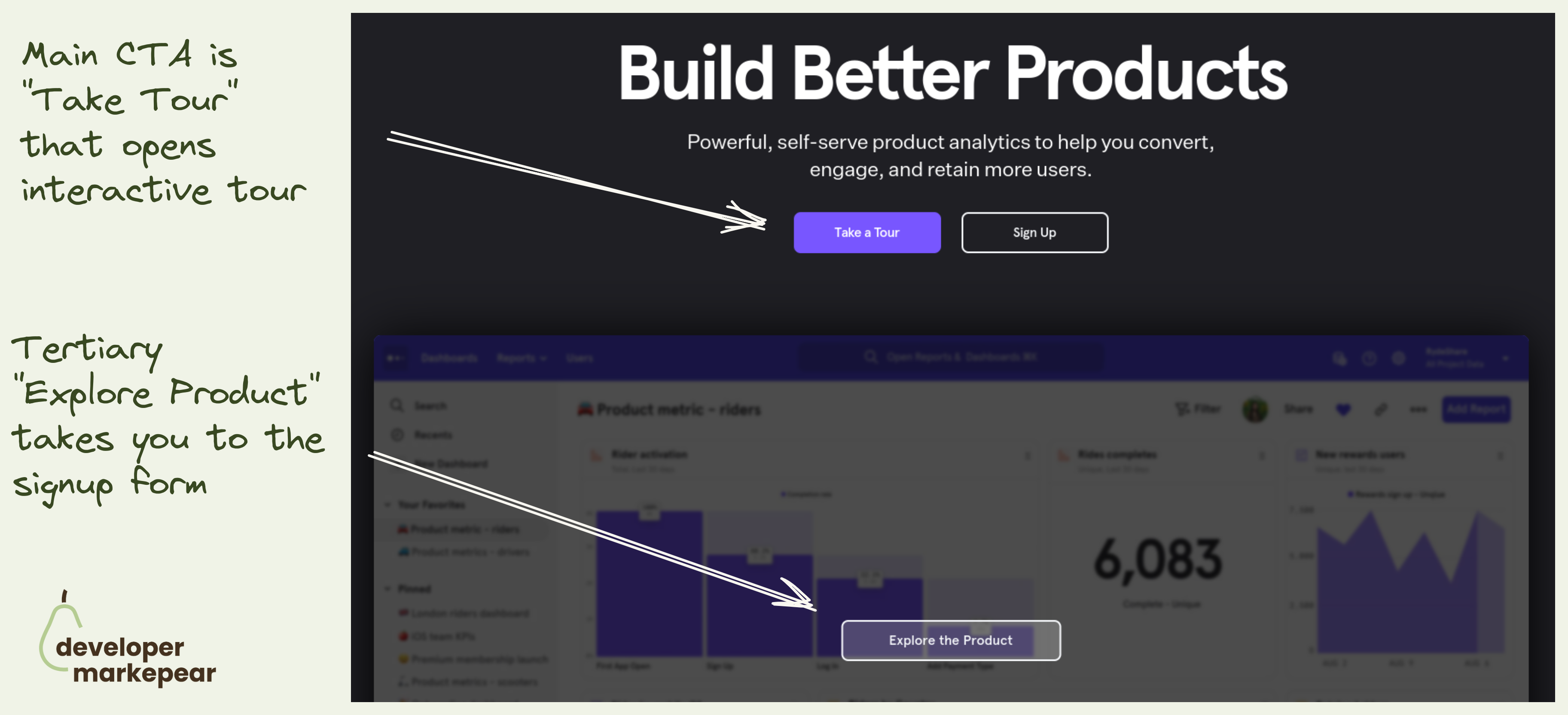
Mixpanel primary CTA is to take an interactive tour.
They take you to a 30min video + a guided UI tour.
Not a signup.
That is because with products that have long time to value (like analytics, observability etc) dev will not see value in the first session.
I mean to really see value you need to see real data, real use cases. And if you were to actually test it would take weeks.
That is why many companies do demos. But demos have their own problems (and most are bad).
Interactive tools make it possible for me to explore the value without talking to anyone.
I love this option.

An interesting option to push people to read the next article.
You use a slide-in triggered on a 75% scroll with a "read next" CTA in the bottom left.
On the aggressive side for sure but when the article you propose is clearly technical it could work.
And if your articles are not connected to the product explicitly you do need some ways to keep people reading and see more of your brand.

One of the top-performing conversion flows in dev-focused articles.
"Aside CTA" in the "How to do {jobs to be done}" article.
You know the drill:
And Export SDK executes it (almost) perfectly:
One thing that could be tested and changed is putting this "Aside CTA" mid-article and not at the end (tip from Martin Gontovnikas).
A good thing to try if you are running the "How to do {jbtd}" article strategy.

I like that this is both strong and subtle.
It comes right after I've delivered a smell of value with a technical intro.
And I can see that there is more value to come after thanks to the table of contents.
The CTA itself feels like an info box in the docs rather than a typical subscribe CTA.
Good stuff.

Sometimes you have an article, report, or event you want to drive people to.
And it is important that they read it.
What Plaid did here is an interesting way of putting it right in the hero section without making it overwhelming or distracting.
I like it.

Action-focused copy is usually better than "sign up".
But sometimes it is hard to find a good copy for this.
Some teams like Vercel or Auth0 do "Start building "
But that doesn't always work.
I really like this "Get API keys" CTA copy.
Now for the Hero section I really like those two CTAs:
Really great job imho.

How to get people to sign up for your office hours?
Why not put it on your docs homepage?
Btw, I really like the concept of office hours.
You get your devrels or product to do those weekly and then you just have to figure out how to get people there.
Classic options are to put info in onboarding sequences, in the app, or on the website hello bar.
But Flatfile had another idea. They put it in their docs homepage header.
I find this idea brilliant as many people who browse your docs (especially for the first time) are in that evaluation mode and would actually want to do that.
Plus calls to action in the docs get more respect by design ;)

There are three CTAs actually.
Common knowledge suggests doing one, maybe two, they do 3:
Devs want relevant and practical.
Also, devs love docs and examples and check them before signing up.
Action-focused copy is great as well.

With infrastructure tools, it is notoriously difficult to show people the value quickly.
To really see it they would need to set up everything at their company infra, create dashboards for their use case, and so on.
A lot of work.
That is why creating a sandbox experience is a good way of giving people a taste.
I like the way Axiom calls it a playground and says "Play with Axiom" and "Launch playground".
This copy is good because:

Adding CTA in dev-focused articles is hard.
You don't want to be too pushy, but you do want to get conversions.
DigitalOcean strikes a great balance with its in-text article CTA design.
They make this CTA look like an info box that you'd typically see in the documentation.
It is clear that it is a Digital Ocean CTA but it doesn't feel pushy.
It feels like a piece of potentially useful information.
Love it.
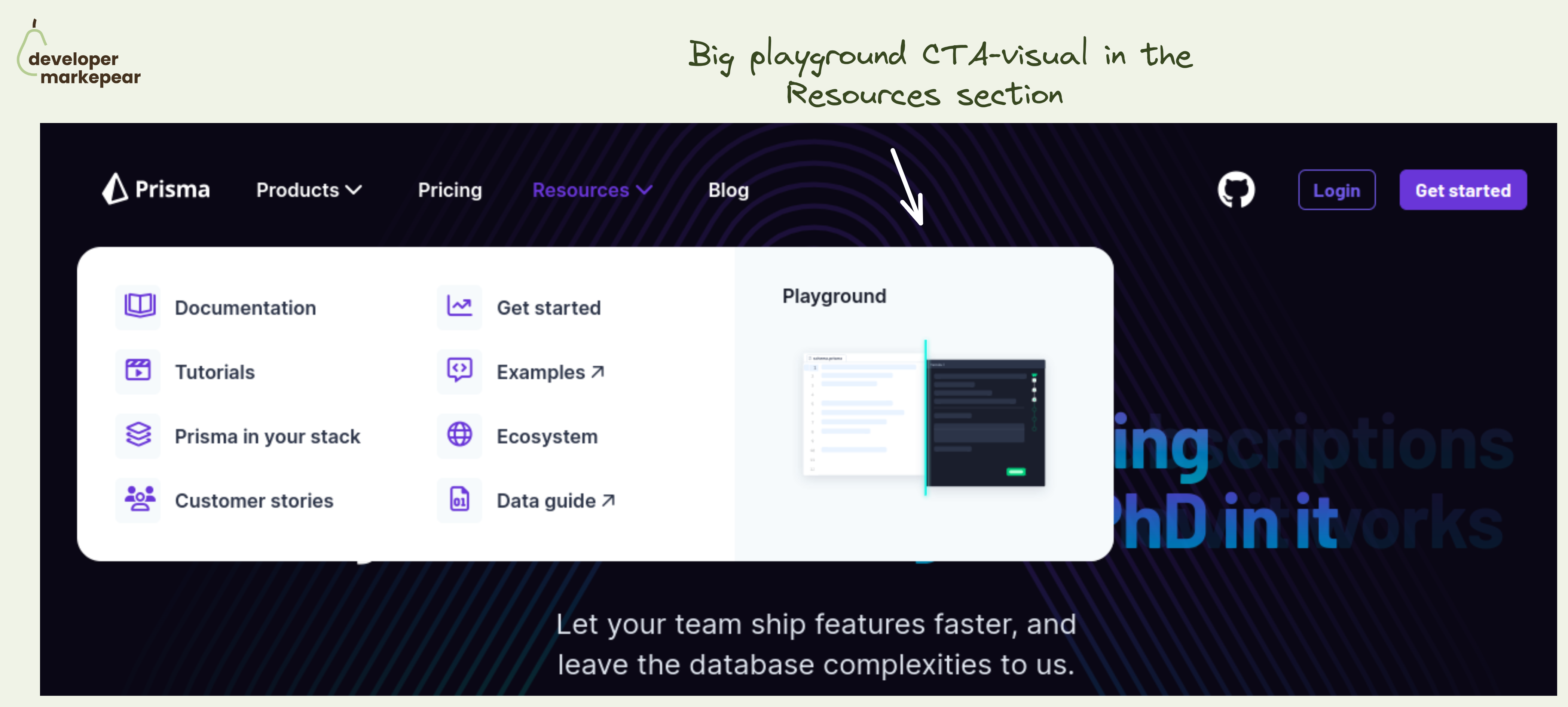
Simple yet powerful CTA in the navbar resources section.
The resources section in the navbar is mostly navigational. Well, the entire navbar is ;)
But you always have that one action that is more impactful than others.
💚 And I think that a Plauground is a great option. You get people to see how your product works. You let people play with it and see for themselves.
Not many next actions can be as impactful as getting people to experience the product.
Especially if you are a heavier infra tool that people cannot really test out in that first session. I mean, you won't really create a realistic example of your core database in 15 minutes to see how that new tool that you just saw works.
🔥 Making this CTA "big and shiny" and showing a glimpse of what will happen after clicking is great too.
🤔 2 changes I'd test out:
But the core idea behind making the playground your core navbar resource section CTA is just great.

That CTA.
You go straight for the install/download.
I don't know if you can go more developer-focused than that.
It sets the tone for the entire homepage.
And let's be honest (almost) nobody actually clicks that "Sign up" button in the hero section.
There are a few developer experience gems here:
Also, their design is super clean, non-invasive, and simple which makes for easy content consumption and more developer love.

Interesting dev blog CTA idea from V7.
CTAs in technical articles is a tricky subject:
I like how V7 approached it here:
What I'd change/test is making this CTA not a generic value prop but something closely connected to the rest of the article.

Funny dev newsletter CTA. From shiftmag .dev by Infobip.
It starts with a chuckle-worthy:
"Sarcastic headline, but funny enough for engineers to sign up"
Then they follow up by disarming the "is that spam" and building more rapport with:
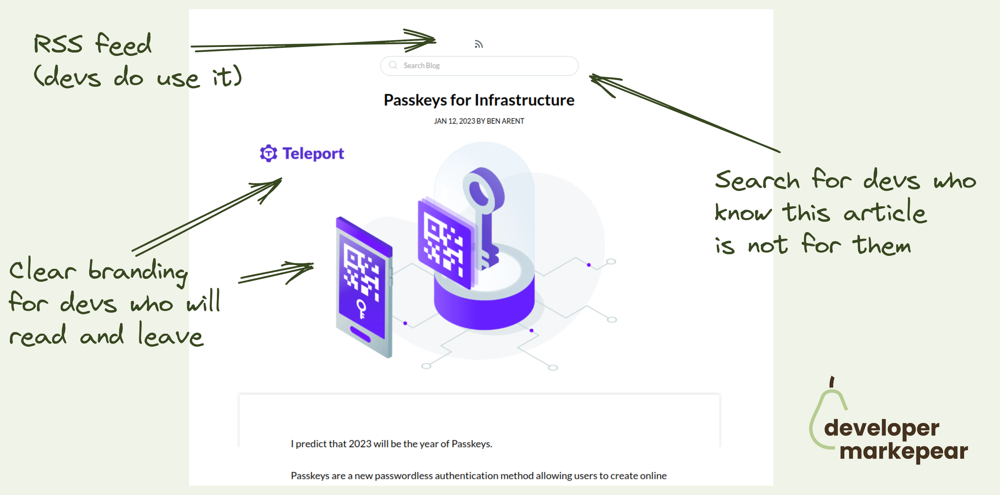
They end with an alternative call to action. RSS feed.
Most newsletters don't do RSS.
But for many devs RSS feed is the preferred content subscription.
Great job!
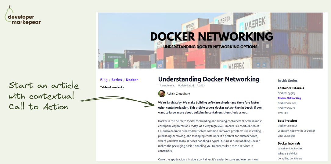
Need one more call to action idea for your dev tool blog?
How about starting an article with it?
Sounds weird but if done right it can work. Even with devs (or maybe especially with devs).
Earthly did and they are known for great dev-focused content.
Ok, so how does it work?
You start your article with a contextual call to action where you explain:
And then you let people read.
Those who find the topic important will remember you and/or maybe click out to see more.
I like it. It's explicit, transparent, and actually noninvasive.
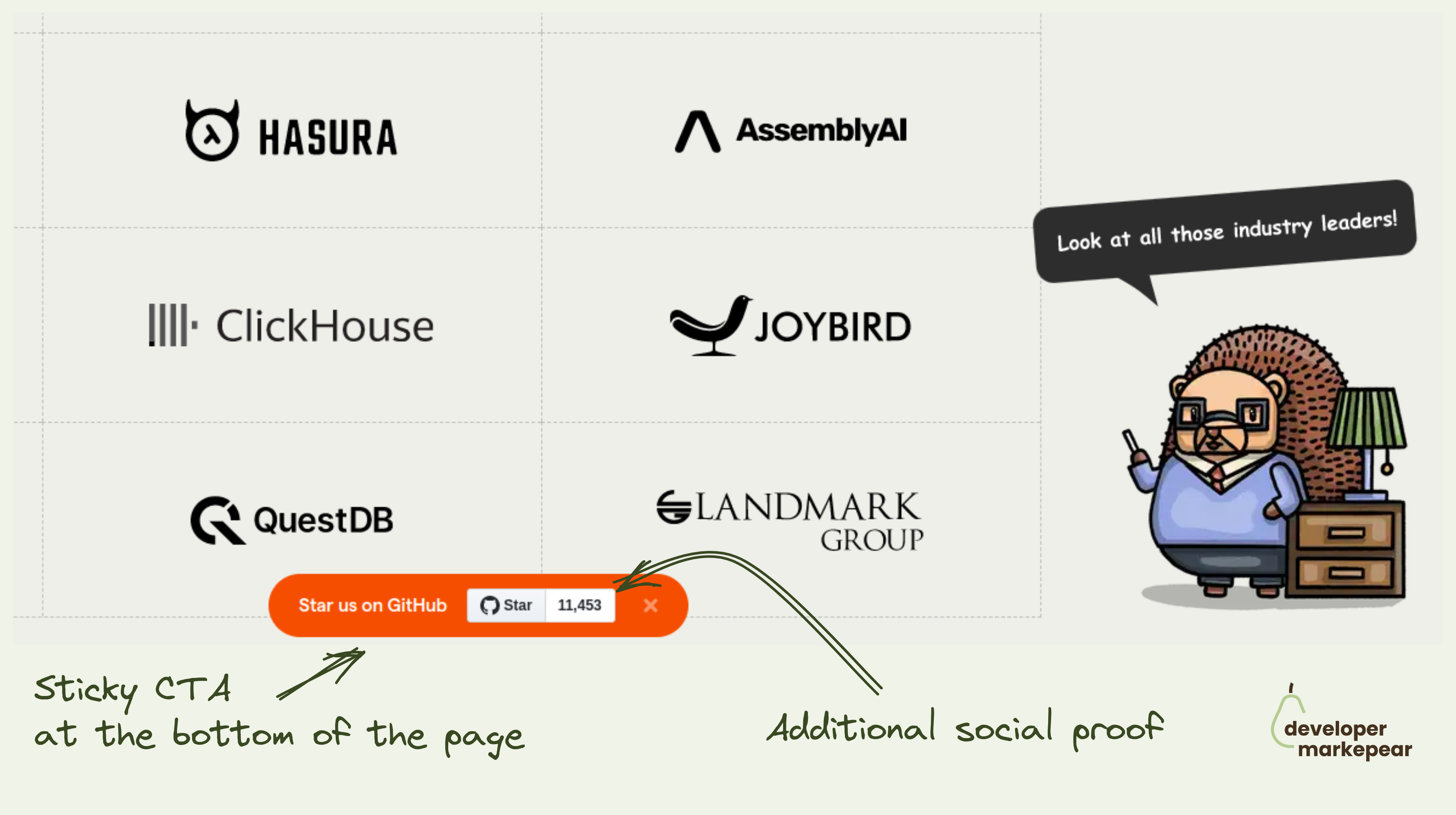
OK, the best way of getting GitHub stars is by creating a project that solves real developer problems well.
I assume you have done that already and the metric that people love to hate ⭐ is growing organically.
What do you do now?
I mean you got to ask people in one way or another.
Many companies put it in their navbars or hello bars.
Posthog adds a sticky banner at the bottom of the page that follows you as you scroll.
It also shows a start count which at their size (11k + stars) acts as social proof.
You can close it and the next time you visit the page it will be off not to push too much.
I like the concept makes sense to test it out this way imho.
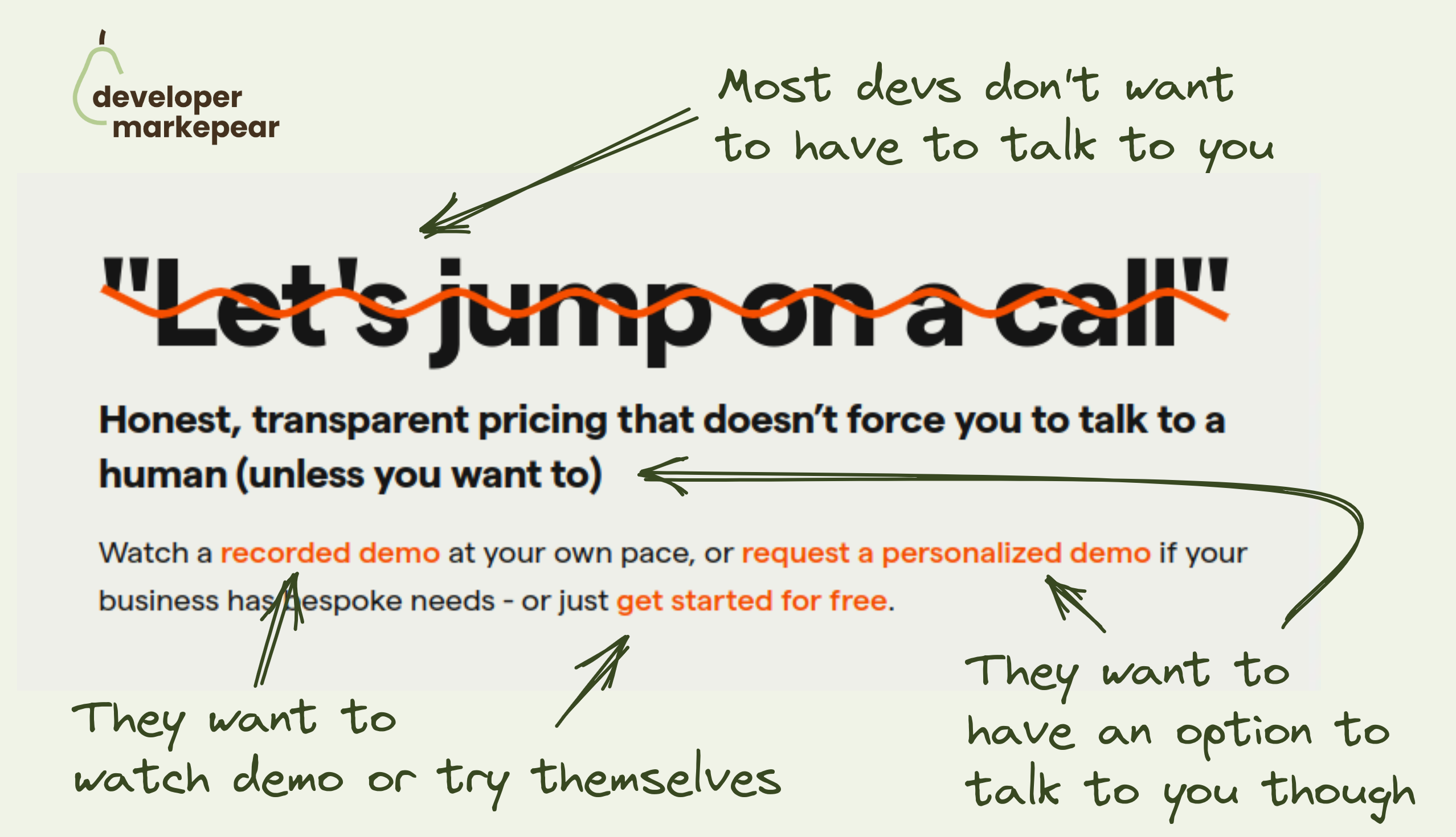
Most devs want to explore products themselves.
They want to read the docs, see examples, play with the product, or watch a video.
They don't want to hop on a demo call, especially early on in the evaluation process.
And they definitely don't want to sit through the demo to learn what your pricing is.
But there will be moments when they will want to talk to you. They will raise their hands and let you know then.
Posthog speaks to this reality with this copy beautifully:
This is very developer-focused approach and I love it.
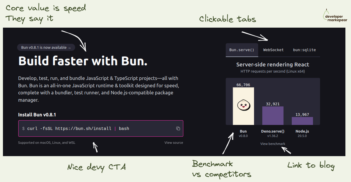
If your dev tool's USP is that it is faster -> Show it in the header
I like how folks from Bun focus on the fact that they are a faster library.
They show the benchmark as the key visual on the homepage header.
I love it.
If you think about it how else do you really want to show that you are faster?
This is believable, especially with a link to the benchmark so that I can dig deeper.
They show competitors, they don't pretend they don't exist.
And they talk about being faster left right and center.
I mean, they drive this "we are faster" home for me.
If that was important to me, I'd check it out.
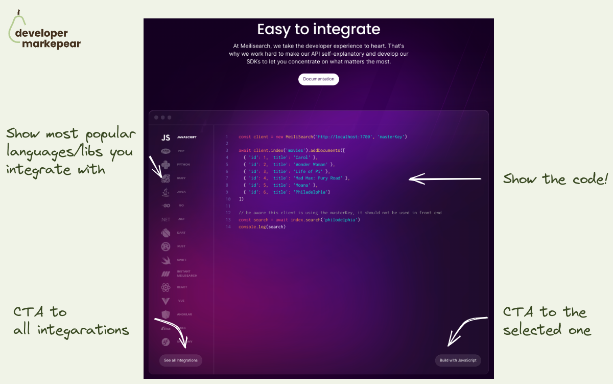
How to show integrations on your dev tool homepage?
Every dev tool needs to integrate with other libraries in the space.
And you want to show how well integrated with the ecosystem you are.
But you ctually want to do a bit more than that.
You want devs to see how easy / flexible / clean it would be for them to use it.
That is why instead of showing just logos from your ecosystem it is good to show the code too.
Meilisearch does that beautifully:
I am sure this is getting more clicks than just a list of logos.

Beautiful mockery of classic conversion tactics from PostHog website.
So what do we have here:
I have to admit I chuckled ;)
And I bet many devs who don't think of marketing very highly chucked too.
That builds rapport. (hopefully) makes you one of the tribe rather than another faceless corpo.
BTW, they used it as a bottom of the homepage call to action.
I like it.
Most of the people who scrolled there are not going to buy anyway.
But they may share the website with someone who will.
A classic dev tool blog call to action that is somewhat underused these days.
Was going through Martin Gontovnikas blog and found a post from a couple of years back.
He called this "Aside CTA" and the idea is this:
Why this can work well with devs is:
Definitely a classic that is worth trying.

This is one of the more devy blog designs I've seen in a while.
It has this docs-like feel.
But is just a bit more fun and loose than most docs would allow.
Here is what I like:
And if your posts are code-heavy, then a docs-like experience is where you want to be anyway.
But you can spice it up with things that wouldn't fit the docs.
Like a Twitter/X embed or a meme.