
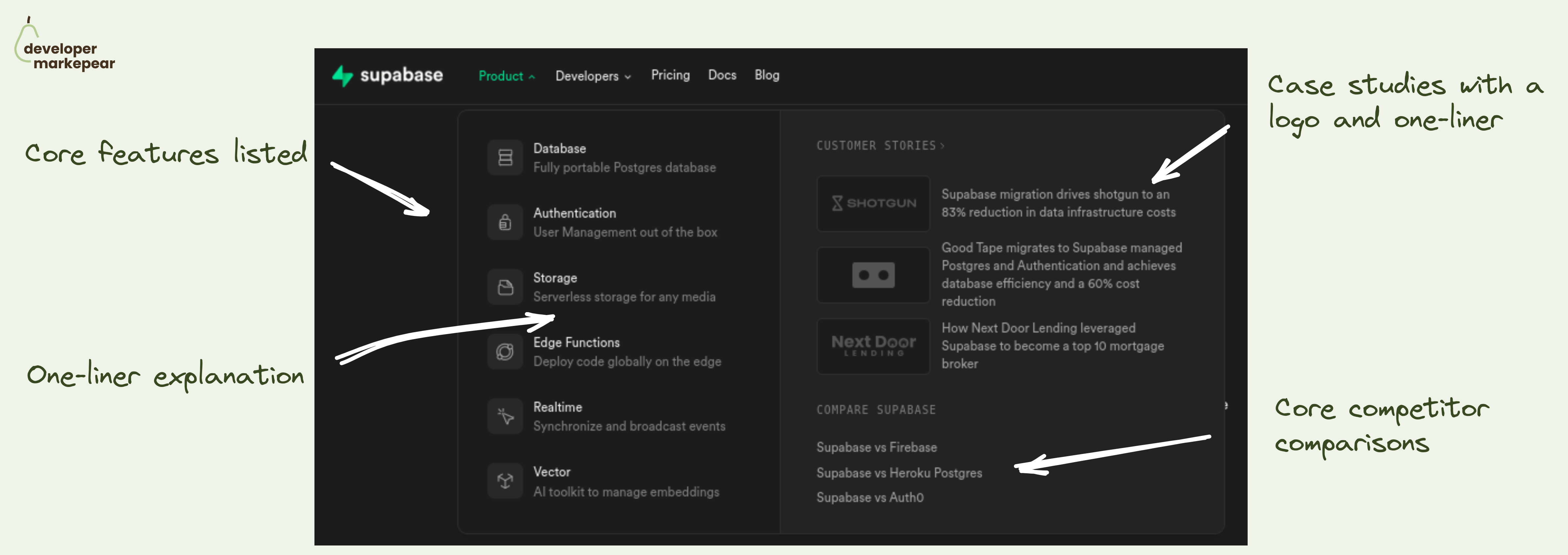
Really good product navbar tab from Supabase.
The product tab in your navbar is likely the most visited one on your site.
And there are a million ways of organizing information in there.
But ultimately, you want to help people understand what this product is about at a glance.
Even before they click. Even if they never click.
And how do you explain your product to devs?
By answering common questions:
Supabase does it really nicely:
Very solid pattern imho.
What I'd improve:
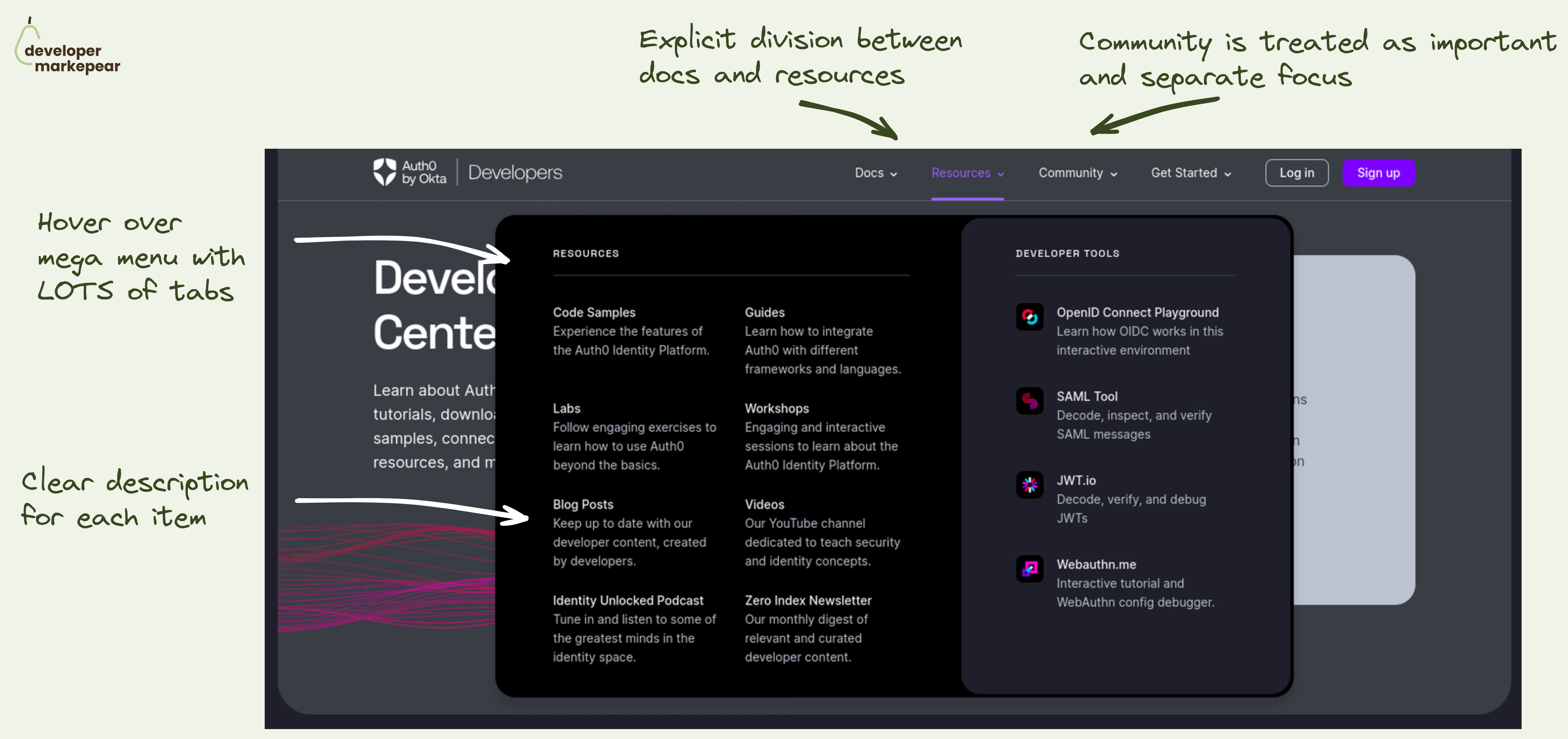
Navbar is a hugely important conversion lever on the dev-facing website. I saw it move the needle by x times in some cases/conversion events.
So, what does a good one look like?
Auth0 did a great job on their developer portal. But the learnings can be applied to your marketing website too.
What I like:
That makes it easy for devs to explore. Without having to click out to see what each tab/item means. And when devs know what you mean they are more likely to actually click out. And convert.

Linked GitHub logo in the navbar
Adding CTA to your GitHub repo makes your company look more dev-friendly.
If you have a ton of stars I'd show those as well to play that social proof card.
But even without it, I think it's a good way to get more traffic to your repo and get those stars :)
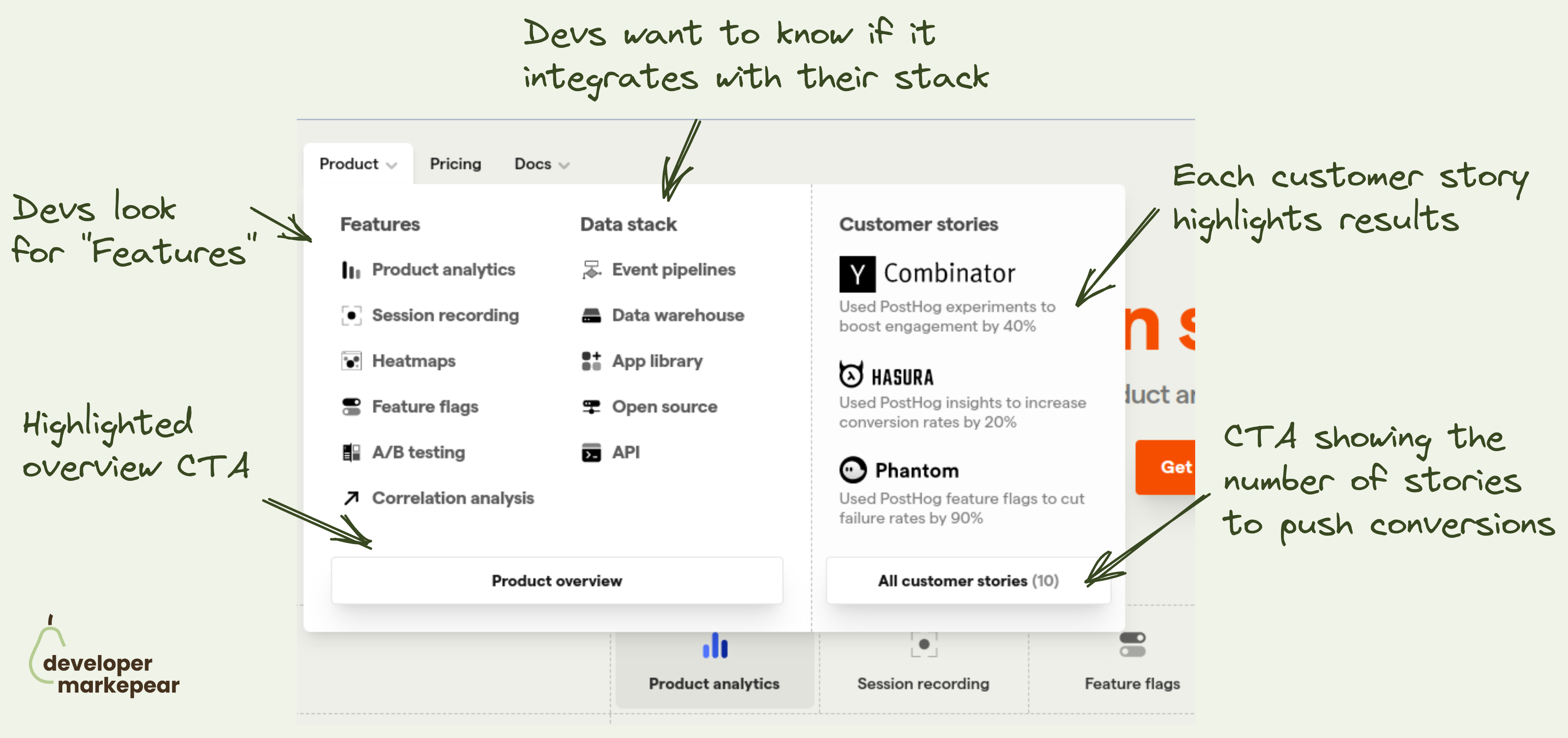
How to design the navbar product tab? This is what @PostHog does 👇
Figuring out what to put in the navbar is tricky:
The "Product" tab is especially tricky.
It can get overloaded with a ton of content.
I like how Posthog approached it:
I like it.

A nice example of making navbar more developer-focused.
Ask for GitHub stars with a link to the repository.
It does three things:
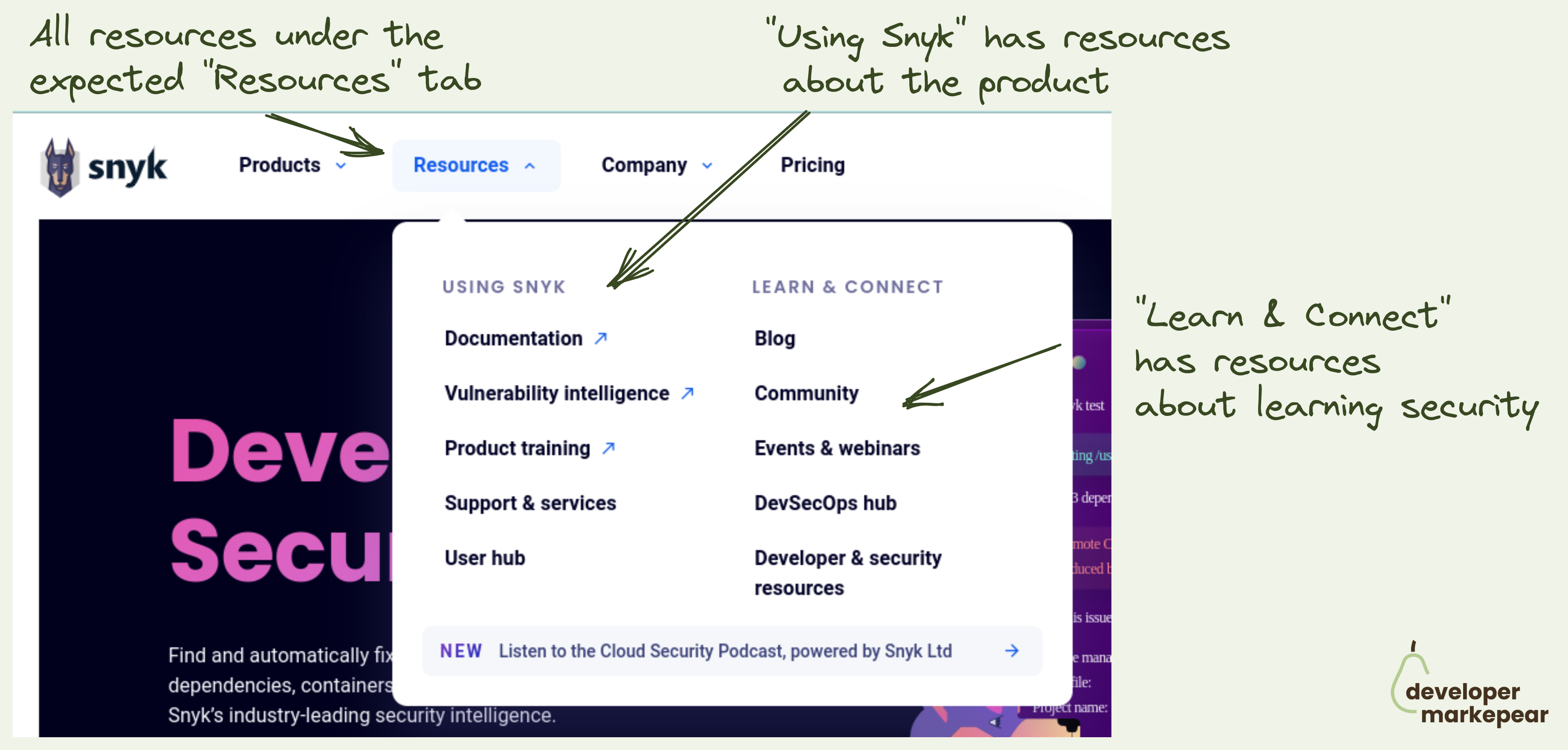
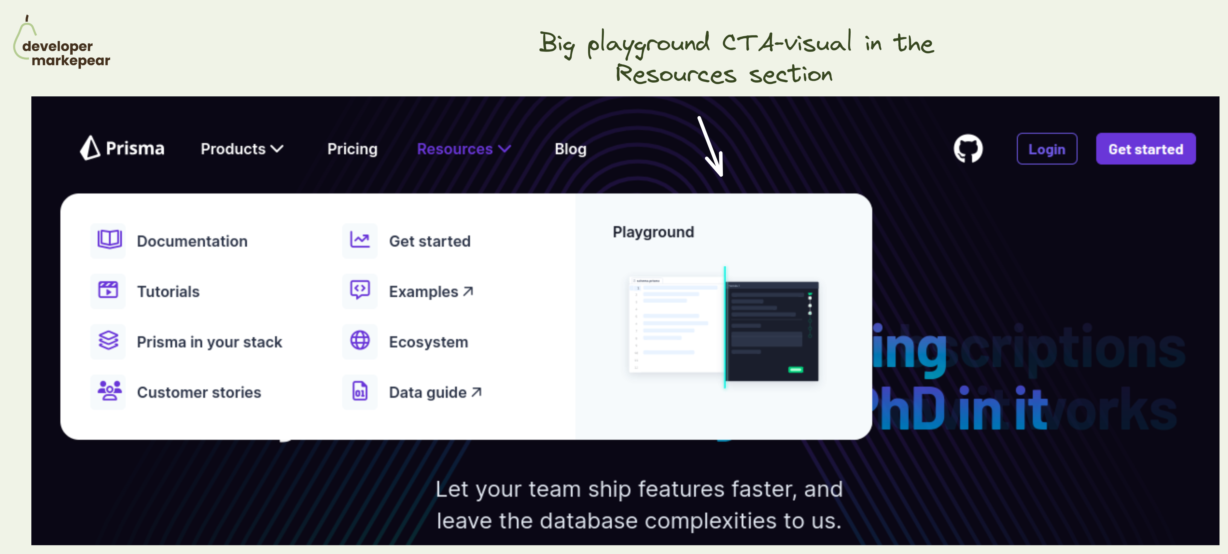
The "Resources" tab is the most loved and hated tab for developer marketers.
Ok so the common problem is that you have lots of different resources:
You want to showcase them in the navbar but where do you put them?
Under product? Company? Docs?
How to make sure that people don't go to your blog to read about your product just to find out that you talk about the industry problems there?
Enter the "Resources" tab. The "Miscellaneous" of the navbar world.
And typically it is just crammed with all stuff that doesn't fit anywhere. Just like any respectable misc folder would.
How do you deal with that?
Snyk approached it in a clear and logical way:
I love this (and already stole the idea for our site).
Simple yet powerful CTA in the navbar resources section.
The resources section in the navbar is mostly navigational. Well, the entire navbar is ;)
But you always have that one action that is more impactful than others.
💚 And I think that a Plauground is a great option. You get people to see how your product works. You let people play with it and see for themselves.
Not many next actions can be as impactful as getting people to experience the product.
Especially if you are a heavier infra tool that people cannot really test out in that first session. I mean, you won't really create a realistic example of your core database in 15 minutes to see how that new tool that you just saw works.
🔥 Making this CTA "big and shiny" and showing a glimpse of what will happen after clicking is great too.
🤔 2 changes I'd test out:
But the core idea behind making the playground your core navbar resource section CTA is just great.