Snyk navbar resources tab design

Developer Markepear testimonials

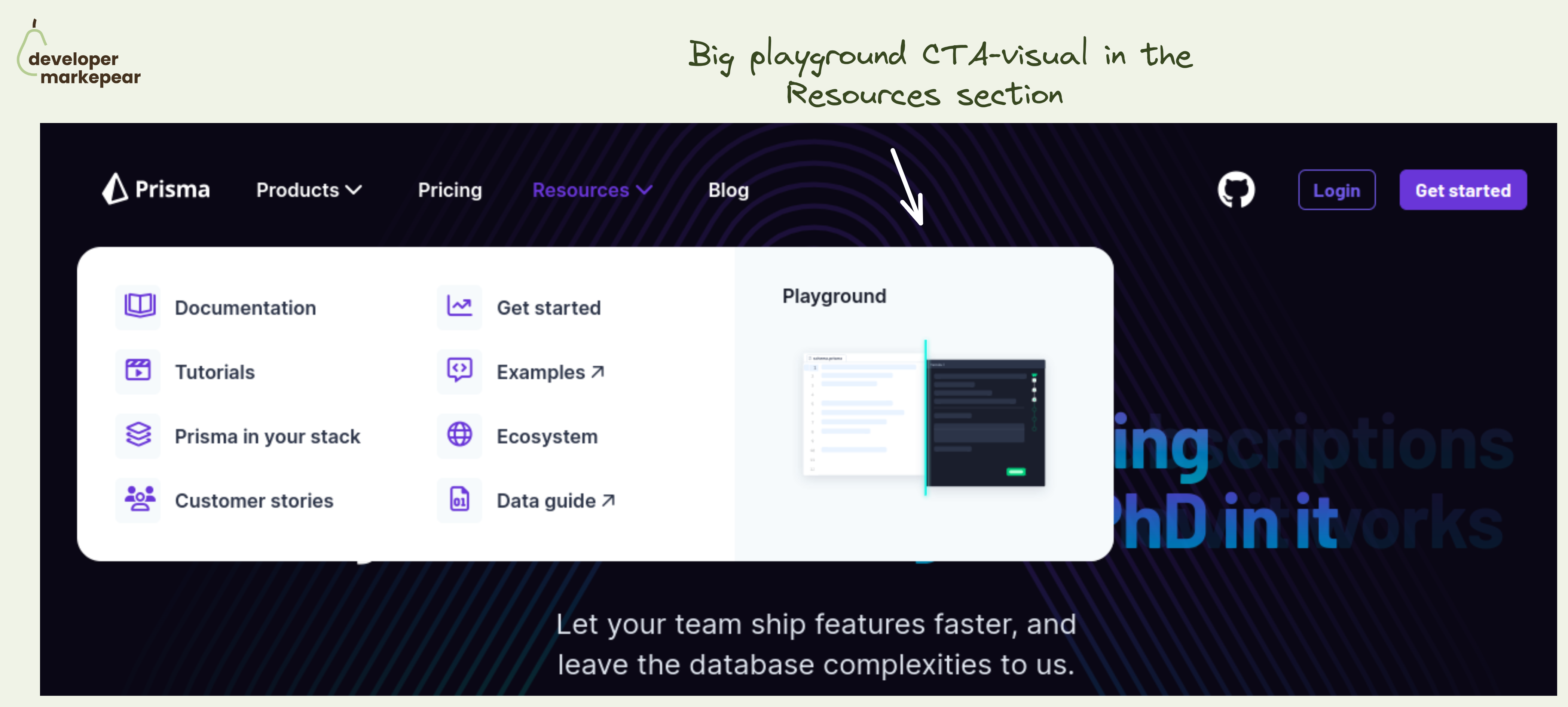
The "Resources" tab is the most loved and hated tab for developer marketers.

Ok so the common problem is that you have lots of different resources:

  • docs
  • product videos
  • meetup videos
  • recorded webinars
  • learning center guides
  • blog articles that don't talk about your product
  • and so much more stuff

You want to showcase them in the navbar but where do you put them?

Under product? Company? Docs?

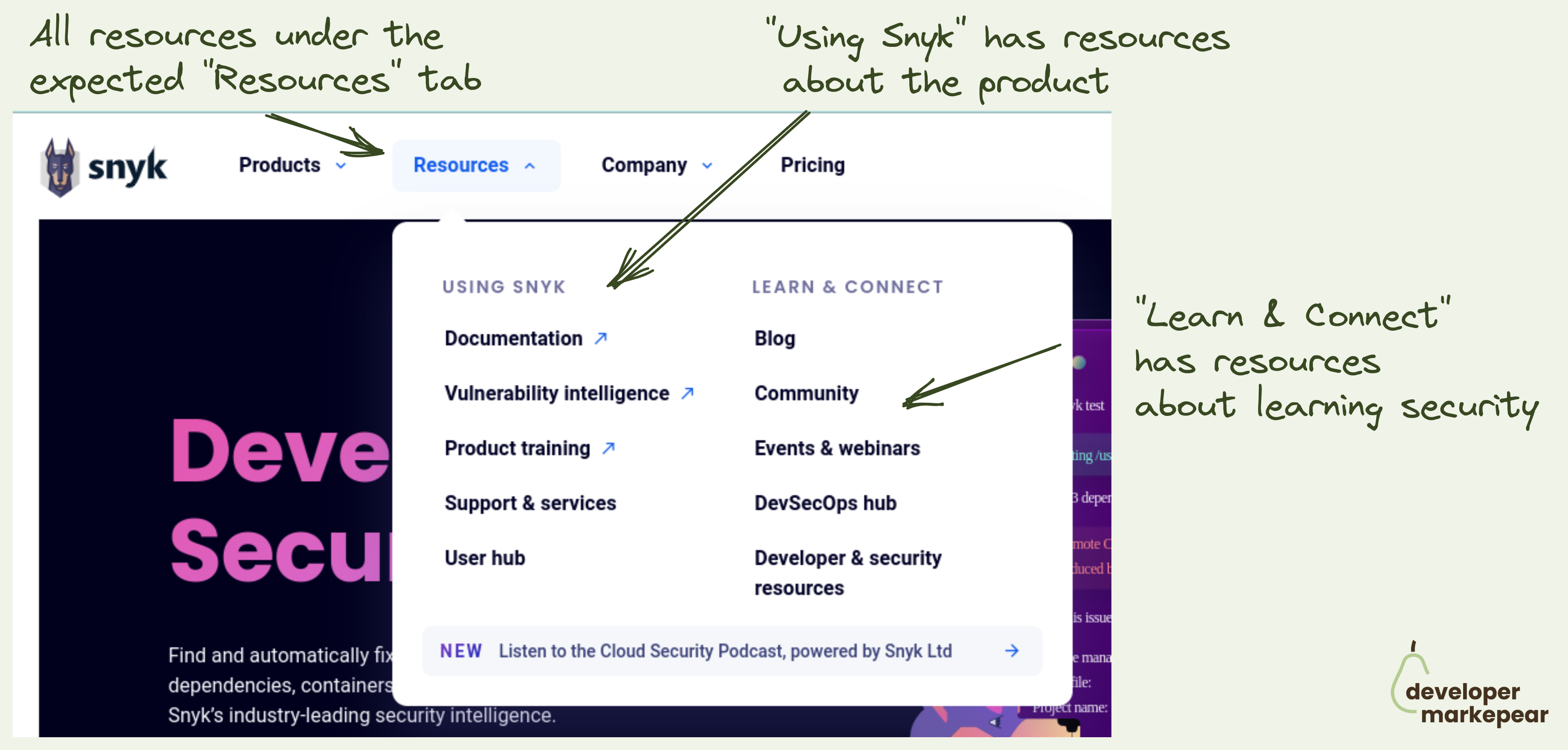
How to make sure that people don't go to your blog to read about your product just to find out that you talk about the industry problems there?

Enter the "Resources" tab. The "Miscellaneous" of the navbar world.

And typically it is just crammed with all stuff that doesn't fit anywhere. Just like any respectable misc folder would.  

How do you deal with that?

Snyk approached it in a clear and logical way:

  • Add sub-navigation
  • Make it clear to devs which parts are about the product and which ones are not
  • They use "Using Snyk" and "Learn & Connect" that could be extended to "Using {Product} and "Learning {Category/Problem}"

I love this (and already stole the idea for our site).

  • See Snyk website
Browse 100+ examples like this ->
navbar
landing page
call to action
product tour

Playground CTA in the navbar resources section from Prisma

developer experience
landing page

Auth0 developer portal Getting started cross-section

developer experience
blog
call to action

Article header from Teleport

copy

"CI" vs "Build" A/B test from Earthly

copy
developer experience
landing page
hero section

Header design from Alpaca

copy
blog
call to action

ShiftMag Newsletter CTA copy

developer experience
landing page

How it works crossover from Mux

developer experience
github
navbar

Subtle GitHub CTA in navbar from Aporia

copy
call to action
product led growth
landing page

Posthog "do not talk to us" copy

ads
reddit
copy
social posts

Basic Reddit Ad from Kubero