

Testimonial ads are a format that helps you move people from "I know what you are doing" to "I trust you enough to do business with you".
Video testimonials are even better.
You see the person who has a similar role that you do saying things about the product you are considering.
CircleCI did a solid job here.
And so if you are running remarketing to people who went to pricing but didn't sign up, or signed up to a free trial but haven't converted yet this is a good format candidate.

It's a nice template for ads on socials.
So you have:
Ideally, I'd make it dark to stand out in the feed and make the CTA about that value as well.
But still, great ad imho.

Understand who is reading. Add social proof that speaks to them.
Social proof is about showing people/companies who are similar to the reader that they got success with the tool.
Company logos can be good if your reader knows and likes those companies.
But if those are random companies, I am not sure how much value does it bring.
Devs care what other devs who use your product have to say about it.
That's why I like testimonials.
Not the crafted, clean ones with features and values.
But the real stuff. Real devs sharing real stories.
Bonus points for "Okay, I get the point" button copy.
It changes from "Show more" when you click.
Nice!

A great example of a quote-style ad.
I like it because:
Great stuff.

Simple and powerful messaging.
They say what they do. Zero fluff.
They make it easy for devs by explaining how they are different than (obvious) competitors.
They add a little developer-focused social proof.
There are many things that I like about it.
Overall with very little effort, I understand what it is, and what it does.
And I can go and dig deeper for myself or spread the word with my circles.
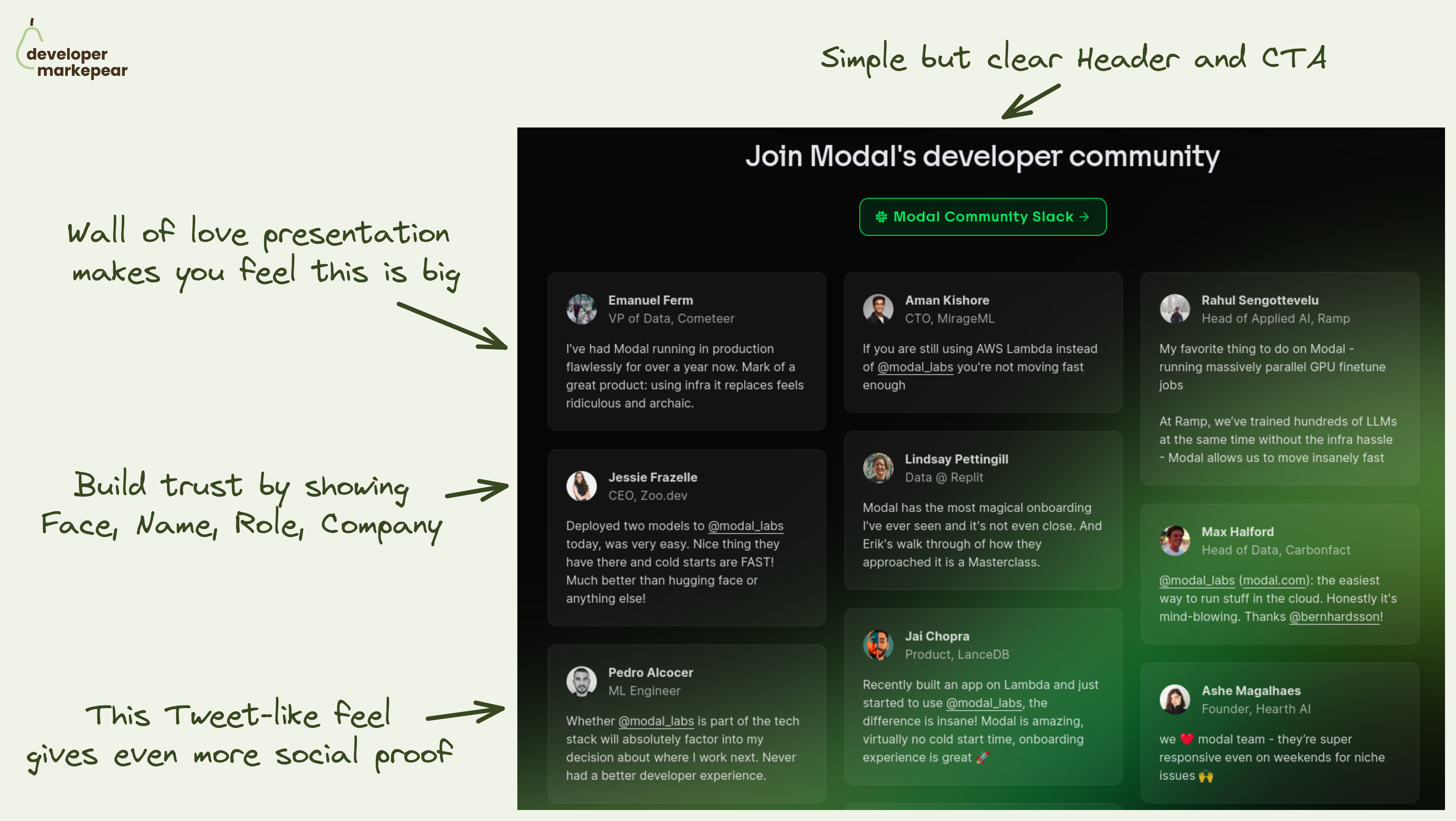
The main message you want to land on your homepage community section is:
"We have a big community of devs who love using the product"
🚧 That helps you tackle obstacles your dev reader has:
💚 Modal solves it beautifully by going simple but smart:
It lands the message that this section should land for sure. I really like it.

This is one of the more devy blog designs I've seen in a while.
It has this docs-like feel.
But is just a bit more fun and loose than most docs would allow.
Here is what I like:
And if your posts are code-heavy, then a docs-like experience is where you want to be anyway.
But you can spice it up with things that wouldn't fit the docs.
Like a Twitter/X embed or a meme.

Super short dev tool case study on a single viewport.
Many case studies follow a Hero -> Problem -> Solution -> Results framework.
Many try and do it on a one-pager.
But what @Resend did is next level and I like it.
Especially with devs, you want to be technical and succinct.
And Resend took all the possible fluff out of it.
I'd like to have some before or after probably or a stronger results (or pain) ) focused headline.
But I think this is great actually.
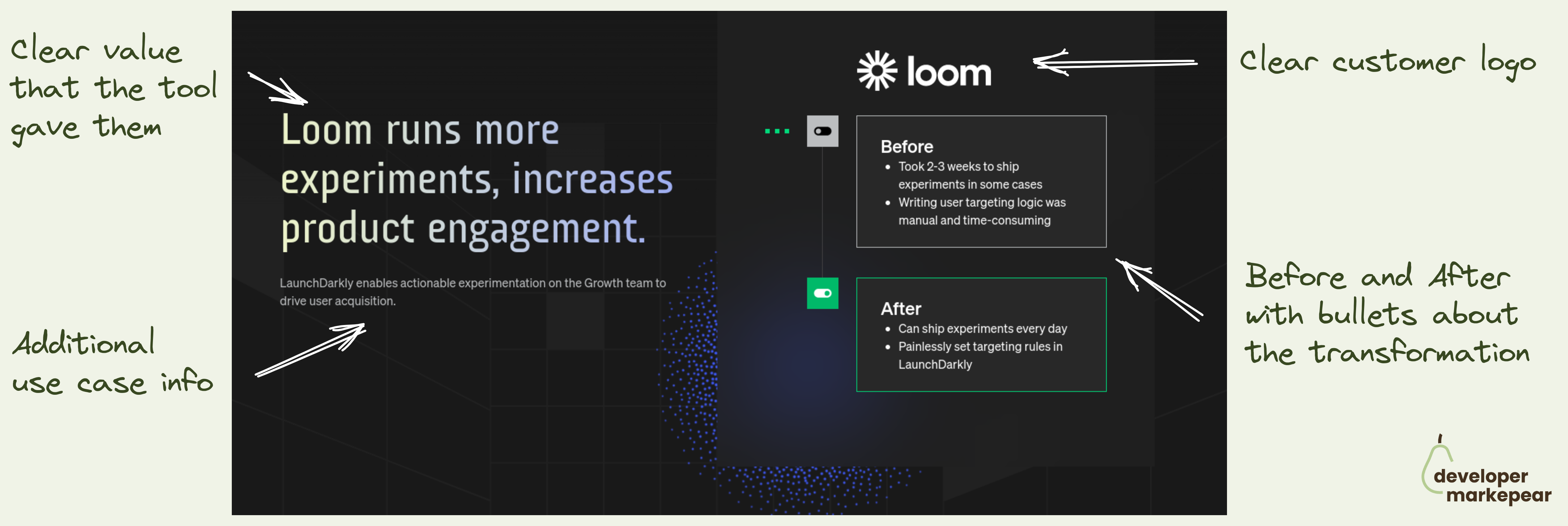
Looking for a good dev-focused case study format?
People tell you to follow a classic Hero > Problem > Solution > Results.
They tell you to show numbers, talk value, etc.
And it is true. Great format.
But packaging this for devs is hard.
For example, putting numbers in there, and framing it in a "save 28min every week" is a recipe for losing trust with that dev reader.
That is if you can even get those numbers from your customers.
I like how @LaunchDarkly solves it.
Hero section:
Case study body:
They keep the content down to earth and devy but still frame it in a value-focused way.
I like that that they speak in the currency that devs care about.
Wasted time.
Before: "Took 2-3 weeks to ship"
After: "Can ship experiments every day"
The cool thing is you could actually use this hero section format and then have a more technical user story below. By doing that you could speak to the why and how.
That depends on your target reader for this page of course.
Anyhow, I do like this format and I am planning to take it for a spin.

How to bring attention and trust to a feature section?
Add a testimonial.
Ideally, it should talk about that feature to make your message even stronger.
I like how Appsmith made it animated and it just makes you look.
And you read the testimonial and look at the feature above it.
Good stuff.
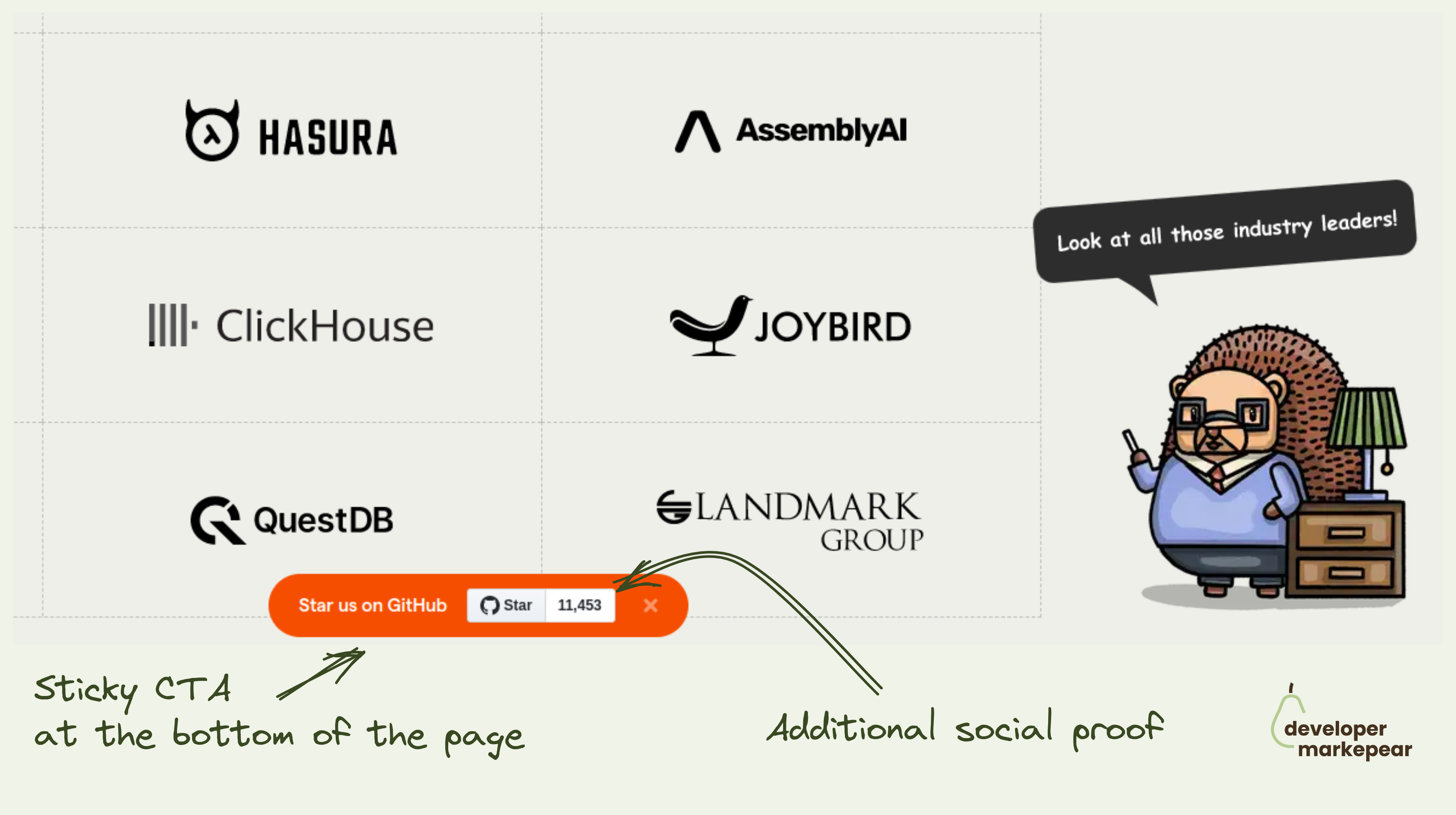
OK, the best way of getting GitHub stars is by creating a project that solves real developer problems well.
I assume you have done that already and the metric that people love to hate ⭐ is growing organically.
What do you do now?
I mean you got to ask people in one way or another.
Many companies put it in their navbars or hello bars.
Posthog adds a sticky banner at the bottom of the page that follows you as you scroll.
It also shows a start count which at their size (11k + stars) acts as social proof.
You can close it and the next time you visit the page it will be off not to push too much.
I like the concept makes sense to test it out this way imho.

Classic remarketing ad. But things are classic because they work 👇
Youtube remarketing is one of the most popular ways to stay top of mind with devs who visit your site.
Lots of devs spend time on Youtube so it is a solid match.
But, "buy now" style ads rarely work because if they wanted to try/buy they would have already.
They need something more.
That "more" is often trust.
They simply don't trust you, your product, and your company.
They don't think you are the real deal and will solve their problems.
But you can build that trust. And to do that you can use testimonial-style ads:
That is it.
Show enough of these and % of people will trust you and convert.