Docs header diagram from Hopsworks

Developer Markepear testimonials

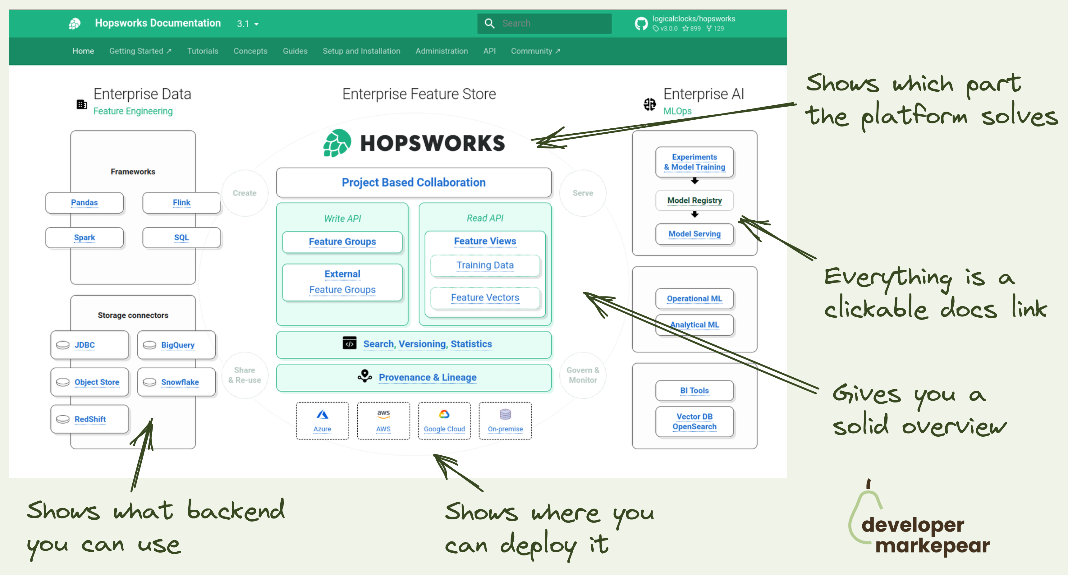
A docs header worth a thousand words.

For a dev platform or infrastructure tool it is hard to explain where you fit, what you do quickly, and how you connect to existing components quickly.  

Hopsworks docs team does a great job here.

So instead of using words, they use a diagram:

  • You get a solid overview of where your tool/platform fits larger context
  • It shows you which part of the workflow/infra the platform solves
  • Every part of the diagram is a clickable docs link
  • Shows where you can deploy it
  • Shows what backend you can use.

All of that in a single diagram.

Now that is a dev-focused header visual.

  • See Hopsworks docs
Browse 100+ examples like this ->
developer experience
copy
social proof

Case study format from LaunchDarkly

developer experience
github
navbar

Subtle GitHub CTA in navbar from Aporia

social proof
developer experience

Case study in a single view from Resend

developer experience
copy
blog
call to action

Developer-focused blog CTA from Snyk

social proof
landing page
developer experience

Showing testimonials related to features from Appsmith

developer experience
github
call to action
social proof

Sticky "star us on GitHub" from Posthog

developer experience
docs

Devex in ReactJS documentation

landing page
developer experience
call to action

Benchmark section on homepage from Astro

campaigns
copy
developer experience
ads
reddit

"We blew our budget on X" format

developer experience
social proof
landing page

Social proof from TailwindCSS homepage