

Classic Auth0 campaign coming back in 2023.
I love how simple and powerful this message is.
You can outsource a dull but important problem of authentications to them.
That is all the say.
But it is enough to get you interested and understand what they do.

Simple and powerful messaging.
They say what they do. Zero fluff.
They make it easy for devs by explaining how they are different than (obvious) competitors.
They add a little developer-focused social proof.
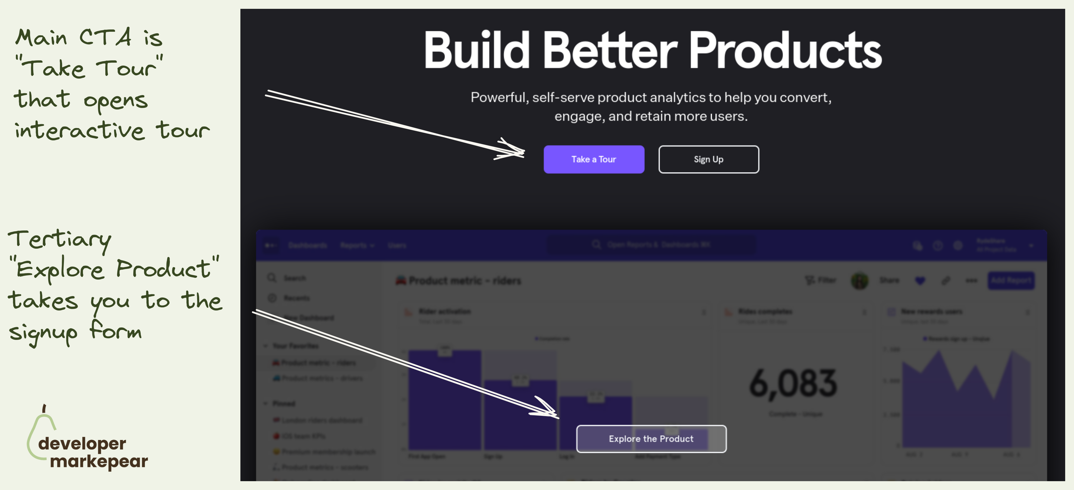
Mixpanel primary CTA is to take an interactive tour.
They take you to a 30min video + a guided UI tour.
Not a signup.
That is because with products that have long time to value (like analytics, observability etc) dev will not see value in the first session.
I mean to really see value you need to see real data, real use cases. And if you were to actually test it would take weeks.
That is why many companies do demos. But demos have their own problems (and most are bad).
Interactive tools make it possible for me to explore the value without talking to anyone.
I love this option.
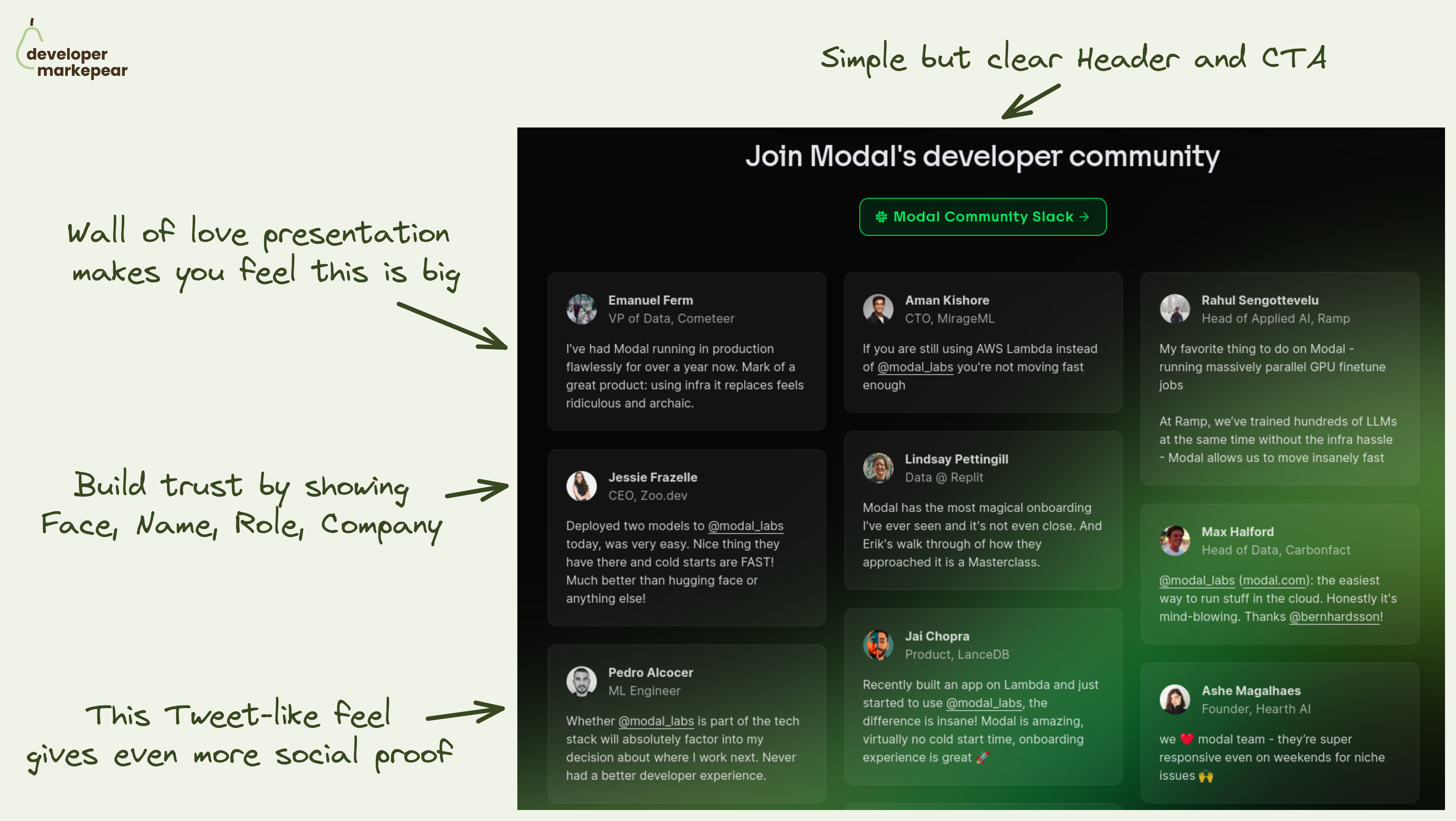
The main message you want to land on your homepage community section is:
"We have a big community of devs who love using the product"
🚧 That helps you tackle obstacles your dev reader has:
💚 Modal solves it beautifully by going simple but smart:
It lands the message that this section should land for sure. I really like it.

Vs pages are a classic SaaS marketing.
But I like how Ably adjusts them to the developer audience:

How easy it is to get started is a big conversion factor for any dev tool.
Devs want to test things out and if it is hard to do they will be gone testing a competitor that made it easy.
And so a good how-to section on your homepage can make a big difference in getting devs to that first experience.
Appsmith does it beautifully with their 1-2-3 How-to section:
It is so engaging and just beautifully designed. And the CTA to additional resources like integrations, widget library, and docs make the message land. I do believe it is easy to set this up.
Great pattern to copy-paste imho.
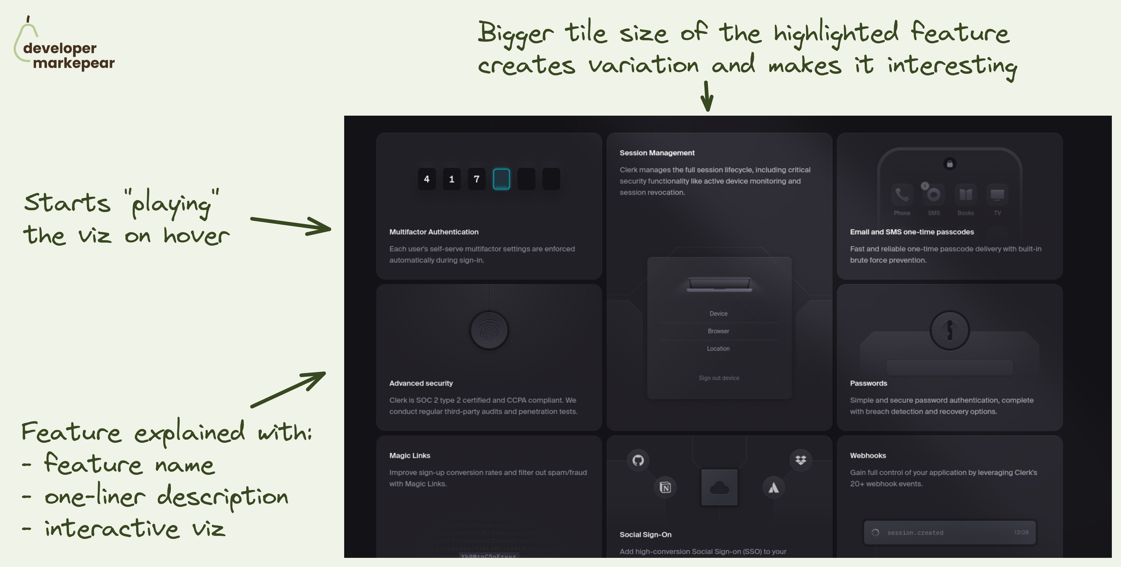
How to present many features at once?
Sometimes your dev tool has many features/products that you want to show.
❌ Showing all of them as separate sections doesn't work with more than 3. It just gets too long very quickly.
✅ You can go with the tabs pattern where each tab has copy+visual for a feature.
💡 But there is another option that makes a ton of sense when you have many features to show.
Interactive tiles of different sizes.
💚 I like the implementation of that pattern coming from Clerk:
That pattern can work really well on blogs or learning centers too but I think we're going to see more of it on dev tool websites.

In a mature category, it is safe to assume that people know about other tools.
Especially devs.
I love how Axiom owns its unique selling point and how it stands out from the competition.
Takes guts but I love it.

Streamlit has an amazing explainer.
They show how to go from:
In 42 seconds.
No audio, just code and a simplified result window.
Amazing stuff.
There are many things that I like about it.
Overall with very little effort, I understand what it is, and what it does.
And I can go and dig deeper for myself or spread the word with my circles.
I like this idea of showing how your dev tool works.
With developers, you almost have to explain how it works on your homepage.
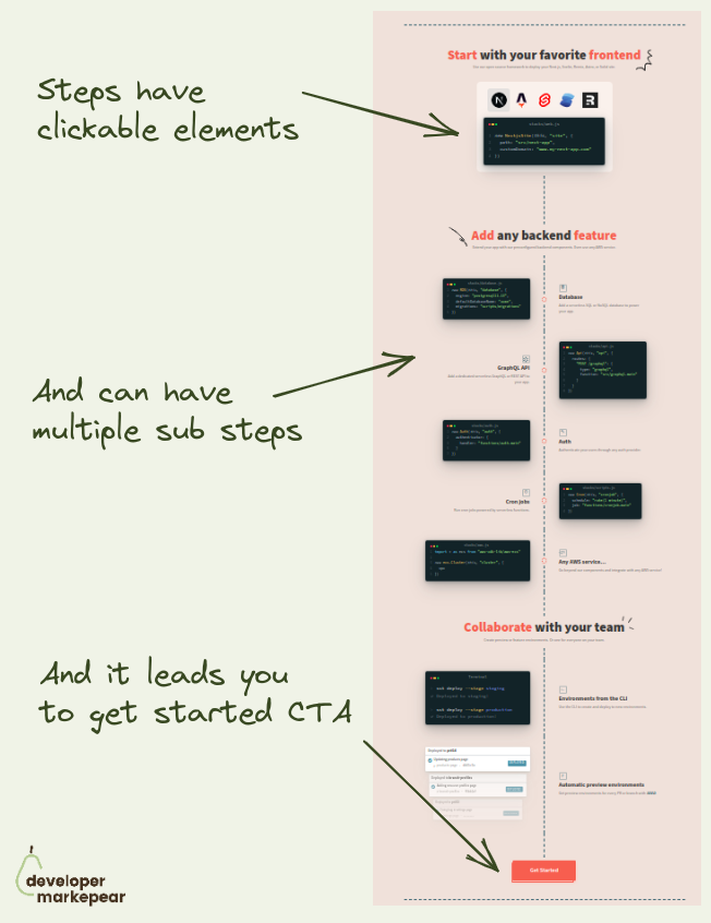
Many products do some version of Step 1 -> Step 2 -> Step 3 -> Success.
I really like how @SST approached it with a timeline.
I find it more engaging than those disconnected steps.
And when I follow this journey the final and logical step is to try it out. Get started.

How to bring attention and trust to a feature section?
Add a testimonial.
Ideally, it should talk about that feature to make your message even stronger.
I like how Appsmith made it animated and it just makes you look.
And you read the testimonial and look at the feature above it.
Good stuff.
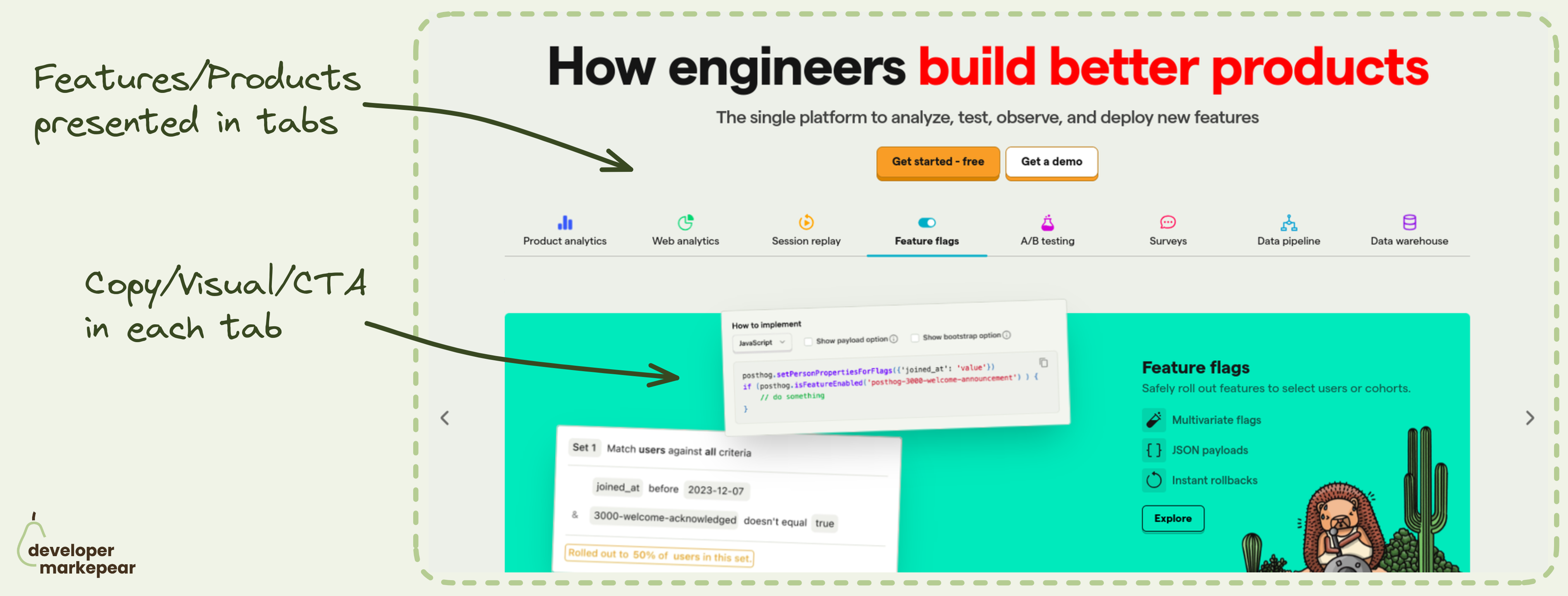
Which feature/product to show in the header?
How about all?
Many dev tool products are feature-rich. And you want to show those awesome features.
But it is easy to overwhelm the reader when showing so much info.
That is why I really like the header tabs pattern that @PostHog uses:
This pattern is especially powerful when you want to communicate completeness.
Posthog definitely wants to do that. If you are on that train I'd strongly suggest considering/testing it.
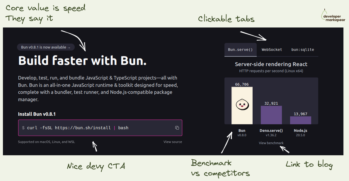
If your dev tool's USP is that it is faster -> Show it in the header
I like how folks from Bun focus on the fact that they are a faster library.
They show the benchmark as the key visual on the homepage header.
I love it.
If you think about it how else do you really want to show that you are faster?
This is believable, especially with a link to the benchmark so that I can dig deeper.
They show competitors, they don't pretend they don't exist.
And they talk about being faster left right and center.
I mean, they drive this "we are faster" home for me.
If that was important to me, I'd check it out.

Action-focused copy is usually better than "sign up".
But sometimes it is hard to find a good copy for this.
Some teams like Vercel or Auth0 do "Start building "
But that doesn't always work.
I really like this "Get API keys" CTA copy.
Now for the Hero section I really like those two CTAs:
Really great job imho.

That CTA.
You go straight for the install/download.
I don't know if you can go more developer-focused than that.
It sets the tone for the entire homepage.
And let's be honest (almost) nobody actually clicks that "Sign up" button in the hero section.

I love the design of this crossover section on the Tailwind homepage.
I see the code and the result next to each other.
I see how I can get that result with code.
It is interactive and catches my attention.
It makes me feel inspired.
Great job Tailwind team!

In dev tools, you really can solve the problem for a narrow market and extend to adjacent markets over time.
Use that -> Snyk did.
Their value proposition stayed pretty much the same for 7 years!
"Find and fix vulnerabilities in open-source software you use."
But the market they served got so much bigger over time:
Again, their core value prop is the same in 2023 as it was in 2016.
But their target market (and revenue share) grew by... a lot ;)
Isn't that just beautiful marketing-wise?
So the takeaway is this:
Start narrow, solve the problem, and extend to other frameworks/languages/tech can still work.

Show how product components fit together.
A good diagram is such a good solution to that.
They use the same colors and eyebrow copy that was used for body sections.
It all clicks now, I get the full picture.

I love that it is static and it blurs everything I don't need to get the concept.
For the dev audience, static graphics, when done well, are better than
Tell me what you do in 1 sec, not 60

Understand who is reading. Add social proof that speaks to them.
Social proof is about showing people/companies who are similar to the reader that they got success with the tool.
Company logos can be good if your reader knows and likes those companies.
But if those are random companies, I am not sure how much value does it bring.
Devs care what other devs who use your product have to say about it.
That's why I like testimonials.
Not the crafted, clean ones with features and values.
But the real stuff. Real devs sharing real stories.
Bonus points for "Okay, I get the point" button copy.
It changes from "Show more" when you click.
Nice!

With infrastructure tools, it is notoriously difficult to show people the value quickly.
To really see it they would need to set up everything at their company infra, create dashboards for their use case, and so on.
A lot of work.
That is why creating a sandbox experience is a good way of giving people a taste.
I like the way Axiom calls it a playground and says "Play with Axiom" and "Launch playground".
This copy is good because:

Sometimes your product just wins on price.
I like how New Relic owns it on this page:
After reading this I'd trust them to give me a solid price estimate and that it will likely be cheaper than Datadog.
Obviously price is not the only reason why we choose tools, but if that was a problem I had with Datadog, they have my attention.

"How fast do you ship?"
Not many dev tools answer that on their homepage. PostHog does.
In a typical (enterprise) sales process, people often ask:
And you show them the roadmap or get someone from the product on the next call.
But I haven't yet seen dev tools talk about it on their homepage.
But why not?
Devs who want to buy self-serve want to know it almost just as much.
After all, they won't be able to twist your arm to build that custom feature cause "we are your biggest client and we need it".
I like it, it builds trust, it shows me you are transparent,
And it shows me that those features I can see on the public roadmap will come true.

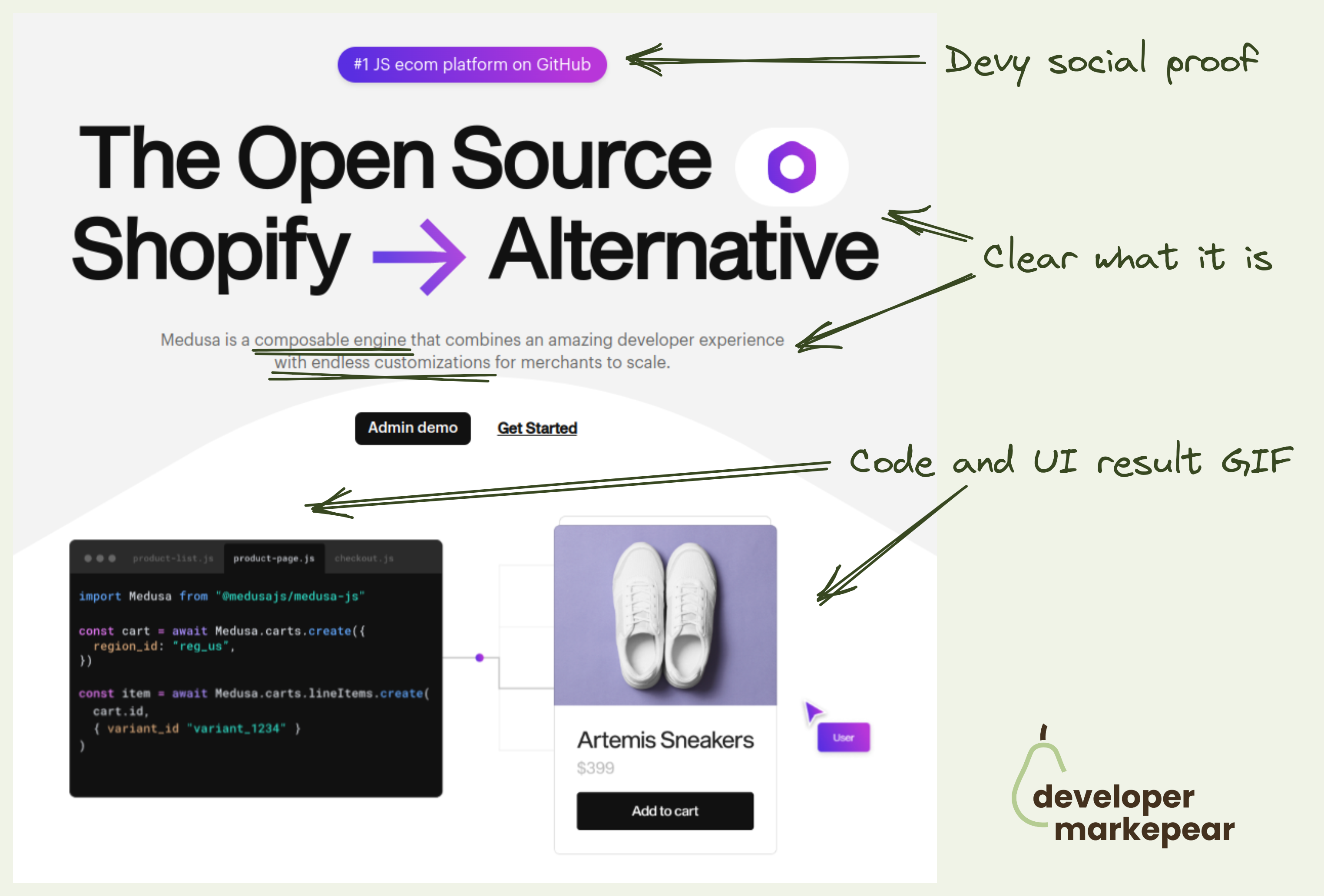
What CTAs should you choose for your open-source project homepage?
Was always wondering what is my default.
There are many options: "See docs", "Get started", "Sign up", "Start X"
But in open-source you want people to start playing with it, install it.
So what should you choose?
Recently came across Astro homepage and loved what they chose.
"Get started"
Install code
Whatever I choose I will actually get my hands dirty.
I think this will be my default from now on.

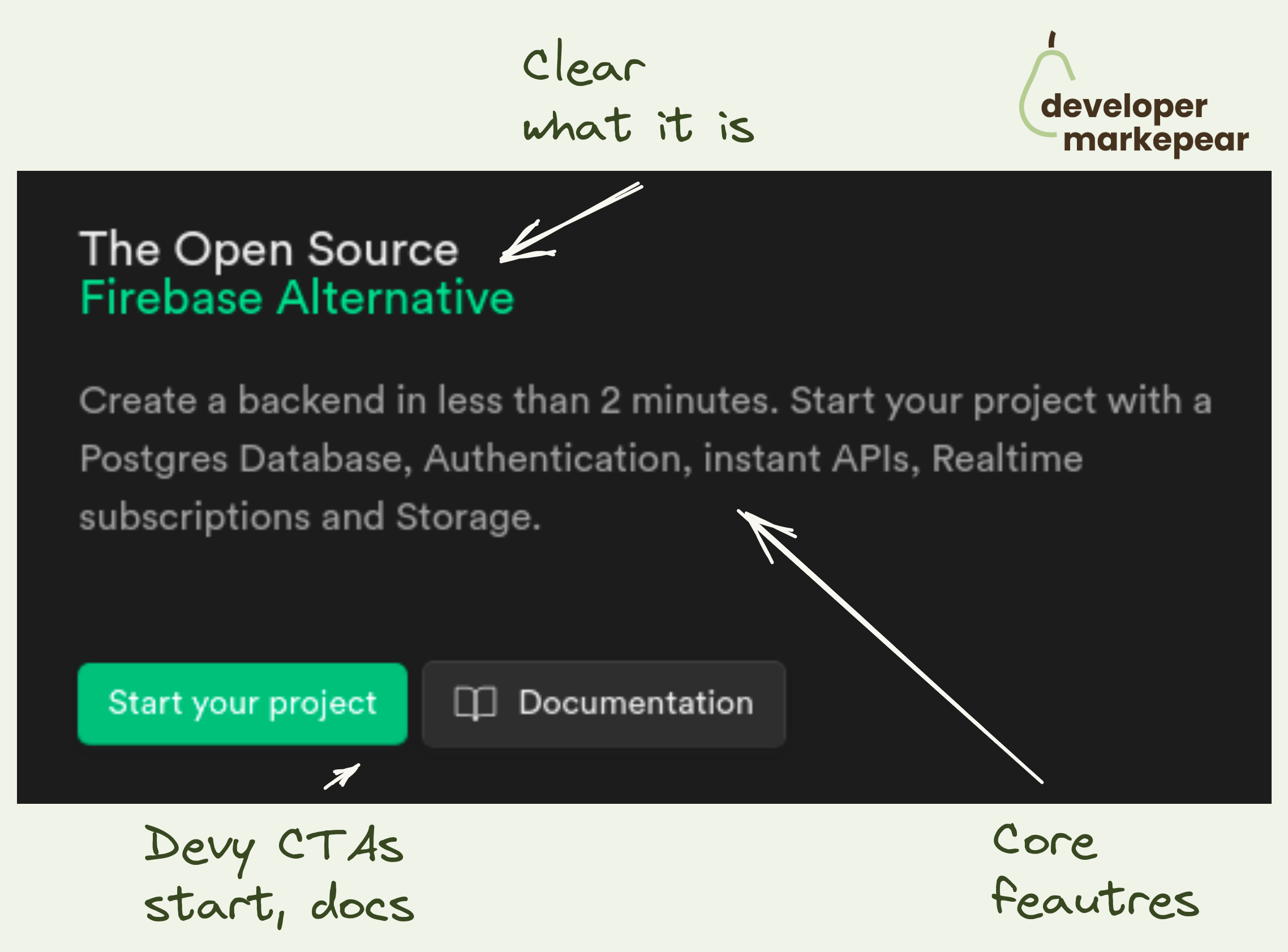
This has to be one of the better dev-focused headers I've seen in a while.
Headers should deliver your core product message and get people interested. That is true at any stage but early stage especially.
💡You want everyone, even those folks who just take a look and leave to remember. You want them to recall it in their next conversation around this topic.
There may be supporting messages for sure but there is always that one core thing. Make sure it lands.
In the case of Clickhouse, that core message is that they are a database that is fast at a huge scale.
Their supporting messages are:
💚And they deliver that beautifully with:
Headline
Clear as day headline speaking to value delivered at a level that builds rapport with their audience.
Not "Give users seamless web experience at scale" but "Query billions of rows in milliseconds". I like that little touch with "rows" which makes who they speak to obvious
Subhead
Subhead supporting it with "fastest and most resource-efficient DB"
+ talking about the use cases "real time apps and analytics" and it being open-source
Calls to action
These CTAs make the audience feel at home. There are docs in there + clear "we are open-source" CTA
Visual
That supporting visual is just amazing.
It shows the value in the most believable way you could deliver it here imho. Query and an Output that shows the size of the database and speed of the query
Social proof
Social proof in the navbar, almost 34k stars and a GitHub icon.
+ a way to get people to that repository, check it out and leave a star.
There is more social proof below the fold with big logos and stuff but the GitHub icon and stars make it immediately clear that this is a project that people care about.
It is remarkable how brilliantly simple it is all presented. Just a fantastic work IMHO.
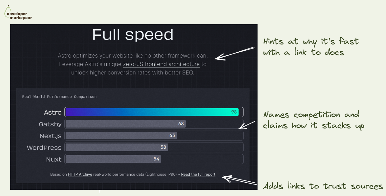
Your dev tool is faster/more scalable/more X -> show it with benchmarks.
For some tools the entire unique selling point is that they are faster.
You build your messaging around that, put a flavor of "fastest Y for X" in the header and call it a day.
But devs who come to your website cannot just take your word for it. They need to see it, test it.
For some tools it is possible to just see it for themselves, get started.
But you cannot expect devs to really take a database or an observability platform for a spin.
As to test the speed or scalability on realistic use case you need to...
... set up a realistic use case. Which takes a lot of time.
But you can set that use case and test it for them. With benchmarks.
I really like how Astro approached it:
If your usp is that you are faster/more scalable/ more whatever. Back it up. This is the nr 1 thing devs on your website need to trust you with to move forward.

This body cross-section is just awesome.
It makes it obvious that I can connect it to my workflow.
This is a must for dev-focused pages imho.
What I like:
- there are many integrations listed
- I can see the code and that it is easy to use
- The CTA is to integration docs, awesome!

Mux does a few things beautifully in this header.
Value proposition:
Animated visual that is really good for dev tools:

I love this simple design.
They show:
Simple, and powerful imho.

I like the design of this crosshead.

Sometimes you have an article, report, or event you want to drive people to.
And it is important that they read it.
What Plaid did here is an interesting way of putting it right in the hero section without making it overwhelming or distracting.
I like it.

What to put in the header when your dev tool does a lot?
I like how Appsmith approaches it.
In their case, they have multiple use cases they want to showcase.
But you could use the same idea for many features or products.
Show multiple clickable tabs:
A bonus idea is the "Try cloud" | "Self-hosted" CTA.
It communicates right away that you can deploy that dev tool anywhere.
If the self-hosted deployment is important to your customers let them know.
You don't want them to look for it and drop from the page trying to find the FAQ.
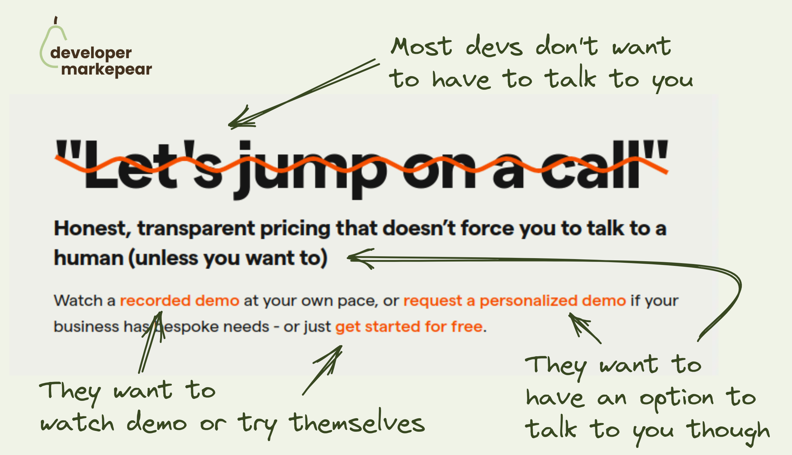
Most devs want to explore products themselves.
They want to read the docs, see examples, play with the product, or watch a video.
They don't want to hop on a demo call, especially early on in the evaluation process.
And they definitely don't want to sit through the demo to learn what your pricing is.
But there will be moments when they will want to talk to you. They will raise their hands and let you know then.
Posthog speaks to this reality with this copy beautifully:
This is very developer-focused approach and I love it.

Devs are builders.
Make your home page for builders.
Go directly into the "how" instead of the way.
Many devs when they land on your home page, already know the "why".
I love that it:

There are three CTAs actually.
Common knowledge suggests doing one, maybe two, they do 3:
Devs want relevant and practical.
Also, devs love docs and examples and check them before signing up.
Action-focused copy is great as well.

Great above the fold
The subheader explains the value proposition.
Header handles major objections:
Then we have 3 CTAs but they are super focused on devs:
Then it goes on to explain how it works with a simple, static graphic.
This whole thing makes me feel peaceful.
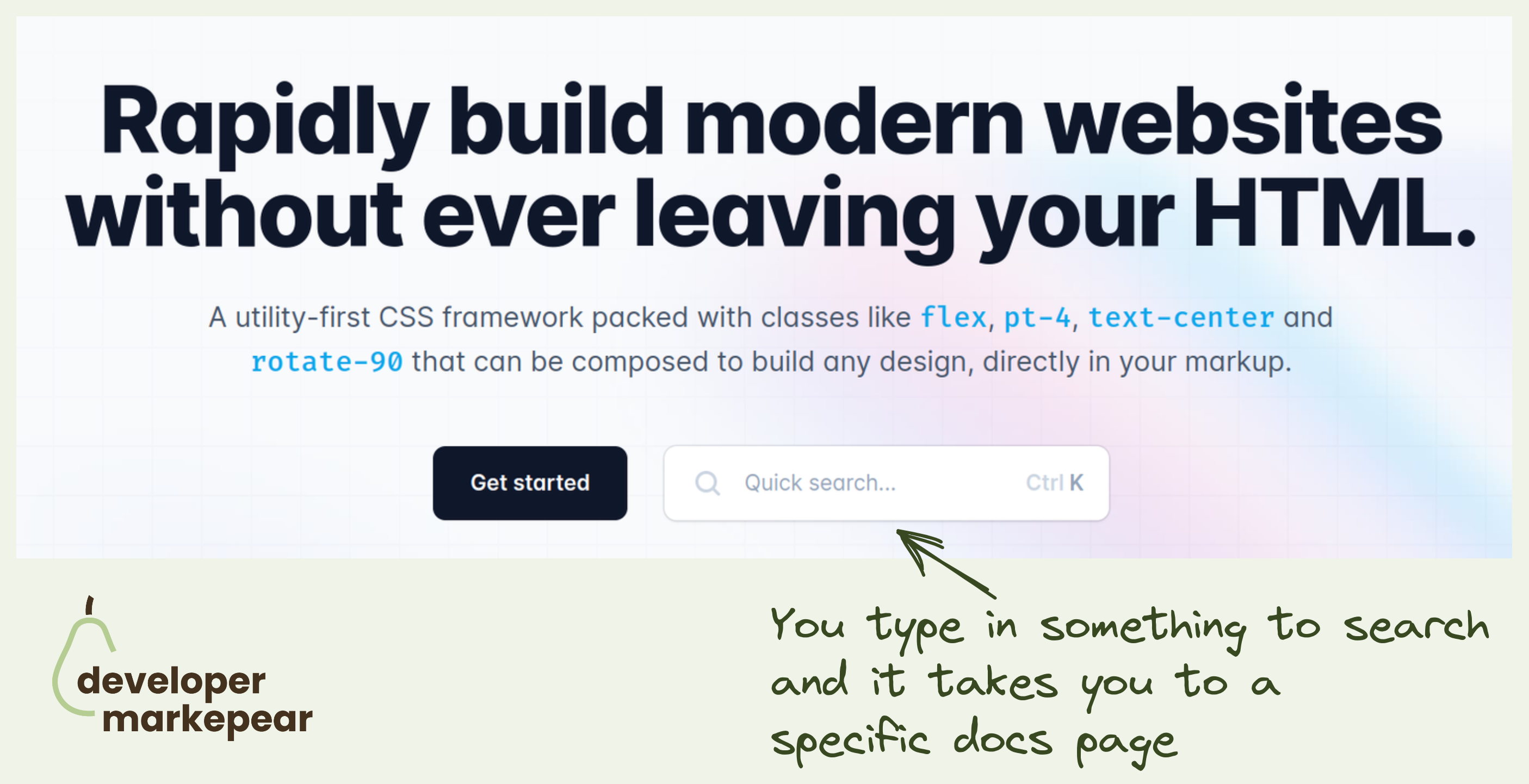
"See docs" is one of my favorite secondary CTA on dev-focused pages.
TailwindCSS takes it to the next level by inserting docs search right into the header CTA.
This takes devs directly to the page they are interested in rather than have them try and find things for themselves.
They could have searched the docs in the docs, of course.
But this is just this slightly more delightful developer experience that TailwindCSS is known for.
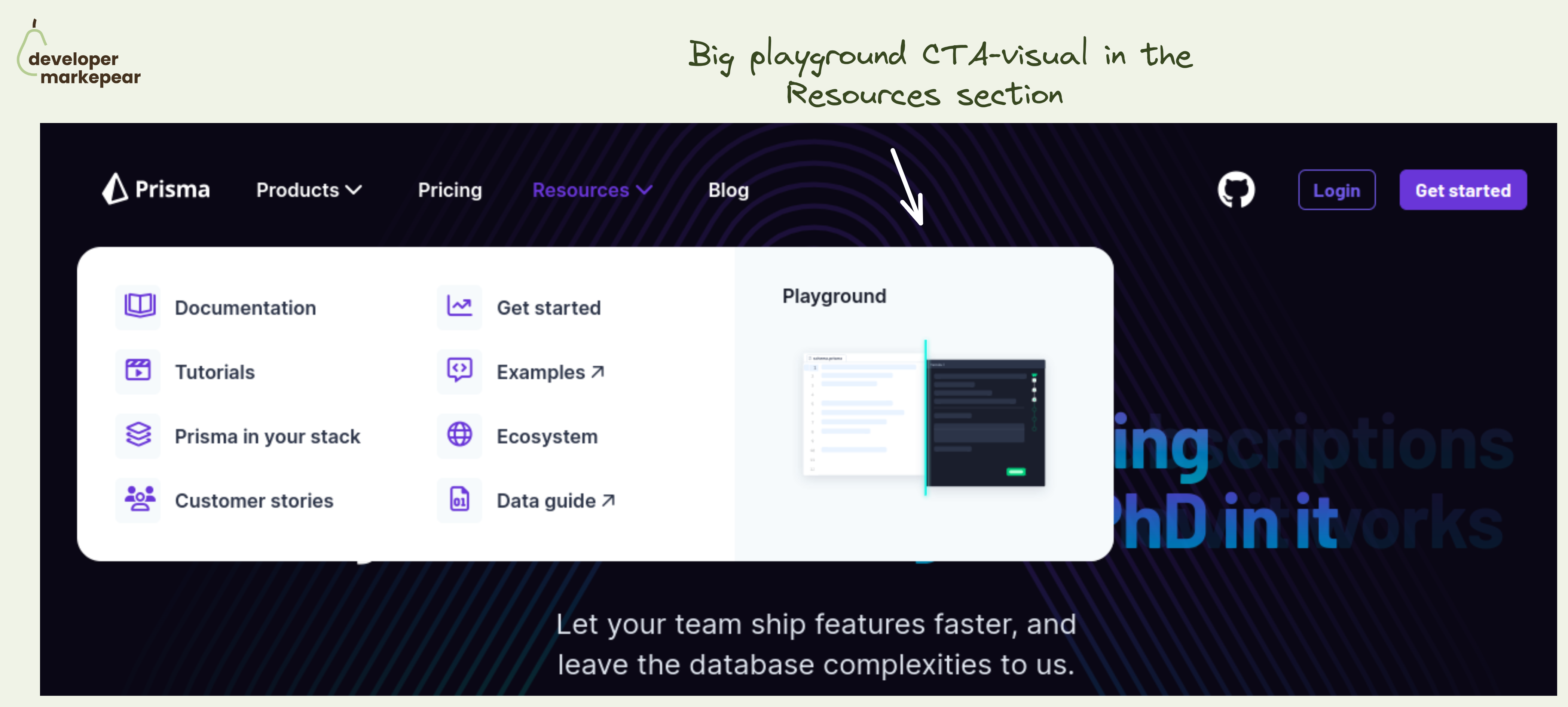
Simple yet powerful CTA in the navbar resources section.
The resources section in the navbar is mostly navigational. Well, the entire navbar is ;)
But you always have that one action that is more impactful than others.
💚 And I think that a Plauground is a great option. You get people to see how your product works. You let people play with it and see for themselves.
Not many next actions can be as impactful as getting people to experience the product.
Especially if you are a heavier infra tool that people cannot really test out in that first session. I mean, you won't really create a realistic example of your core database in 15 minutes to see how that new tool that you just saw works.
🔥 Making this CTA "big and shiny" and showing a glimpse of what will happen after clicking is great too.
🤔 2 changes I'd test out:
But the core idea behind making the playground your core navbar resource section CTA is just great.

Very nice design solution on the homepage.
Classic communication of the world before using your tool and the world after.
Really liked how it felt messy before.
And is nice and clean after.

Good in-place code pattern.
I can go and see different code snippets without moving to other parts of the website.
At the same time, I can read explanations and value propositions.
I like how "view documentation" is such a strong CTA with so much going on here already.

The problem with presenting API is that it is hidden. It gets the job done in the background.
So it is not "attractive" in the way some other dev tools can be.
But you can:
That is how Mux, video API, solves it.
Found this awesome crossover on their homepage.
They give you:
Love it!
Say what you do and how you do it.
What:
How:
CTA (bonus):

I love this copy. It answers:
It doesn't talk about the value as it is obvious to devs.
Obviously, it will save time and make things safer.
Don't talk about it.
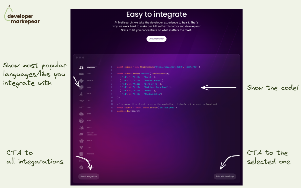
How to show integrations on your dev tool homepage?
Every dev tool needs to integrate with other libraries in the space.
And you want to show how well integrated with the ecosystem you are.
But you ctually want to do a bit more than that.
You want devs to see how easy / flexible / clean it would be for them to use it.
That is why instead of showing just logos from your ecosystem it is good to show the code too.
Meilisearch does that beautifully:
I am sure this is getting more clicks than just a list of logos.

Beautiful mockery of classic conversion tactics from PostHog website.
So what do we have here:
I have to admit I chuckled ;)
And I bet many devs who don't think of marketing very highly chucked too.
That builds rapport. (hopefully) makes you one of the tribe rather than another faceless corpo.
BTW, they used it as a bottom of the homepage call to action.
I like it.
Most of the people who scrolled there are not going to buy anyway.
But they may share the website with someone who will.

This is a simple but great header imho:
Love it.