Open-source project homepage CTA from Astro

Developer Markepear testimonials

What CTAs should you choose for your open-source project homepage?

Was always wondering what is my default.

There are many options: "See docs", "Get started", "Sign up", "Start X"

But in open-source you want people to start playing with it, install it.

So what should you choose?

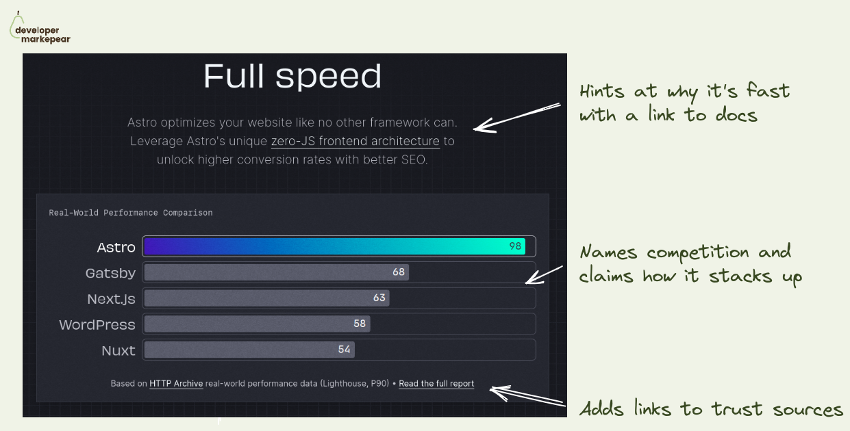
Recently came across Astro homepage and loved what they chose.

"Get started"

  • Takes you to the quickstart in the docs
  • Is action-focused copy
  • Sets obvious(ish) expectations

Install code

  • Gives you copy-pasteable install command
  • + it shows the code to make it more devy

Whatever I choose I will actually get my hands dirty.

I think this will be my default from now on.

  • See the website
Browse 100+ examples like this ->
copy
developer experience
landing page
hero section

The header copy of Auth0 developers portal

blog
call to action
seo

JTBD blog post from WorkOS

landing page
social proof

Modal Community section

landing page
developer experience
call to action

Integrations section on Meilisearch homepage

landing page
developer experience
call to action

Benchmark section on homepage from Astro

developer experience
landing page

Multi-tab GIF cross section website design from Supabase

developer experience
copy
call to action
landing page
hero section

Auth0 developers portal header

call to action
blog

Aside CTA from ExportSDK

copy
developer experience
call to action
landing page
hero section

Header content CTA from Plaid

landing page
hero section

Clickhouse header design