

What to say when you have many products?
Dev tool companies over time grow from one product to suite of products to platforms with products built on top of the core one.
The result is that it is harder to communicate without going full-on fluff mode (my fav "built better software faster").
But for most companies, there is this core capability/product where people start. The entry product. Why not use that?
I really liked what Stripe did on their docs page here:
Even though this is docs, the same applies to homepages and other dev comms.
If you have many products, figure out what is the most important one, the one where most people enter. Focus on that. "Upsell" to other products later.

How to get people to sign up for your office hours?
Why not put it on your docs homepage?
Btw, I really like the concept of office hours.
You get your devrels or product to do those weekly and then you just have to figure out how to get people there.
Classic options are to put info in onboarding sequences, in the app, or on the website hello bar.
But Flatfile had another idea. They put it in their docs homepage header.
I find this idea brilliant as many people who browse your docs (especially for the first time) are in that evaluation mode and would actually want to do that.
Plus calls to action in the docs get more respect by design ;)
"See docs" is one of my favorite secondary CTA on dev-focused pages.
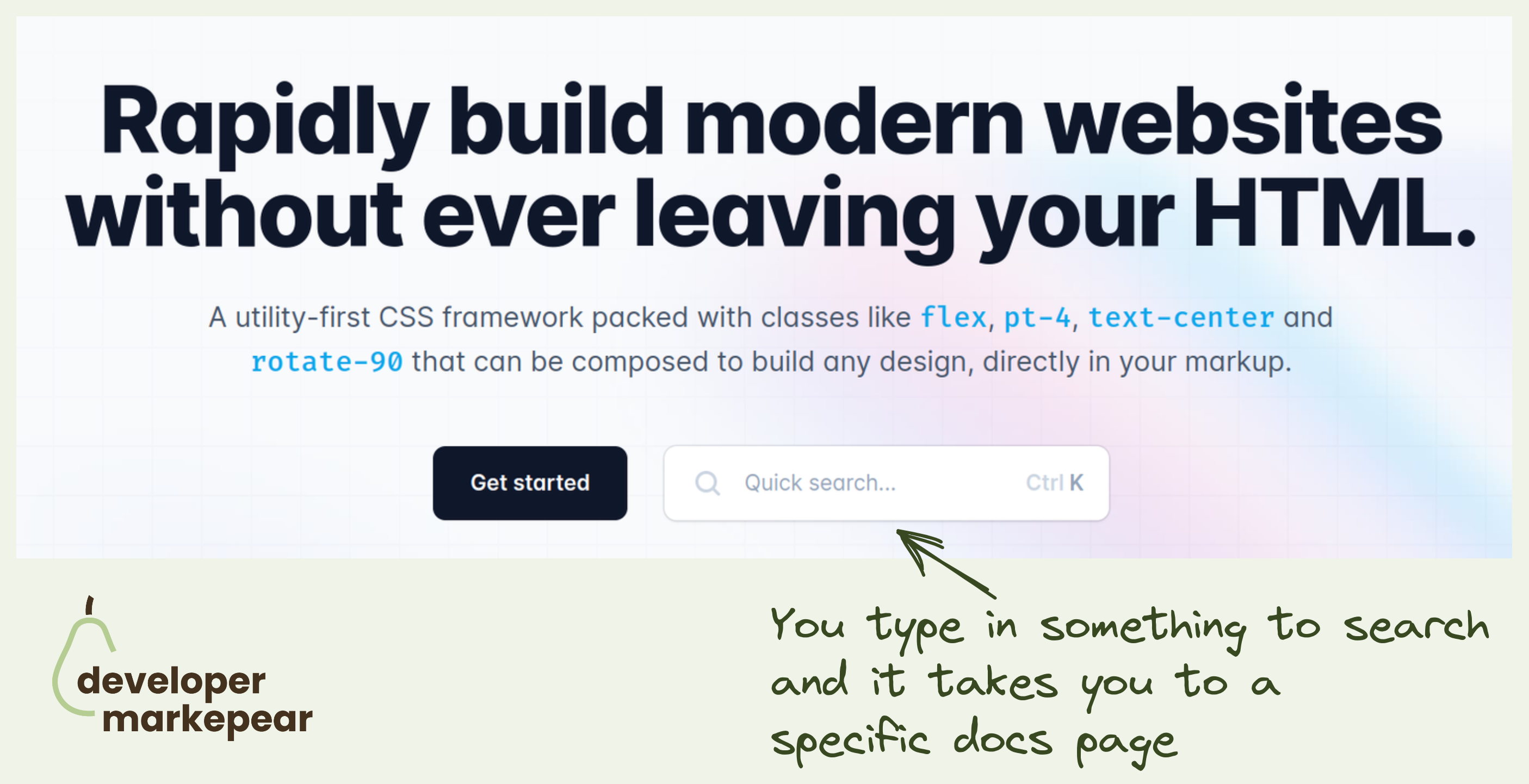
TailwindCSS takes it to the next level by inserting docs search right into the header CTA.
This takes devs directly to the page they are interested in rather than have them try and find things for themselves.
They could have searched the docs in the docs, of course.
But this is just this slightly more delightful developer experience that TailwindCSS is known for.
A docs header worth a thousand words.
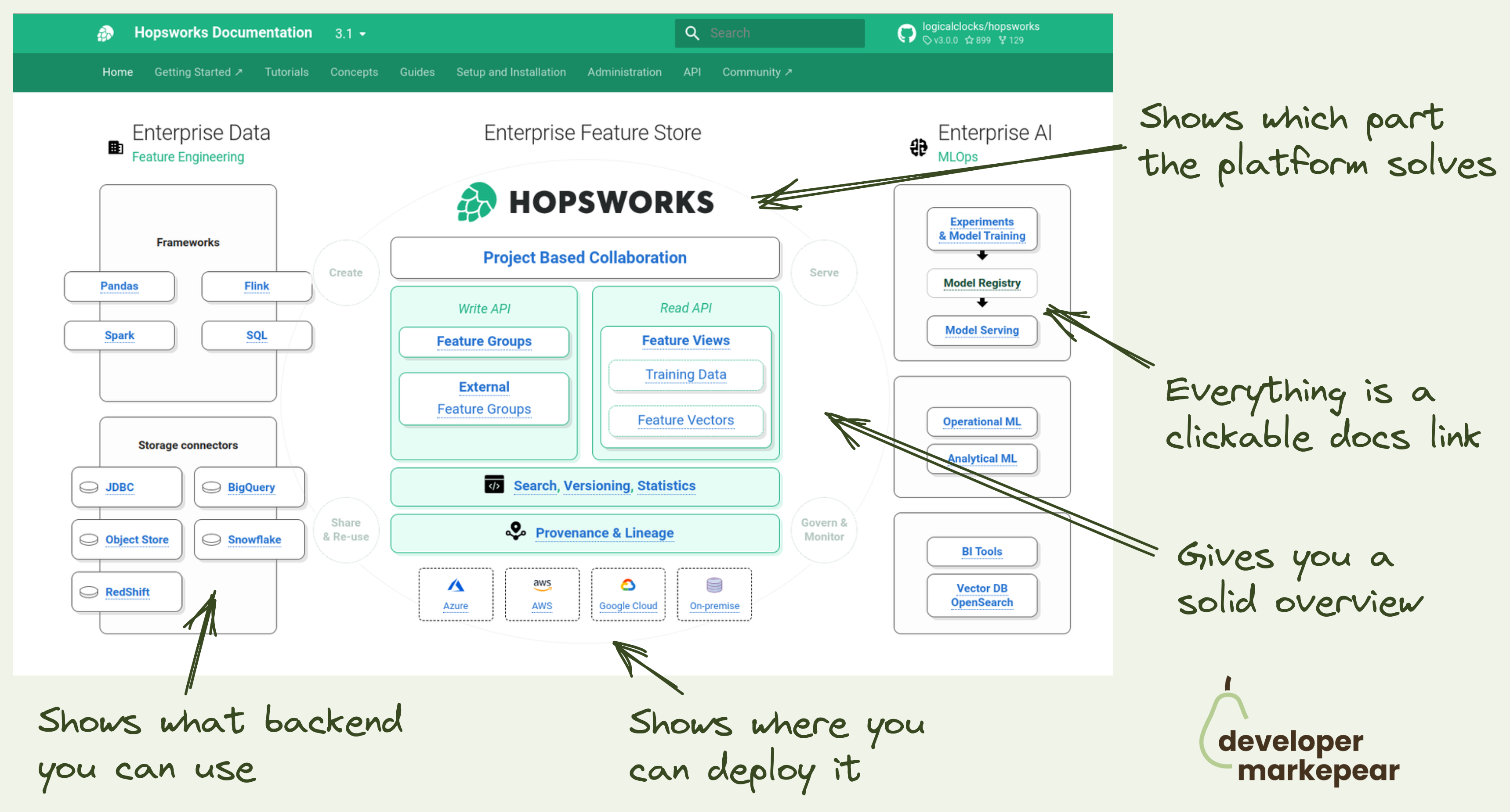
For a dev platform or infrastructure tool it is hard to explain where you fit, what you do quickly, and how you connect to existing components quickly.
Hopsworks docs team does a great job here.
So instead of using words, they use a diagram:
All of that in a single diagram.
Now that is a dev-focused header visual.
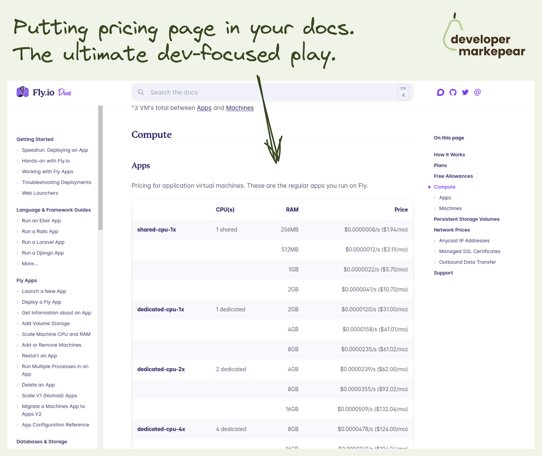
Pricing in your docs? That is how @Fly.io does it.
You click a pricing page link on their homepage and you go to the docs!
No 3 boxes with the "most popular" being the middle paid plan ;)
They just give it to you how it is. Exactly what you'd expect from the docs.
There are tables, explanations, and links to other docs pages.
Very bold decision imho. It definitely makes them feel super developer focused.
Plus if you do want a more standard, enterprise stuff you see:
"If you need more support or compliance options, you can choose one of our paid plans. These come with usage included and additional support options."
And that page looks like a classic pricing page.
But they focus on the developer buying experience here. Super interesting.
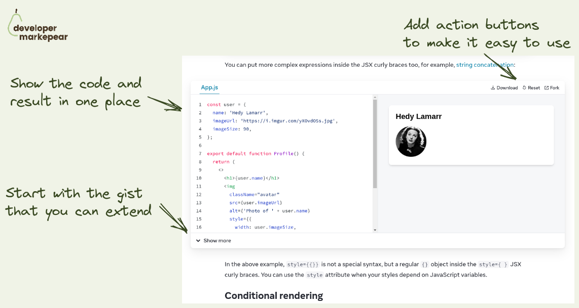
Nice way to show code and results straight from the React docs that people love.
And this pattern can be used outside of the docs for sure.
Anyway, a classic situation:
And folks behind React docs solved it nicely by:
Not groundbreaking maybe but a beautiful implementation that is just a delight to use.