

Funny dev newsletter CTA. From shiftmag .dev by Infobip.
It starts with a chuckle-worthy:
"Sarcastic headline, but funny enough for engineers to sign up"
Then they follow up by disarming the "is that spam" and building more rapport with:
They end with an alternative call to action. RSS feed.
Most newsletters don't do RSS.
But for many devs RSS feed is the preferred content subscription.
Great job!
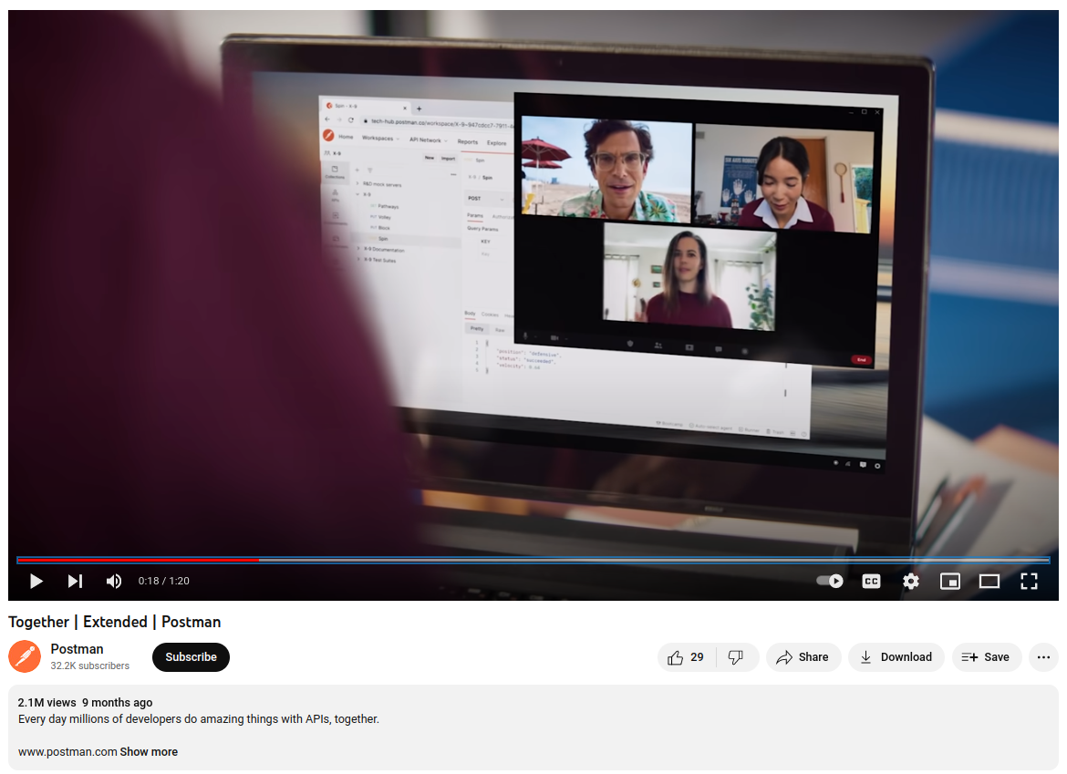
How to do a dev-focused brand video and get 10M+ views?
Making a memorable brand video is hard.
Doing that for a boring tech product is harder.
Doing that to the developer audience is next level.
Postman managed to create not one but three of those brand videos that got from 4M to 10M youtube views.
The videos I am talking about are:
So what did they do right?
Honestly, I am not exactly sure what special sauce they added but those are just great videos that you watch.
And I definitely remember them and the company which is exactly what you want to achieve with brand ads.
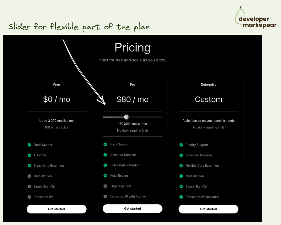
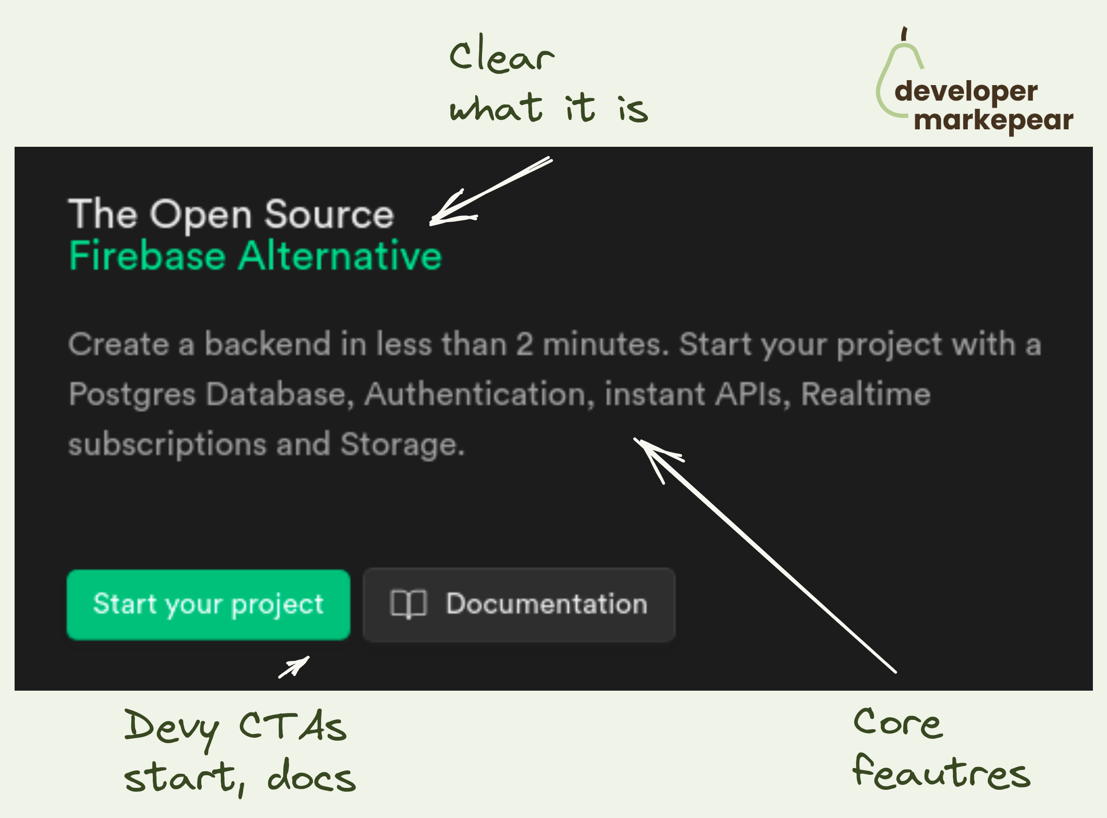
How to communicate the flexible part of your plan?
Many dev tools have 3 plans:
Especially the ones doing some flavor of product-led-sales or open-source go-to-market.
Now, the Team plan is often a self-served version.
And for many dev tools, this part is partially or entirely usage-based.
So how do you present it?
You can just have "+ what you use" and explain it in the big table below.
But if you have just one usage dimension then why not do it here?
Resend does it beautifully communicating right away that it starts at 20$ / month and grows with the amount of emails you send.
Very clear. Very nice.

Interactive product tours are all the rage.
But how do you make them work for the dev audience?
How do you deal with:
That is hard.
But Vercel somehow made it.
This is by far the best product tour I have seen so far.
What I love:
This product tour is what dev tool startups will aspire to for years (or months ;) ) to come.
Mark my words.

There are three CTAs actually.
Common knowledge suggests doing one, maybe two, they do 3:
Devs want relevant and practical.
Also, devs love docs and examples and check them before signing up.
Action-focused copy is great as well.

That CTA.
You go straight for the install/download.
I don't know if you can go more developer-focused than that.
It sets the tone for the entire homepage.
And let's be honest (almost) nobody actually clicks that "Sign up" button in the hero section.

In a mature category, it is safe to assume that people know about other tools.
Especially devs.
I love how Axiom owns its unique selling point and how it stands out from the competition.
Takes guts but I love it.

Vs pages are a classic SaaS marketing.
But I like how Ably adjusts them to the developer audience:

Make it about belonging.
Something some people can deeply connect with.
Nostalgia is a very strong emotion.
It feels good to be a part of something as well.
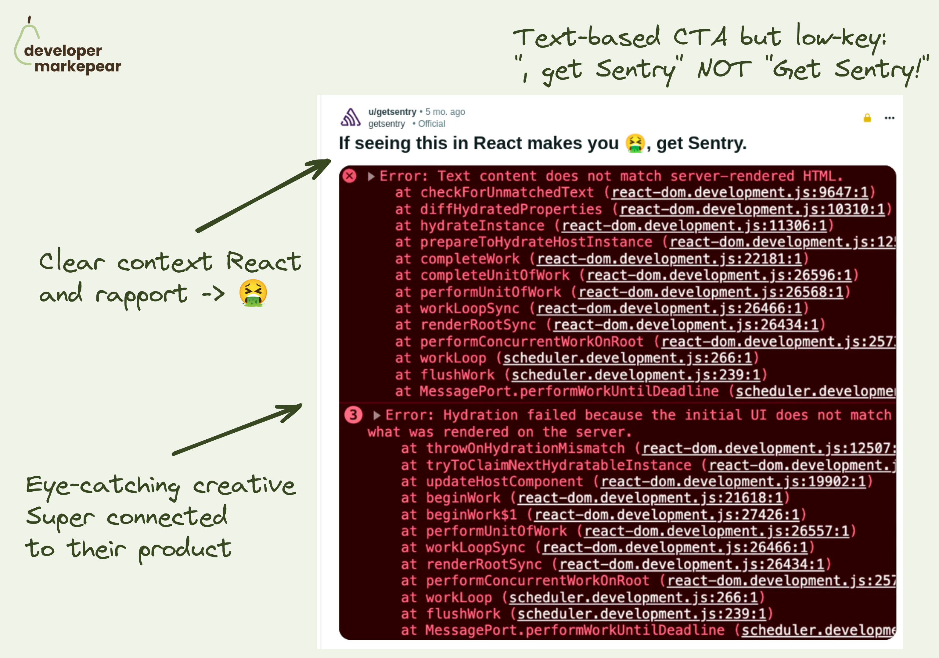
I really like this Reddit ad from Sentry.
Powerful simplicity.
They don't do:
• long value-based copy
• fancy, in-your-face CTAs
• creative that feels "professional
They go for:
• focus on the pain
• creative that speaks to that pain
• low-key CTA ", get Sentry" rather than "Get Sentry Free!"
• building rapport with the dev with copy "If seeing this in React makes you 🤮"
And through simplicity and focus they deliver a message:
• Stack traces in React are not much fun
• They seem to understand that
• Sentry helps you solve that
Good format.

Create a connection with your ideal customer profile.
"Wrong answers only" questions are great for that imho.

I love this simple design.
They show:
Simple, and powerful imho.
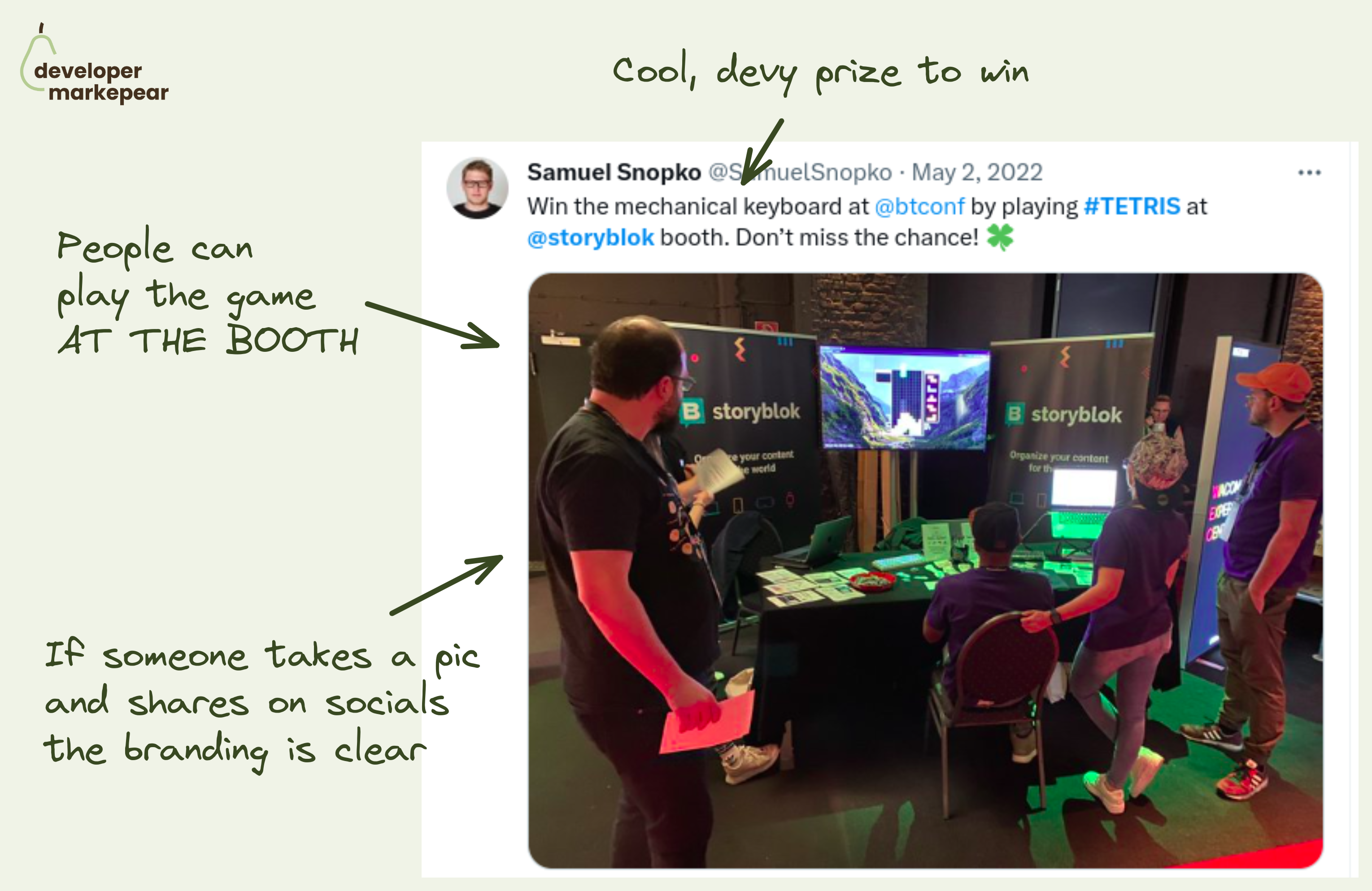
Conference activation idea: Tetris competition at the booth.
It is hard to get devs to your booth if all you offer is a "do you want to see a quick demo" spiel.
You need to get a bit more creative than that.
💚 The team at Storyblok ran a Tetris competition:
Afaik it was a big hit and I can definitely see why.
📒 A few more notes:
btw, I read about it on DX Tips. You want to check out that article on dev conferences from DX Tips

A classic "It doesn't suck" campaign.
Afaik, Barebones ran the first version of this campaign 20 years ago and it was a huge success.
It is so simple, it just speaks to that inner skeptic.
It doesn't say we are the best, we revolutionize software.
It says it doesn't suck.
That is way more believable and makes me think that there is a dev on the other side of that copy.
And there is something cool about this message that makes me want to wear it to the next conference.
Good stuff.

How did this super basic ad get so much engagement on Reddit?
First of all, the value prop is succinct, to the point, and says what it is.
No "streamlining", "boosting", or "democratizing" is involved.
No clever tagline or pains, benefits, or values just says what it is.
But what it is, is "free and open-source" which is what many devs, especially on Reddit want to hear.
And Heroku is a known brand so if you know what Heroku does, you know what Kubero does.
I liked that they linked out to the GitHub project too.
Not 100% sure if that would perform better than a landing page or home. But I see how it feels more in sync with the channel you are running your ads on.
The screenshot? I don't like it but perhaps it doesn't matter as much here?
What do you think?
Oh, and if you read the comments, you'll see that people actually talked about the project, said that they liked the ad etc.
Good stuff.

Classic Auth0 campaign coming back in 2023.
I love how simple and powerful this message is.
You can outsource a dull but important problem of authentications to them.
That is all the say.
But it is enough to get you interested and understand what they do.

Good in-place code pattern.
I can go and see different code snippets without moving to other parts of the website.
At the same time, I can read explanations and value propositions.
I like how "view documentation" is such a strong CTA with so much going on here already.
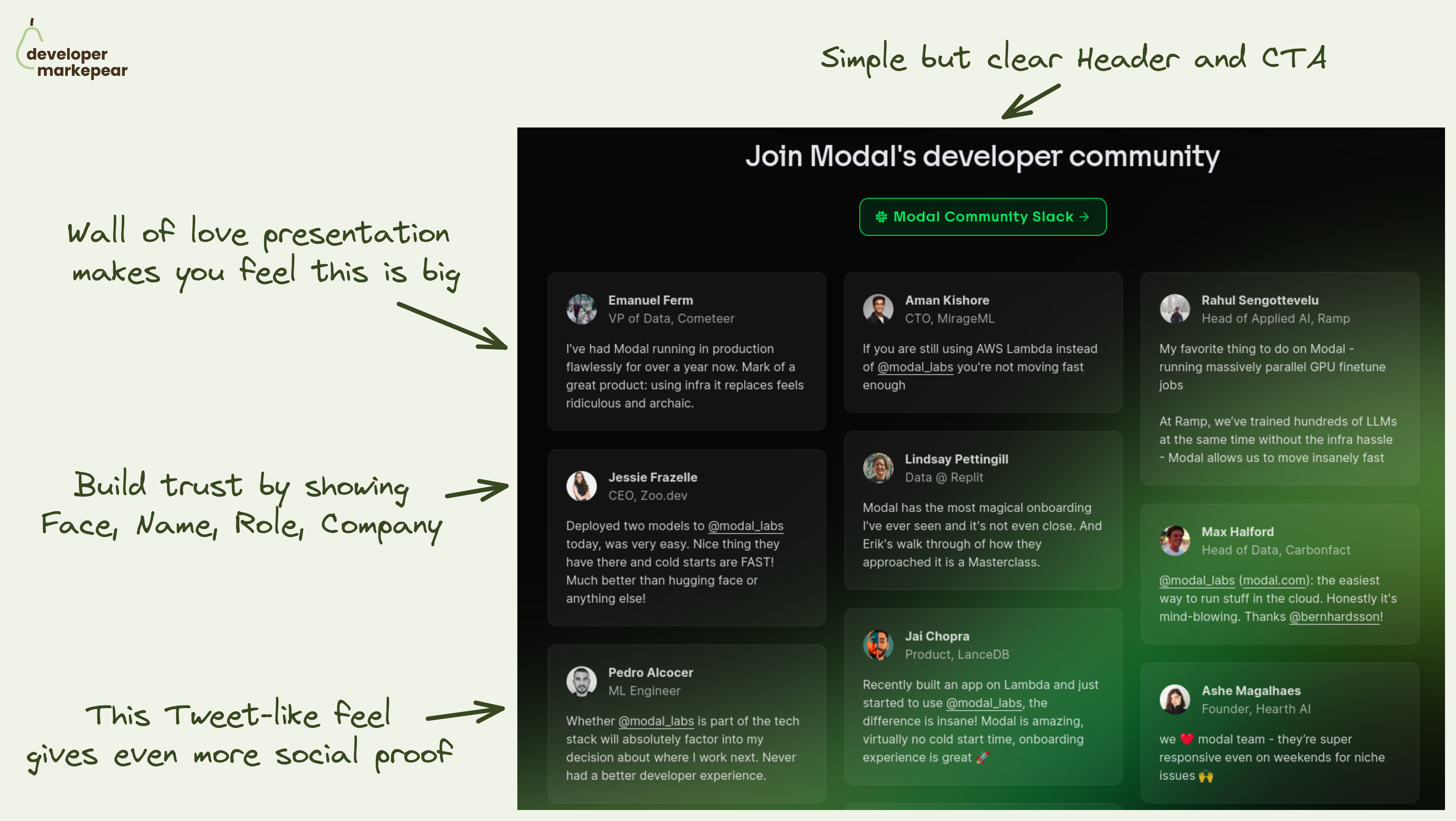
The main message you want to land on your homepage community section is:
"We have a big community of devs who love using the product"
🚧 That helps you tackle obstacles your dev reader has:
💚 Modal solves it beautifully by going simple but smart:
It lands the message that this section should land for sure. I really like it.

Many dev tools have complex pricing and packaging.
Say your dev tool/platform has many product offerings.
And you offer usage-based pricing but also enterprise plans but also per-product options, and additional customizations.
But you want to present it in a way that is manageable for the developer reading your pricing page.
Mux solves it this way:
Extended headers on pricing pages are not common as they add friction.
But sometimes adding friction is exactly what you need to do.
Mux managed to make this page (and their offering) easy to navigate by adding a little bit of friction at the beginning.
Maybe you don't browse plans right away but at least you don't waste energy (and attention) on the parts of the page that doesn't matter to you.
Good stuff.
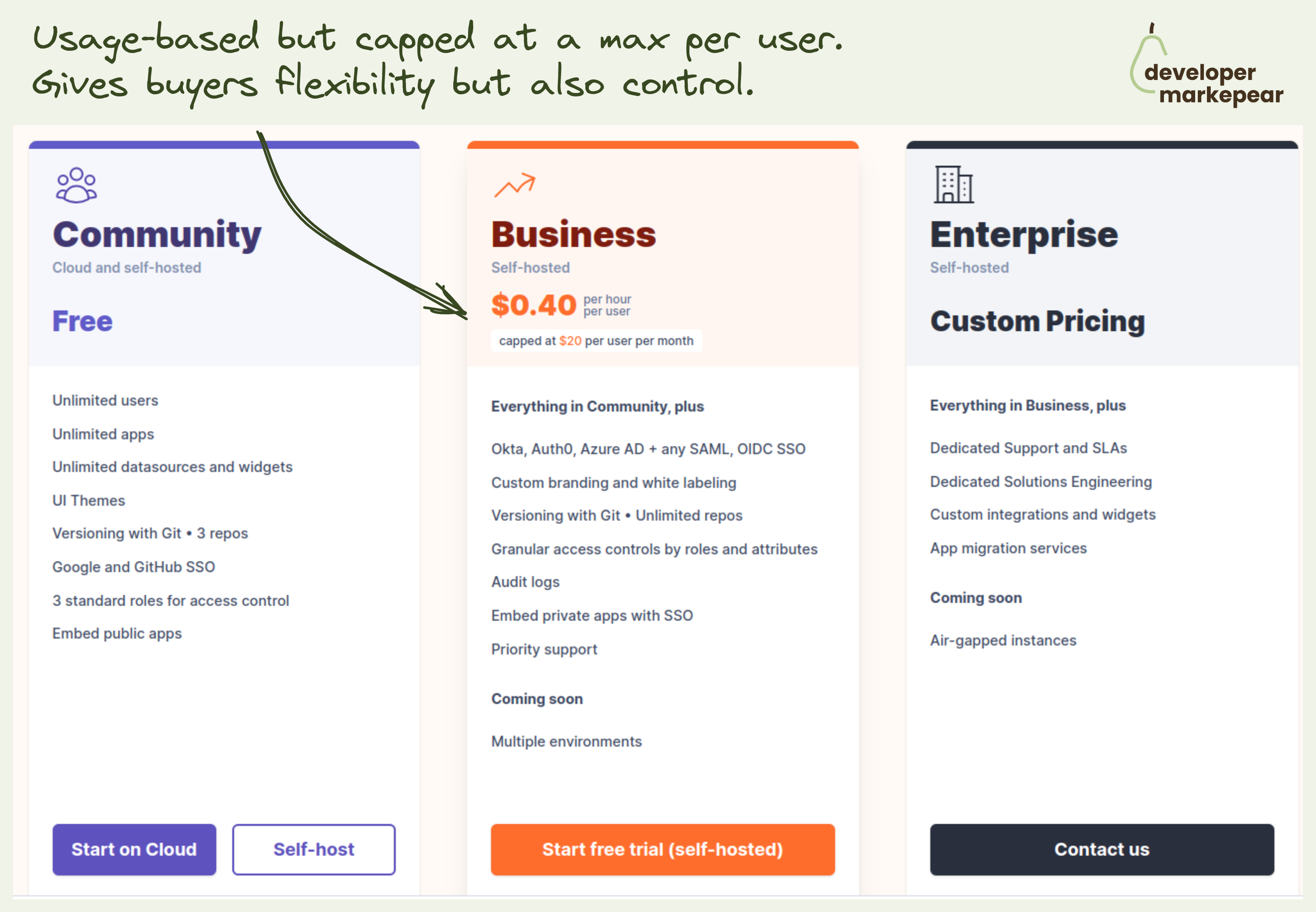
Usage-based pricing is loved by devs. But has its own problems.
Ok, so first what are those problems?
Value metric:
Predictability and procurement:
But devs love usage-based pricing:
It is great for a dev tool company:
But pulling it off is not as easy as you may think.
Choosing that value metric, packaging it, and presenting it is a struggle.
@Appsmith solved it in the following way:
Very interesting approach.
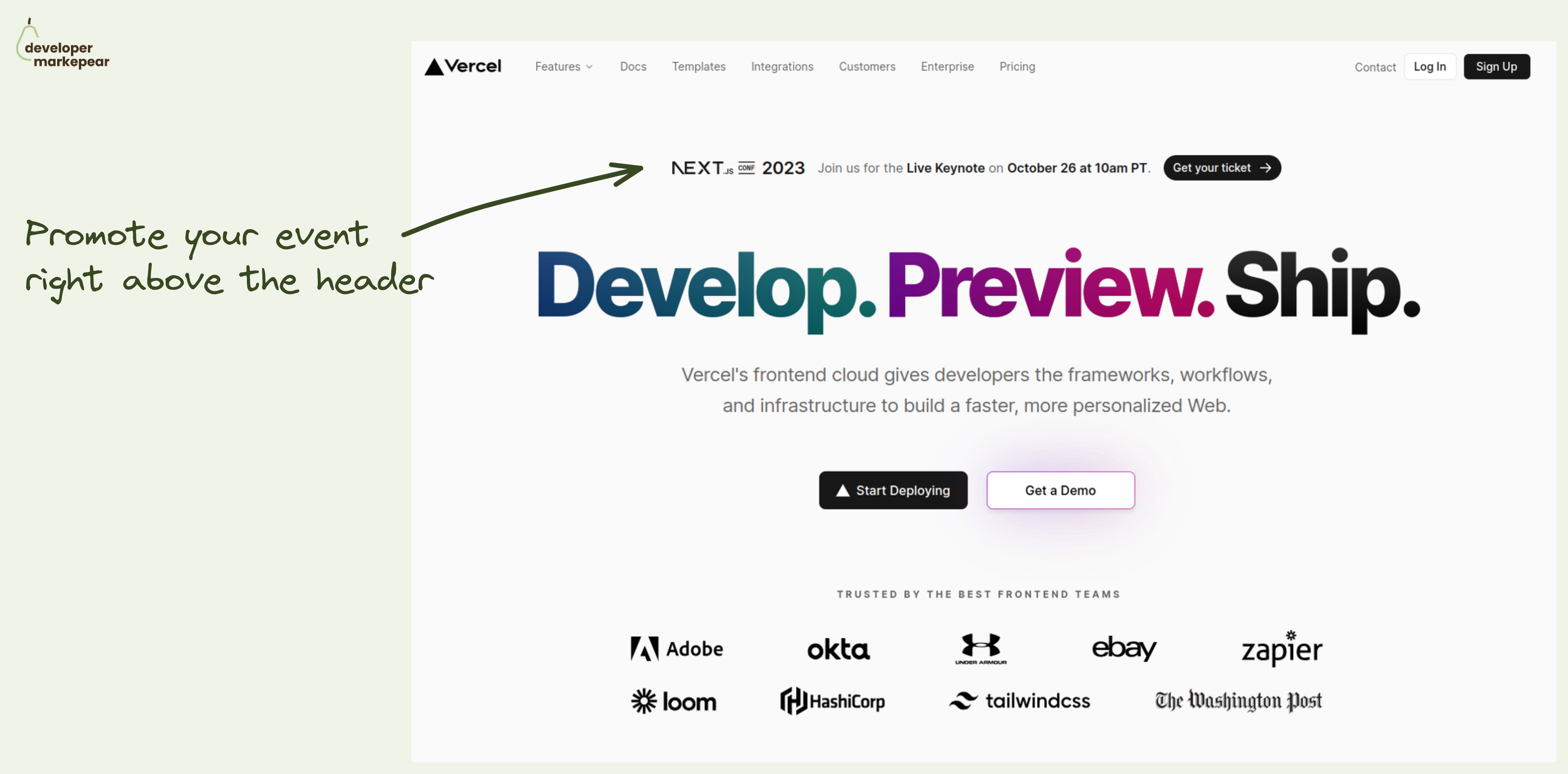
How to promote your important company event? How about right there in the header.
A typical approach to promoting events on your site is to have them in the Hello bar (right above the navbar). This is a solid option of course.
But what if this is a super duper important event that you really want to push?
Put it in the header.
The header is the most viewed part of the most visited page on your site.
Doesn't get much better than that.
But you don't want to distract people from your value propositions and main CTAs too much.
How do you do that?
This is how Vercel did with last year's NEXT.js conf.
Nice execution on that pattern.
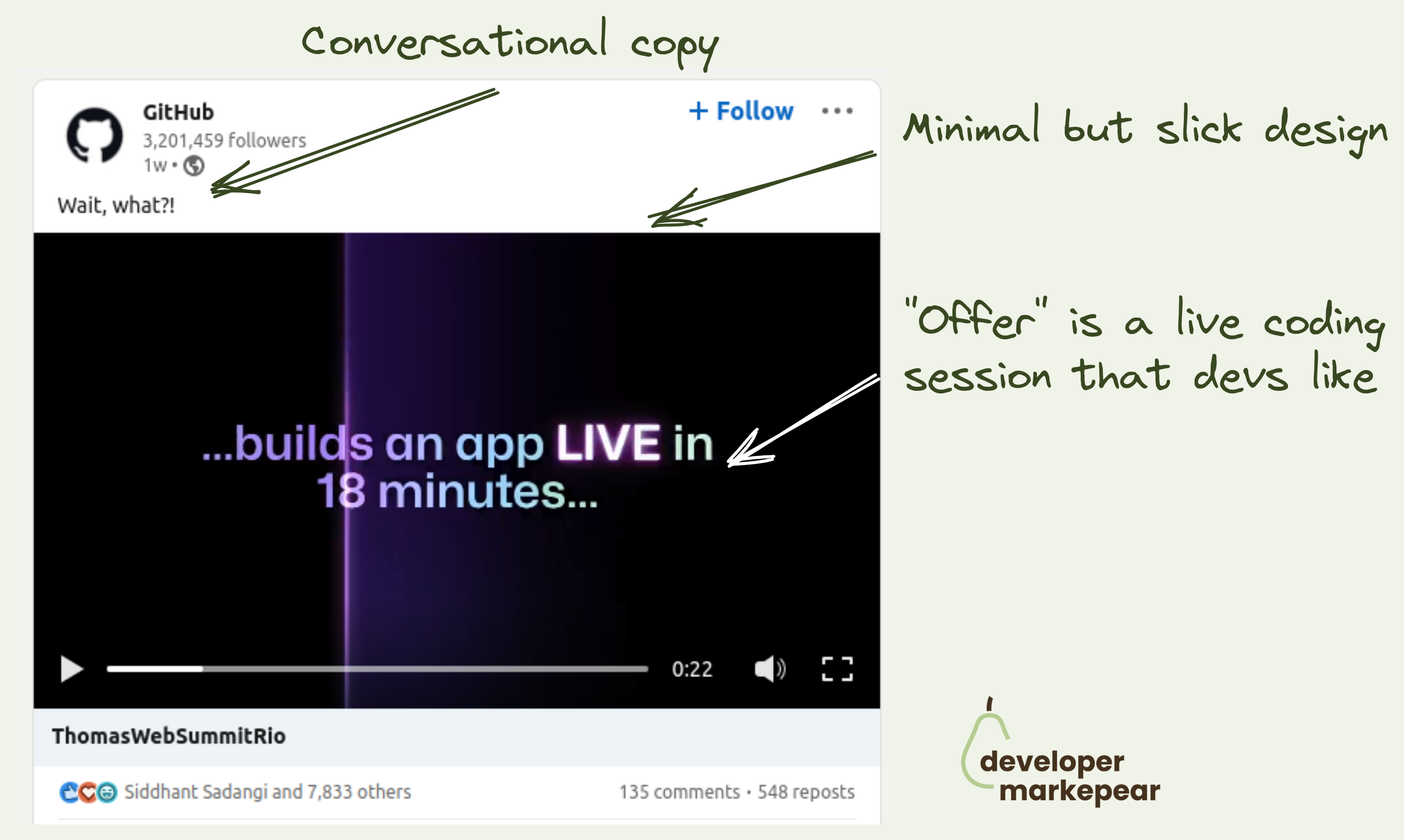
7k likes on an event promo post to the dev audience.
I don't think I've ever seen 7k likes on a developer company post on Linkedin.
Ok, this is Github, but still.
This is a 26sec video where they go:
This is a job well done:
And they could have done:
This is how to promote an event. LOVED IT!

I really love this hand-drawn feel.
It makes it super authentic.
Also, starting from scratch (not a ready diagram) makes following it more fun and less overwhelming.
Great stuff.
BTW the tool used for this is called excalidraw.com

Very cool project.
You type in your GitHub name and see your history in 3d.
And Voila!
You have an intrinsically viral brand awareness campaign.
Just brilliant.

Explain a concept clearly.
Good visual with concrete numbers makes this example easy to understand.
Because it is beautifuly explained people want to share this with their network to be perceived as helpful (and smart).

Architecture diagrams are awesome.
They have this smell of value that makes you want to share them with others.
This one is particularly good-looking imho.
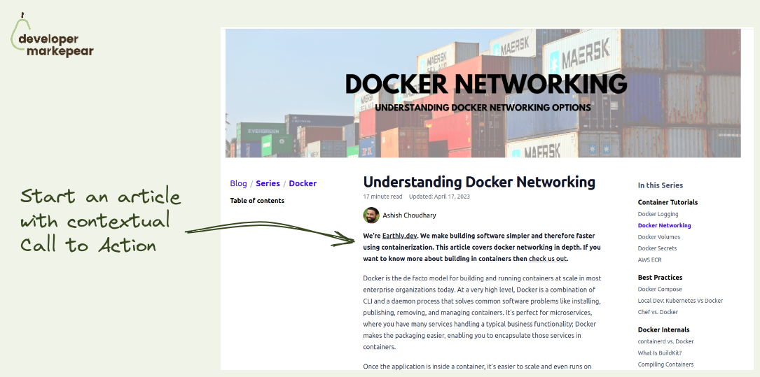
Need one more call to action idea for your dev tool blog?
How about starting an article with it?
Sounds weird but if done right it can work. Even with devs (or maybe especially with devs).
Earthly did and they are known for great dev-focused content.
Ok, so how does it work?
You start your article with a contextual call to action where you explain:
And then you let people read.
Those who find the topic important will remember you and/or maybe click out to see more.
I like it. It's explicit, transparent, and actually noninvasive.

Share an idea about a new concept.
Explain the concept in simple terms.
Back it up with a visualization.
I like the "hand-written" style of this viz that makes it less formal.

𝗛𝗼𝘄 𝘁𝗼 𝗰𝗿𝗲𝗮𝘁𝗲 𝗴𝗼𝗼𝗱 𝘁𝗲𝗰𝗵𝗻𝗶𝗰𝗮𝗹 𝗰𝗼𝗻𝘁𝗲𝗻𝘁 𝘁𝗵𝗮𝘁 𝘁𝗵𝗲 𝗛𝗮𝗰𝗸𝗲𝗿 𝗡𝗲𝘄𝘀 𝗮𝘂𝗱𝗶𝗲𝗻𝗰𝗲 𝗹𝗶𝗸𝗲𝘀?
The general tip is simple. Create content that the HN audience finds interesting.
𝗧𝗵𝗮𝘁 𝘁𝘆𝗽𝗶𝗰𝗮𝗹𝗹𝘆 𝗺𝗲𝗮𝗻𝘀:
But how do you actually do that?
𝗢𝗻𝗲 𝗼𝗳 𝘁𝗵𝗲 𝗽𝗹𝗮𝘆𝗯𝗼𝗼𝗸𝘀 𝘁𝗵𝗮𝘁 𝘀𝗼𝗺𝗲 𝘁𝗲𝗰𝗵𝗻𝗶𝗰𝗮𝗹 𝗳𝗼𝘂𝗻𝗱𝗲𝗿𝘀 𝗱𝗲𝗽𝗹𝗼𝘆𝗲𝗱 𝘄𝗮𝘀 𝘁𝗵𝗶𝘀:
That was exactly what folks from CockroachDB did at the beginning. Heard about it on one of the episodes of the Unusual Ventures podcast with Peter Mattis from Cockroach Labs.
𝗘𝘅𝗮𝗺𝗽𝗹𝗲𝘀 𝘁𝗵𝗮𝘁 𝗵𝗶𝘁 𝘁𝗵𝗲 𝘁𝗼𝗽 𝗼𝗳 𝗛𝗡:
• "CockroachDB Stability Post-Mortem: From 1 Node to 100 Nodes"
• "Serializable, lockless, distributed: Isolation in CockroachDB"
• "How CockroachDB Does Distributed, Atomic Transactions"
Kudos Cockroach Labs team and thanks for sharing!

An ad that doesn't feel like an ad.
I like that this is almost a meme.
But it still explains what the company does.
Love it.

People want to be valued by their tribe.
One of the ways to do that is by being helpful.
So they want to share things that have a "smell" of insight.
Tool stack/workflow/pipeline chart makes them feel that way.
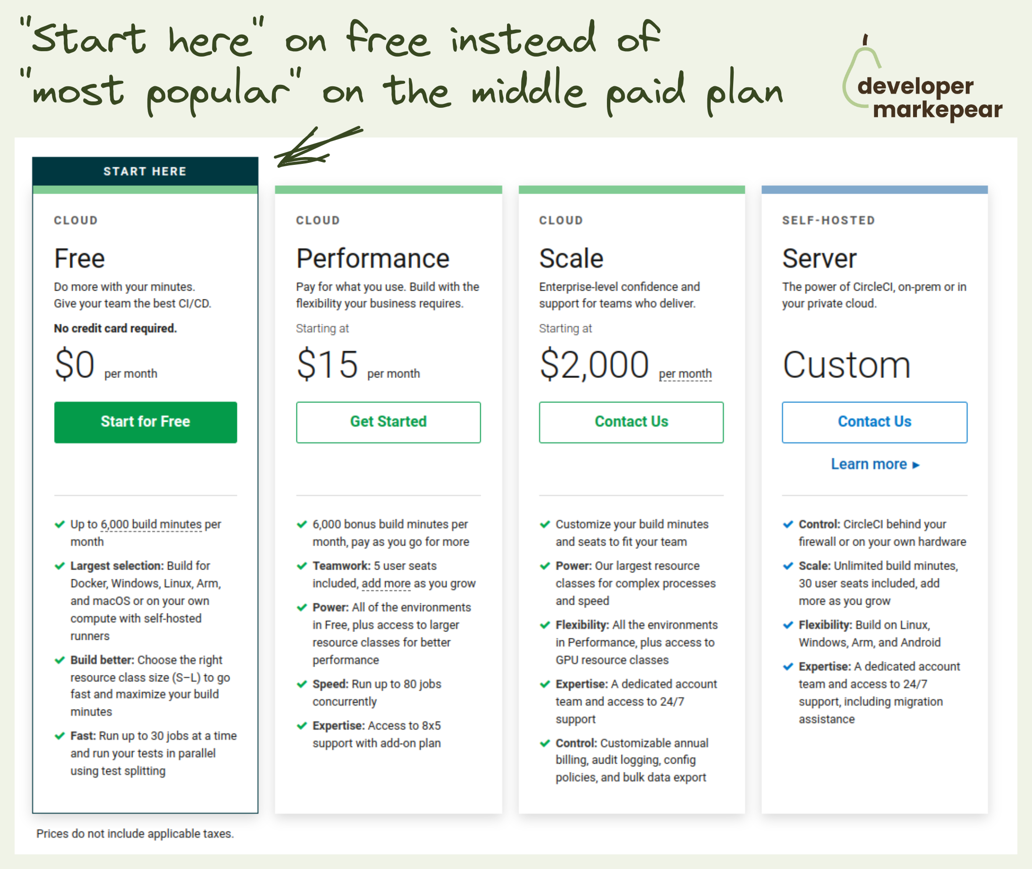
Why not highlight your free plan?
Most companies highlight their middle paid plan saying it is "most popular".
First thing, yeah, sure it is your most popular plan.
But more importantly, most visitors will not convert to your paid plans right away.
So why not try and capture as many devs as possible on the free plan?
If they like your dev tool there are many things you can do to convert some of them to paid plans.
But if they leave that pricing page and go with some other free tool, you are not converting anyone.
@CircleCI highlights free and they are in the mature, competitive market of CI CD tools.
Idk, it really does make a lot of sense to me.
If people need more advanced features they will choose higher plans anyway.
But if they want to get things started with the basic plans they will choose free or go elsewhere.
I'd rather have them choose free than none.

This is one of my favorite our dev tool vs competitor blog posts.
With these pages, you want to explain when you are better.
But you don't want to berate your competitor.
And above all, you want to help people make a decision.
Chances are (almost 100% ;)) that you are not better for every use case. And your developer audience knows it.
But there should be use cases, tool stacks, or situations when you are the best option.
Talk about those. Dev to dev.
@Convex did a great job in this post that I think can be a template for how to write these:
After reading that post you are fairly convinced that if your situation matches the one described and if it makes sense to use it.
Love it.

Adding CTA in dev-focused articles is hard.
You don't want to be too pushy, but you do want to get conversions.
DigitalOcean strikes a great balance with its in-text article CTA design.
They make this CTA look like an info box that you'd typically see in the documentation.
It is clear that it is a Digital Ocean CTA but it doesn't feel pushy.
It feels like a piece of potentially useful information.
Love it.
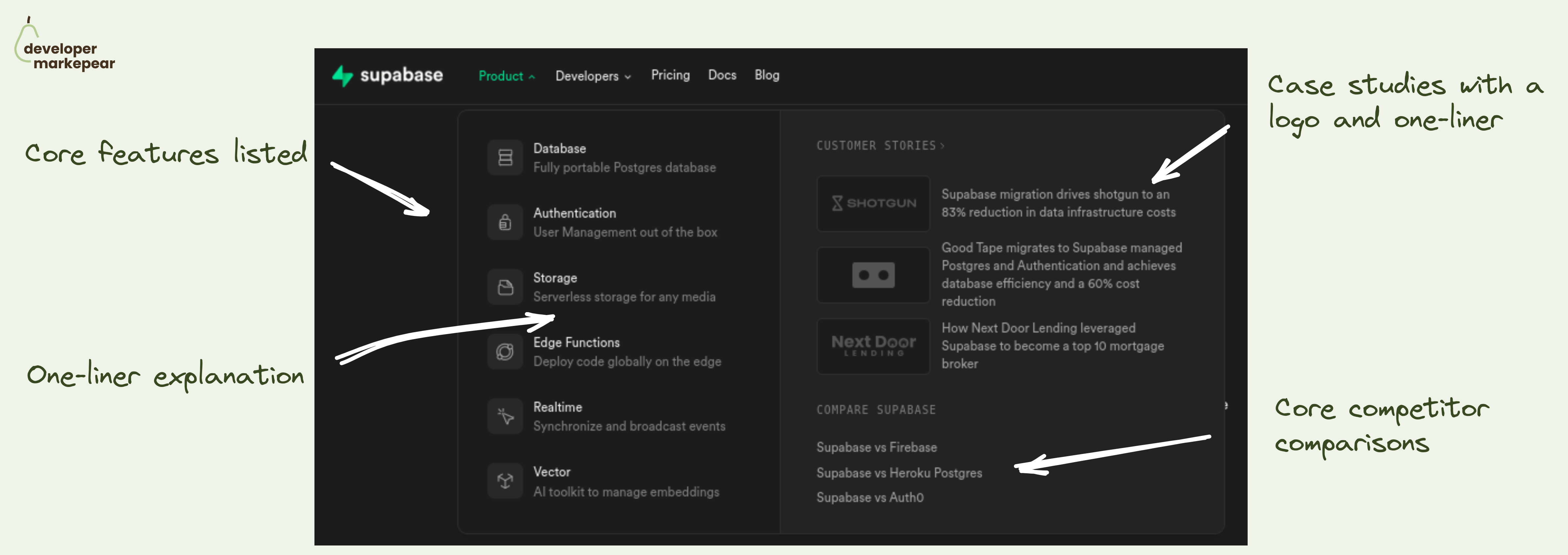
Really good product navbar tab from Supabase.
The product tab in your navbar is likely the most visited one on your site.
And there are a million ways of organizing information in there.
But ultimately, you want to help people understand what this product is about at a glance.
Even before they click. Even if they never click.
And how do you explain your product to devs?
By answering common questions:
Supabase does it really nicely:
Very solid pattern imho.
What I'd improve:

How to run developer-focused Reddit ads that get upvoted?
Reddit is well known for anti-promotional sentiments.
Just post something along the lines "you can solve that with our dev tool" and see.
So running ads on Reddit feels even more like a no-no.
Especially if you add problems with bot clicks and attribution as most devs will have some sort of blocks.
But you know your audience is on Reddit.
And for some of us, it may very well be the only social platform they are on.
So what do you do?
This is how @Featureform approached it to get almost 100 upvotes on an ad:
If you are going for brand awareness rather than a direct conversion those types of ads can work very well.
I liked it for sure.

Funny and memorable competitive billboard ad from @Statsig 👇
You have a big incumbent, everyone knows them. Use it to anchor your brand.
And tell the story of how you do things differently.
👀 But first, make people see you. And remember you in the next conversation when the big known brand or a category comes up.
And being funny is one of the best ways of getting attention and being remembered.
💚 I love how folks from Statsig did it here. Such a playful pun on the feature flag category incumbent Launch Darkly. Job well done.
Btw, this was shared by Oleksii Klochai in the Developer Marketing Community (you joined yet?).

Classic remarketing ad. But things are classic because they work 👇
Youtube remarketing is one of the most popular ways to stay top of mind with devs who visit your site.
Lots of devs spend time on Youtube so it is a solid match.
But, "buy now" style ads rarely work because if they wanted to try/buy they would have already.
They need something more.
That "more" is often trust.
They simply don't trust you, your product, and your company.
They don't think you are the real deal and will solve their problems.
But you can build that trust. And to do that you can use testimonial-style ads:
That is it.
Show enough of these and % of people will trust you and convert.
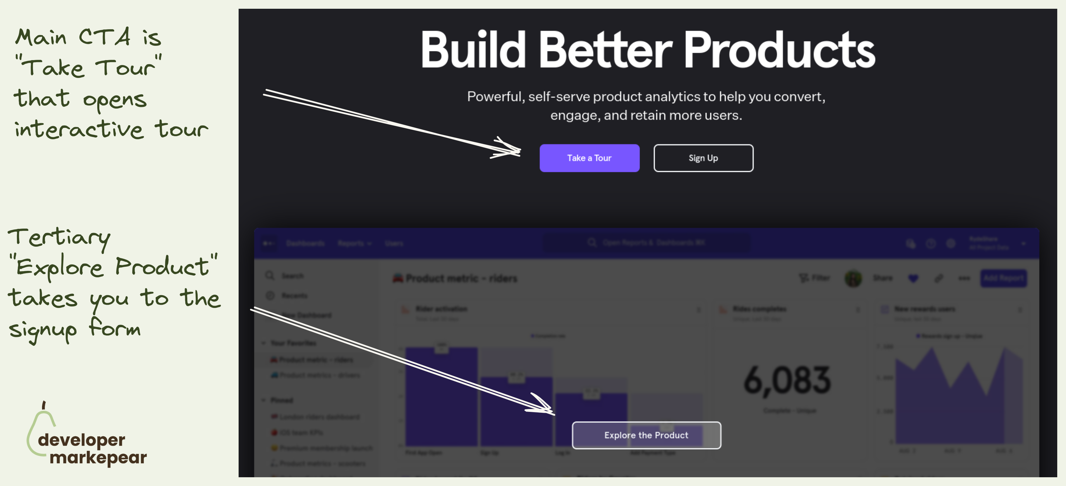
Mixpanel primary CTA is to take an interactive tour.
They take you to a 30min video + a guided UI tour.
Not a signup.
That is because with products that have long time to value (like analytics, observability etc) dev will not see value in the first session.
I mean to really see value you need to see real data, real use cases. And if you were to actually test it would take weeks.
That is why many companies do demos. But demos have their own problems (and most are bad).
Interactive tools make it possible for me to explore the value without talking to anyone.
I love this option.

Digital Ocean went for an ad for the Hactoberfest in a tricky place.
To keep it in the medium that fits YouTube shorts they:
I think doing YouTube shorts is an interesting opportunity in a yet unsaturated market (as of 2022).
And doing ads that fit that medium so nicely is an art.
Good job DO!

Show how product components fit together.
A good diagram is such a good solution to that.
They use the same colors and eyebrow copy that was used for body sections.
It all clicks now, I get the full picture.
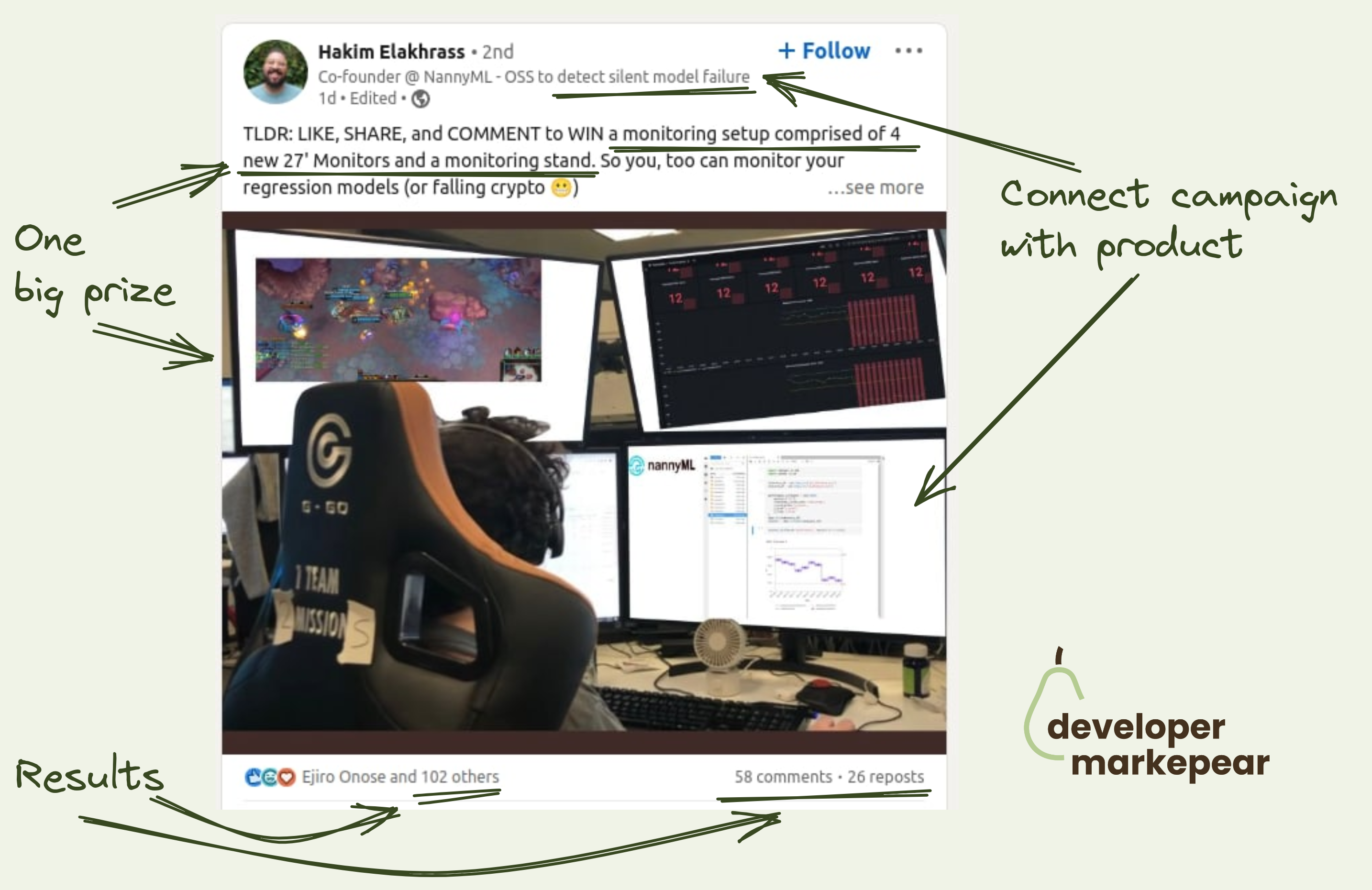
Is it better to do one big prize or many small prizes?
This is a decision you have to make when thinking about running a swag campaign.
Turns out that a small number of huge prizes can get you way better ROI on the same budget.
And NannyML has done it brilliantly here.
They are a monitoring tool and they give away monitoring setup.
This is something that actually can go viral. And it did.
Gonto shared an interesting play that they tried at Auth0 when he was running growth there.
So the story goes like this:
I think that doing just the sponsorship for the retargeting pixel could work.
But when you add that branding consistency between the sponsored site and the product the CTR is better.
Interesting one for sure.

Simple and powerful messaging.
They say what they do. Zero fluff.
They make it easy for devs by explaining how they are different than (obvious) competitors.
They add a little developer-focused social proof.

Linked GitHub logo in the navbar
Adding CTA to your GitHub repo makes your company look more dev-friendly.
If you have a ton of stars I'd show those as well to play that social proof card.
But even without it, I think it's a good way to get more traffic to your repo and get those stars :)
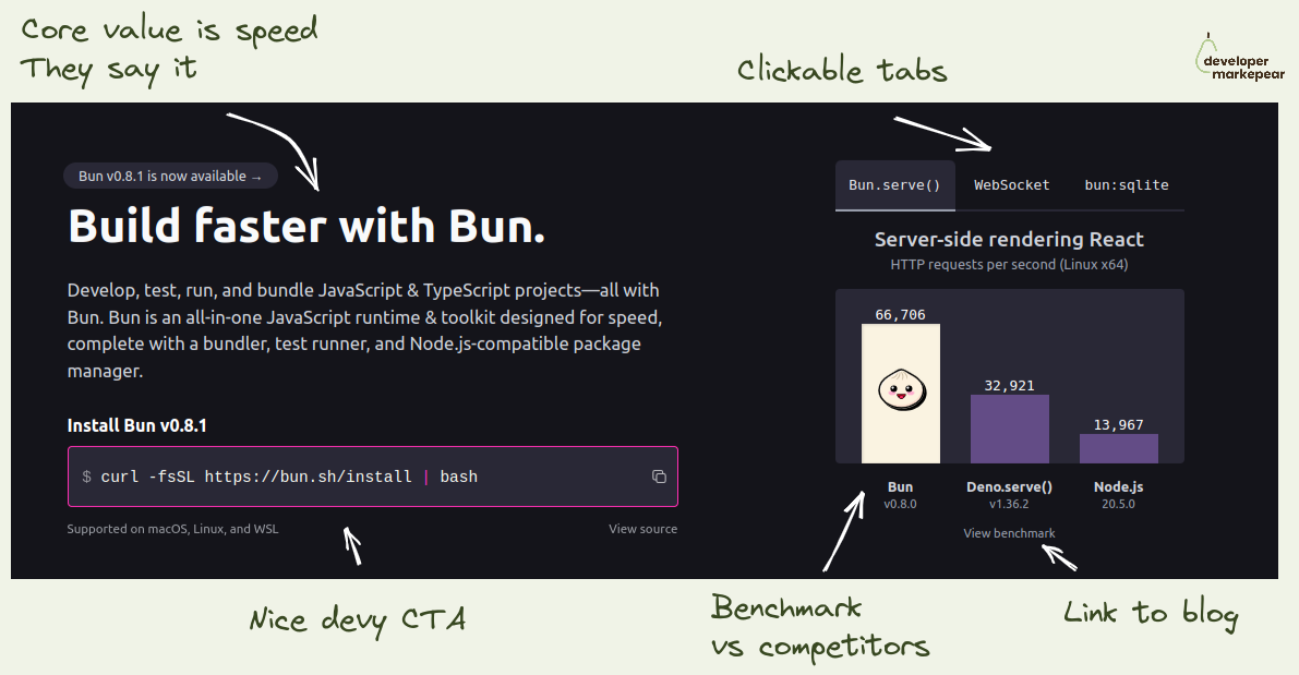
If your dev tool's USP is that it is faster -> Show it in the header
I like how folks from Bun focus on the fact that they are a faster library.
They show the benchmark as the key visual on the homepage header.
I love it.
If you think about it how else do you really want to show that you are faster?
This is believable, especially with a link to the benchmark so that I can dig deeper.
They show competitors, they don't pretend they don't exist.
And they talk about being faster left right and center.
I mean, they drive this "we are faster" home for me.
If that was important to me, I'd check it out.

Super short dev tool case study on a single viewport.
Many case studies follow a Hero -> Problem -> Solution -> Results framework.
Many try and do it on a one-pager.
But what @Resend did is next level and I like it.
Especially with devs, you want to be technical and succinct.
And Resend took all the possible fluff out of it.
I'd like to have some before or after probably or a stronger results (or pain) ) focused headline.
But I think this is great actually.

How to write a "What is {MY CORE KEYWORD}" article that gets to the top of HackerNews? 👇
First of all, almost no one succeeds at that as you write those articles for SEO distribution, not HN distribution.
To get an SEO-first article on HN your content quality bar needs to be super high.
But you can do it.
PlanetScale managed to get their "What is database sharding and how does it work?" on the orange page (kudos to Justin Gage!).
Here is what was interesting about that article:
𝗦𝘂𝗽𝗲𝗿 𝘁𝗼 𝘁𝗵𝗲 𝗽𝗼𝗶𝗻𝘁 𝗶𝗻𝘁𝗿𝗼.
• ❌ No "In today's fast-paced data-driven world enterprises work with data" stuff.
• ✅ Just "Learn what database sharding is, how sharding works, and some common sharding frameworks and tools."
𝗛𝗶𝘁𝘁𝗶𝗻𝗴 𝗸𝗲𝘆𝘄𝗼𝗿𝗱𝘀 𝘄𝗵𝗶𝗹𝗲 𝗯𝘂𝗶𝗹𝗱𝗶𝗻𝗴 𝗿𝗮𝗽𝗽𝗼𝗿𝘁 𝘄𝗶𝘁𝗵 𝘁𝗵𝗲 𝗱𝗲𝘃 𝗿𝗲𝗮𝗱𝗲𝗿.
💚 Speaking peer to peer, not authority-student:
• "You’ve probably seen this table before, about how scaling out helps you take this users table, all stored on a single server:"
• "And turn it into this users table, stored across 2 (or 1,000) servers:"
• "But that’s only one type of sharding (row level, or horizontal). "
𝗨𝘀𝗶𝗻𝗴 𝗷𝗮𝗿𝗴𝗼𝗻 𝗮𝗻𝗱 𝘂𝗻𝗱𝗲𝗿𝘀𝘁𝗮𝗻𝗱𝗶𝗻𝗴 𝘆𝗼𝘂𝗿 𝗮𝘂𝗱𝗶𝗲𝗻𝗰𝗲
Things like:
• "Partitioning has existed – especially in OLAP setups"
• "Sifting through HDFS partitions to find the missing snapshot "
𝗔𝗰𝘁𝘂𝗮𝗹𝗹𝘆 𝗲𝘅𝗽𝗹𝗮𝗶𝗻𝗶𝗻𝗴 𝘁𝗲𝗰𝗵𝗻𝗶𝗰𝗮𝗹𝗹𝘆 𝗵𝗼𝘄 𝘁𝗵𝗶𝗻𝗴𝘀 𝘄𝗼𝗿𝗸
🔥 Look at the section "How database sharding works under the hood" with subsections:
• Sharding schemes and algorithms
• Deciding on what servers to use
• Routing your sharded queries to the right databases
• Planning and executing your migration to a sharded solution
🎁 𝗕𝗼𝗻𝘂𝘀: 𝗽𝗹𝘂𝗴 𝗶𝗻 𝘆𝗼𝘂𝗿 𝗽𝗿𝗼𝗱𝘂𝗰𝘁 𝗴𝗲𝗻𝘁𝗹𝘆
Section "Sharding frameworks and tools" shares open-source tools (every dev, but HN devs in particular like OS projects).
And there as an info box, you have the info that Planetscale comes with one of those OS projects deployed.
Just a beautifully executed piece of content marketing.
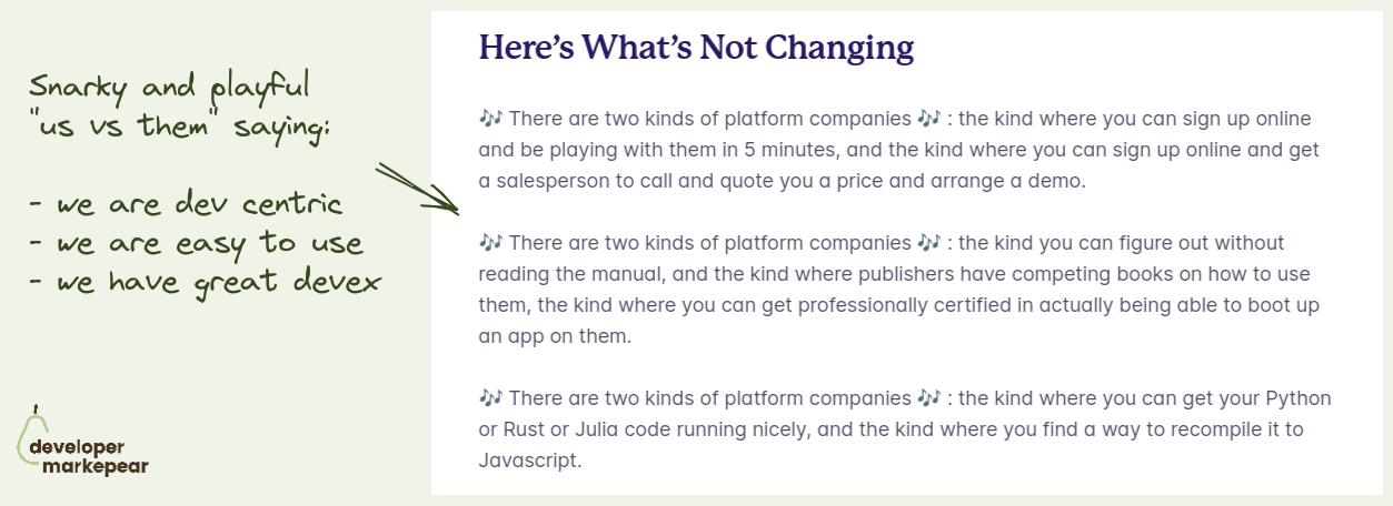
"There are two types of companies": Just a beautiful piece of copy from Fly.io
Doing us vs them doesn't always play out well.
But folks from Fly made it snarky and playful and fun.
And they basically said that they are:
And this is just such a nice brand play as well.
You just show personality and confidence in this devy snarky way.
I dig it.
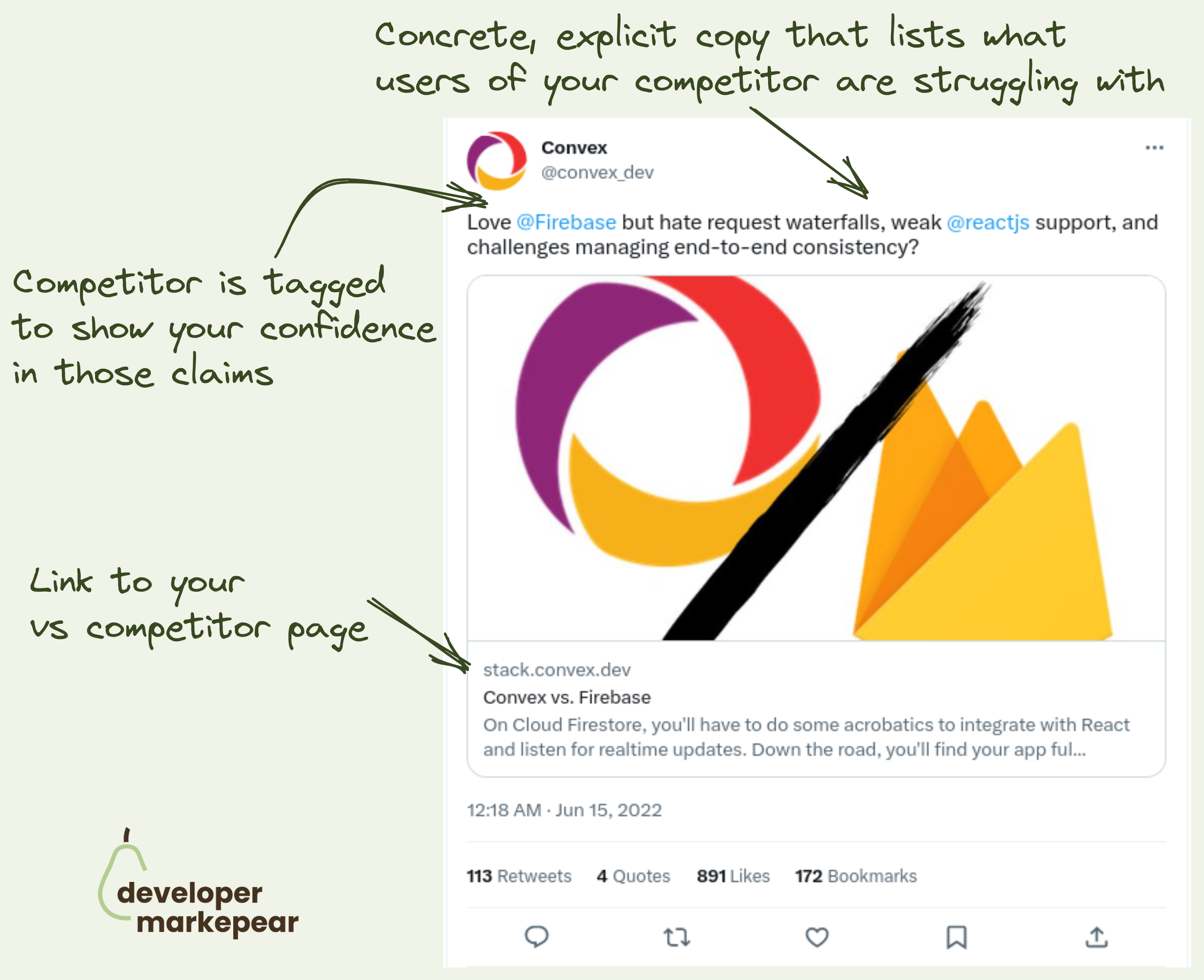
VS competitor ads are hard to pull off with devs. Not impossible though. 👇
So the problem is that:
@Convex does it really nicely here:
And even though this is by a "aggressive" competitor marketing hundreds of devs liked/bookmarked this tweet.
Good job!
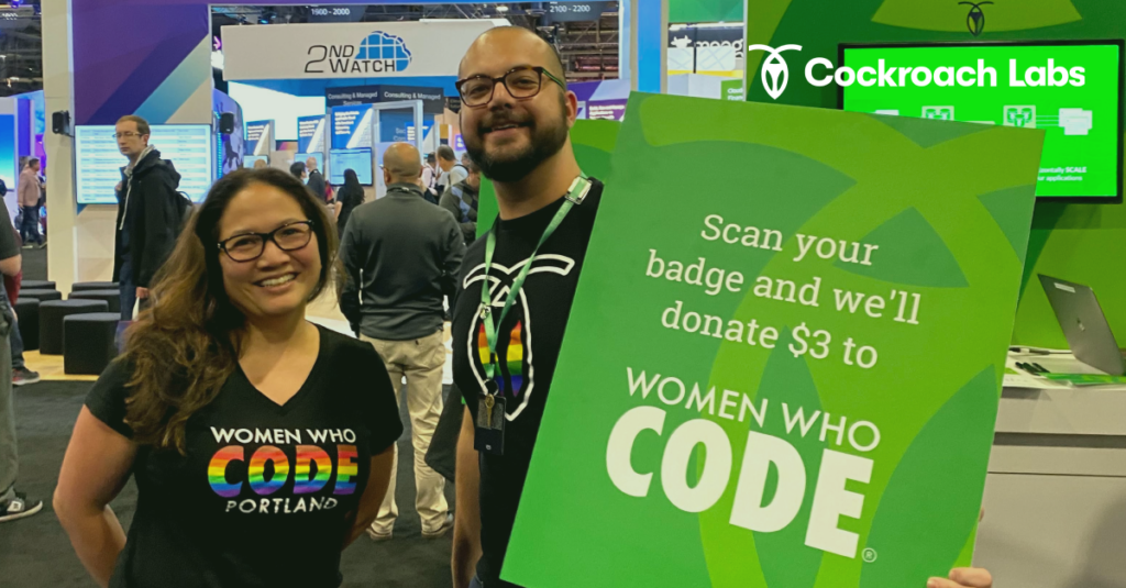
What if your next swag was a donation? That's what Cockroach Labs did.
Ok, so the typical way of doing swag at a conference is to give out t-shirts for badge scans.
And then folks either wear them or throw them away (or keep wearing them when they should have thrown them away but that is another story).
After the conference you take leftovers with you, ship them home or, you guessed it, throw them away.
A lot of throwing away for a badge scan if you ask me.
Cockroach Labs decided to do something completely different.
They donate a few $ to a great charity @Women Who Code for every badge scan they get.
I love it.
An extra benefit (and where the idea originated) is that with this, you can do virtual badge scans too.

Devs like diagrams.
When you explain a complex concept in one diagram it is just very shareable.
If you are interested in reading more there is an entire "blog post" when you click see more.
Just a very solid content format.
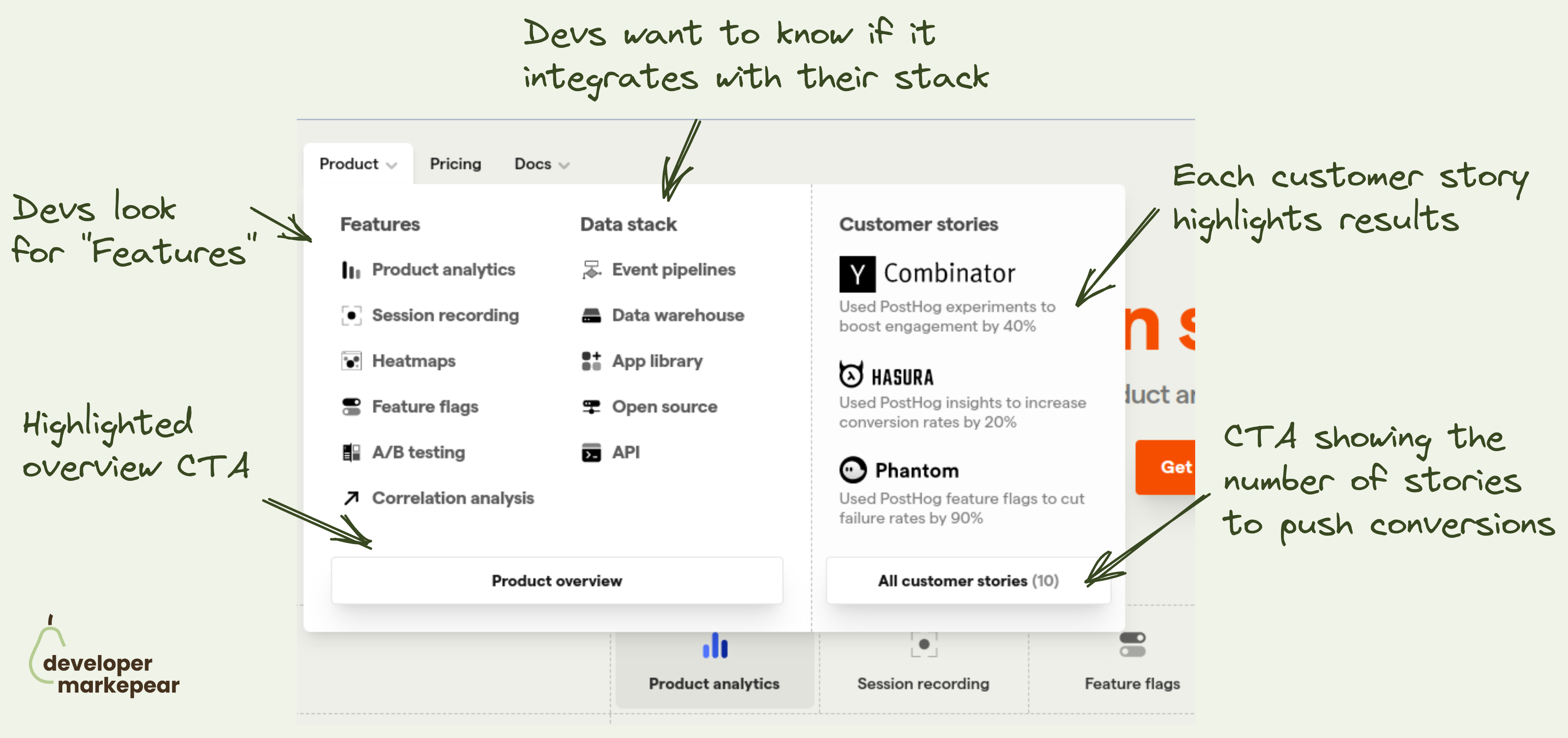
How to design the navbar product tab? This is what @PostHog does 👇
Figuring out what to put in the navbar is tricky:
The "Product" tab is especially tricky.
It can get overloaded with a ton of content.
I like how Posthog approached it:
I like it.

With/without is a classic marketing campaign theme.
AhoyConnect does it nicely in this ad.
Obviously, not everyone loves memes.
But many devs do.
Those who do may smirk -> smirk builds brand affinity.

This is a solid swag copy template that resonates with devs.
"I did X and all I got was this lousy Y"
Why this works imho is:
Very solid start if you run out of ideas.
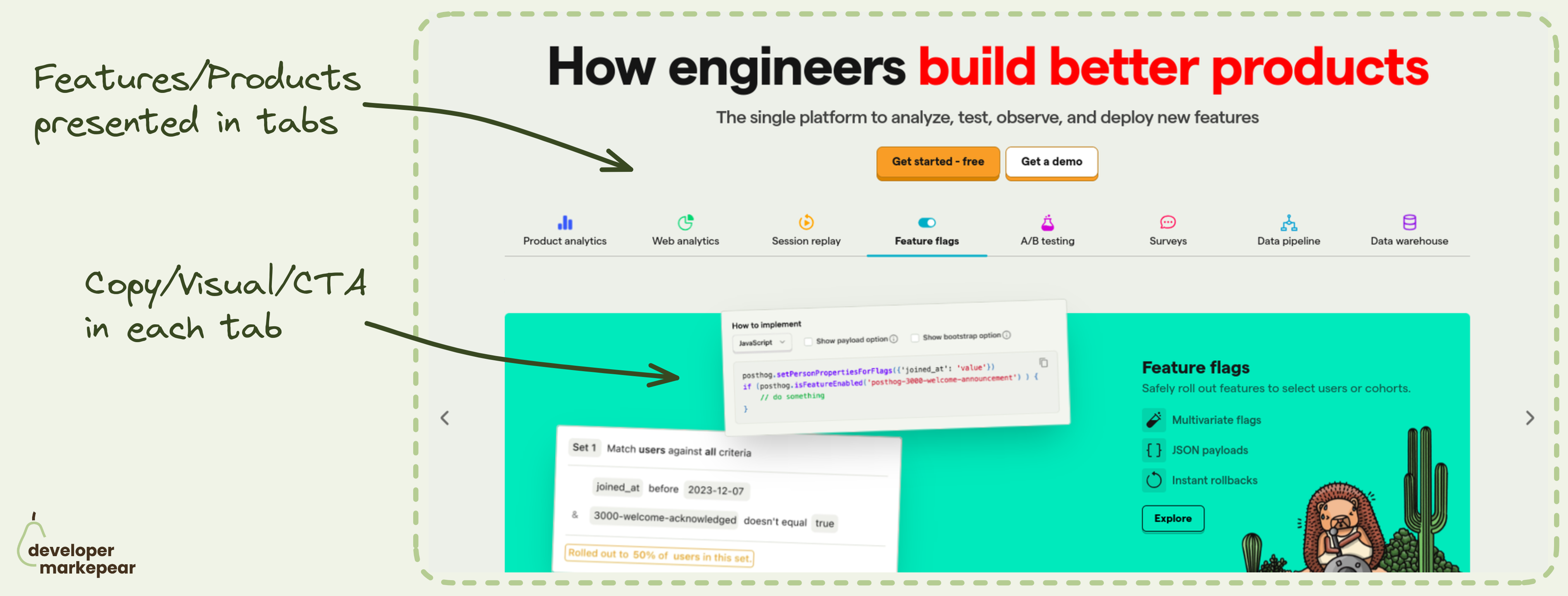
Which feature/product to show in the header?
How about all?
Many dev tool products are feature-rich. And you want to show those awesome features.
But it is easy to overwhelm the reader when showing so much info.
That is why I really like the header tabs pattern that @PostHog uses:
This pattern is especially powerful when you want to communicate completeness.
Posthog definitely wants to do that. If you are on that train I'd strongly suggest considering/testing it.

Sometimes your product just wins on price.
I like how New Relic owns it on this page:
After reading this I'd trust them to give me a solid price estimate and that it will likely be cheaper than Datadog.
Obviously price is not the only reason why we choose tools, but if that was a problem I had with Datadog, they have my attention.
Say what you do and how you do it.
What:
How:
CTA (bonus):

I love this copy. It answers:
It doesn't talk about the value as it is obvious to devs.
Obviously, it will save time and make things safer.
Don't talk about it.

Very nice design solution on the homepage.
Classic communication of the world before using your tool and the world after.
Really liked how it felt messy before.
And is nice and clean after.

Beautiful mockery of classic conversion tactics from PostHog website.
So what do we have here:
I have to admit I chuckled ;)
And I bet many devs who don't think of marketing very highly chucked too.
That builds rapport. (hopefully) makes you one of the tribe rather than another faceless corpo.
BTW, they used it as a bottom of the homepage call to action.
I like it.
Most of the people who scrolled there are not going to buy anyway.
But they may share the website with someone who will.
Great SEO tactic.
What folks from Cronitor did is:
This can be used for many dev-focused tools as by definition they use commands which can be templated.
I've heard about it originally from Harry Dry over at https://marketingexamples.com/seo/cronitor

Understand who is reading. Add social proof that speaks to them.
Social proof is about showing people/companies who are similar to the reader that they got success with the tool.
Company logos can be good if your reader knows and likes those companies.
But if those are random companies, I am not sure how much value does it bring.
Devs care what other devs who use your product have to say about it.
That's why I like testimonials.
Not the crafted, clean ones with features and values.
But the real stuff. Real devs sharing real stories.
Bonus points for "Okay, I get the point" button copy.
It changes from "Show more" when you click.
Nice!

Sometimes your pricing is just complex. But you can still make it work.
If you want devs to convert, make it possible for them to estimate the cost.
@Mux does it nicely with a calculator:
What is crucial is that the calculator dimensions need to be understandable and familiar to the reader.:
The goal of this is to make it possible for a person to get an estimate right here right now.
Not have to setup a meeting with half the team to figure your pricing out.
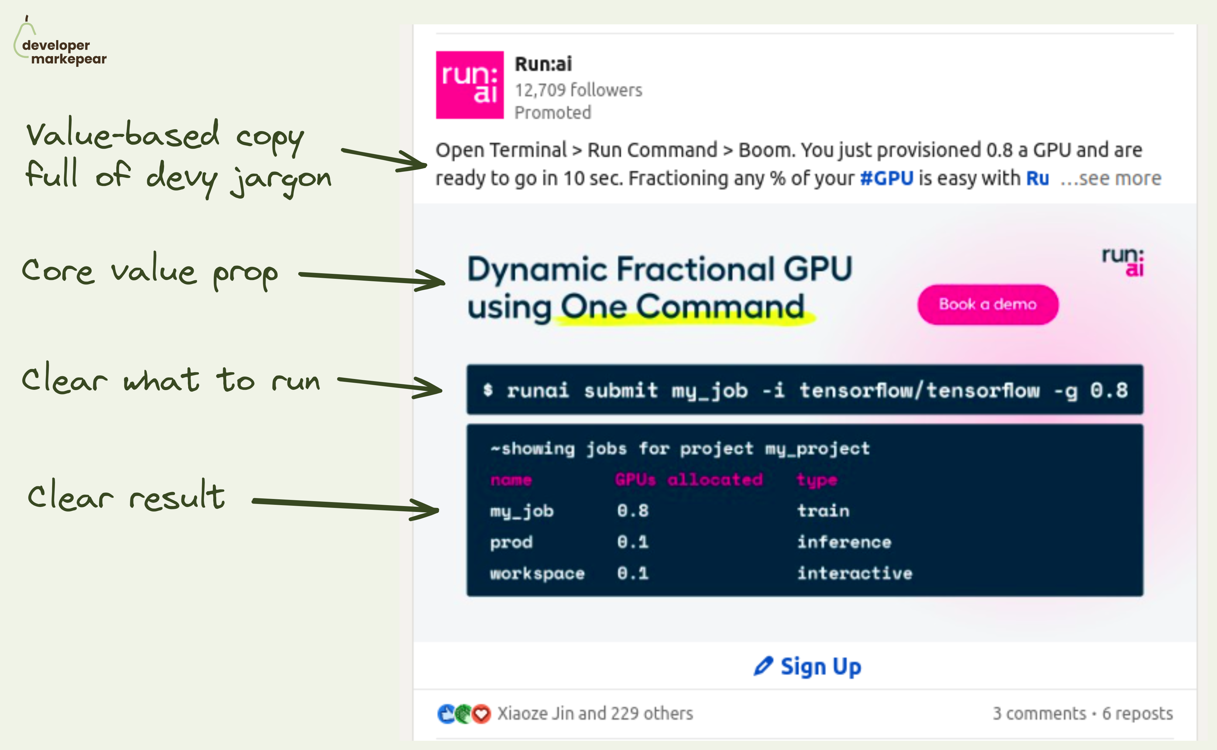
𝗔𝘁𝘁𝗿𝗮𝗰𝘁𝗶𝘃𝗲 𝗮𝗱 𝗰𝗿𝗲𝗮𝘁𝗶𝘃𝗲 𝗳𝗼𝗿 𝗮𝗻 𝗶𝗻𝗳𝗿𝗮 𝗽𝗿𝗼𝗱𝘂𝗰𝘁 𝘁𝗵𝗮𝘁 𝗿𝘂𝗻𝘀 𝗶𝗻 𝗮 𝘁𝗲𝗿𝗺𝗶𝗻𝗮𝗹?
Hard, but Run.ai did that.
Infra products are not "obviously cool".
There is no shiny UI, no happy people wearing your sneakers,
So what do you show on your ads?
First off, the rules still apply:
• Catch your audience's attention
• Say what you do in their language
• Better yet, show how it actually does it
And Run.ai ai and MLOps infra tool managed to create a beautiful Linkedin ad IMHO:
• They catch attention with the code visual
• They say what they do quickly with "Dynamic Fractional GPU using One Command"
• They extend on that in the post copy with an action-driven "Open Terminal -> Run Command -> Boom"
• The code shows what it feels like to use the tool
• And it shows you the result -> fractional GPUs
Job well done!
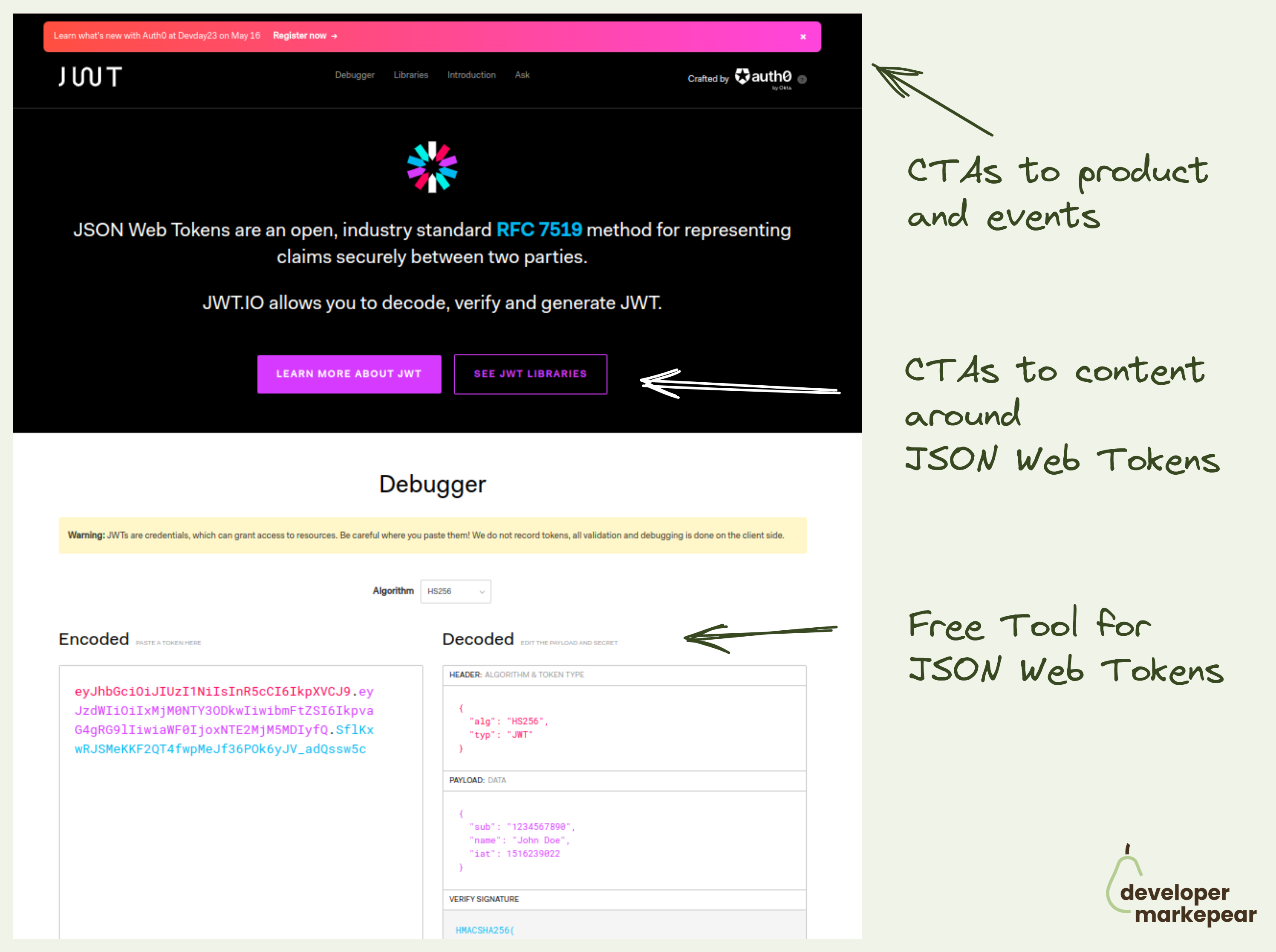
Marketing through free tools is powerful. And Auth0 implemented it beautifully.
In an old article from Gonto I read about some free tools that Auth0 created years ago.
And those tools are still generating traffic and leads today.
And they are helpful to developers and make the Auht0 brand even more appreciated by the community.
One of those tools is JSON Web Token Debugger.
So how this works for them is this:
Now, Gonto suggested that is important to do it on a separate domain to make it less promotional.
I am not sold on that especially when I know there are companies like @VEED.IO that build "SEO tool clusters" in the /tools/ subfolder of their page and crush it in search.
But either way, if you can solve a real problem your target devs have, no matter how small, you should be able to get some developer love (and $) from the value you created.
There are a few developer experience gems here:
Also, their design is super clean, non-invasive, and simple which makes for easy content consumption and more developer love.

Action-focused copy is usually better than "sign up".
But sometimes it is hard to find a good copy for this.
Some teams like Vercel or Auth0 do "Start building "
But that doesn't always work.
I really like this "Get API keys" CTA copy.
Now for the Hero section I really like those two CTAs:
Really great job imho.
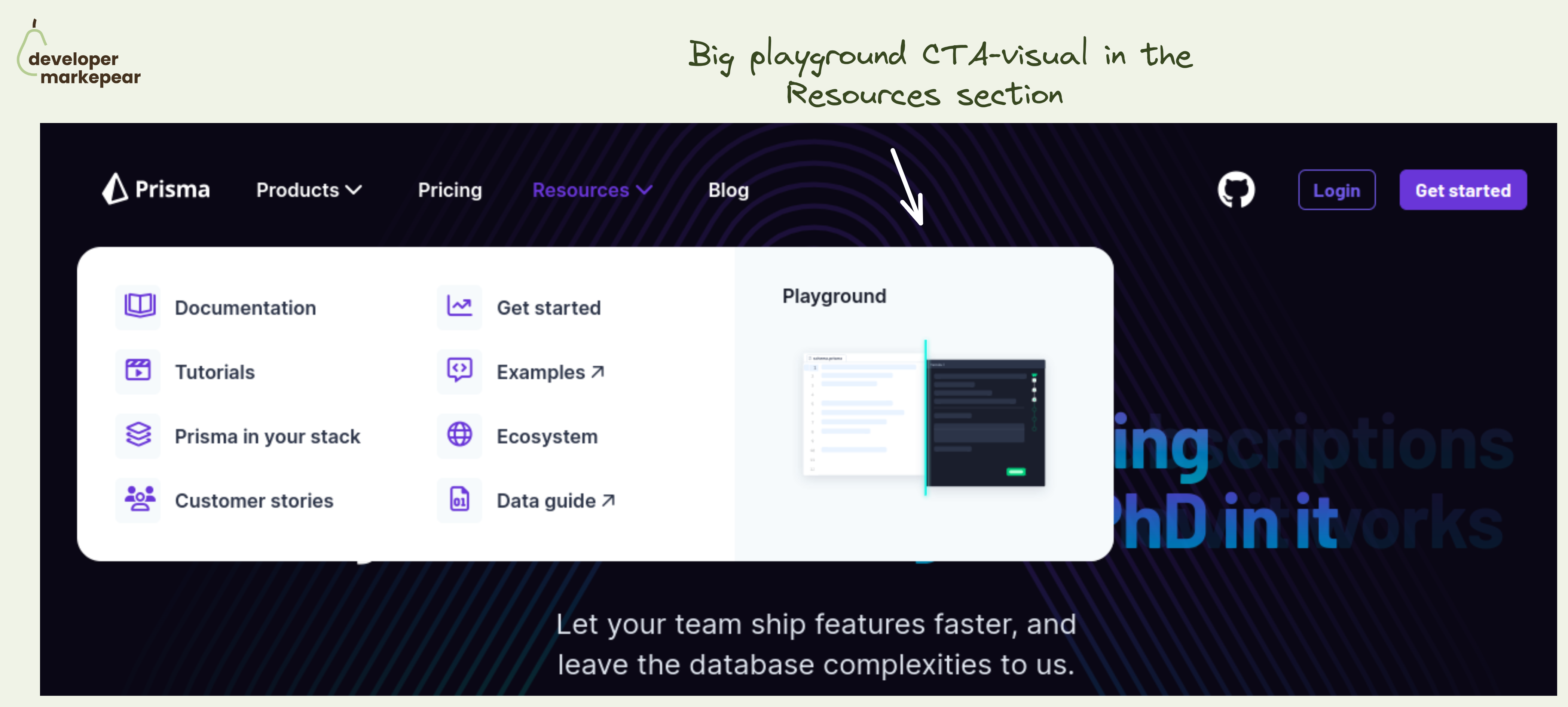
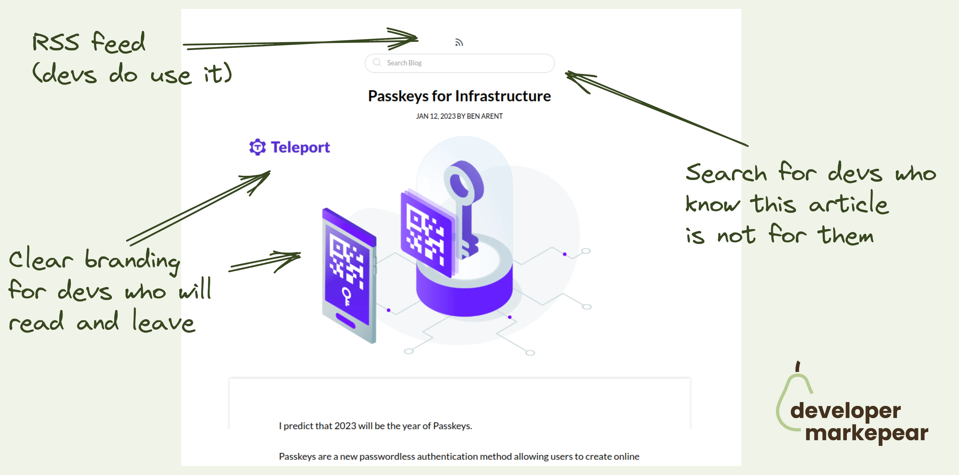
Simple yet powerful CTA in the navbar resources section.
The resources section in the navbar is mostly navigational. Well, the entire navbar is ;)
But you always have that one action that is more impactful than others.
💚 And I think that a Plauground is a great option. You get people to see how your product works. You let people play with it and see for themselves.
Not many next actions can be as impactful as getting people to experience the product.
Especially if you are a heavier infra tool that people cannot really test out in that first session. I mean, you won't really create a realistic example of your core database in 15 minutes to see how that new tool that you just saw works.
🔥 Making this CTA "big and shiny" and showing a glimpse of what will happen after clicking is great too.
🤔 2 changes I'd test out:
But the core idea behind making the playground your core navbar resource section CTA is just great.
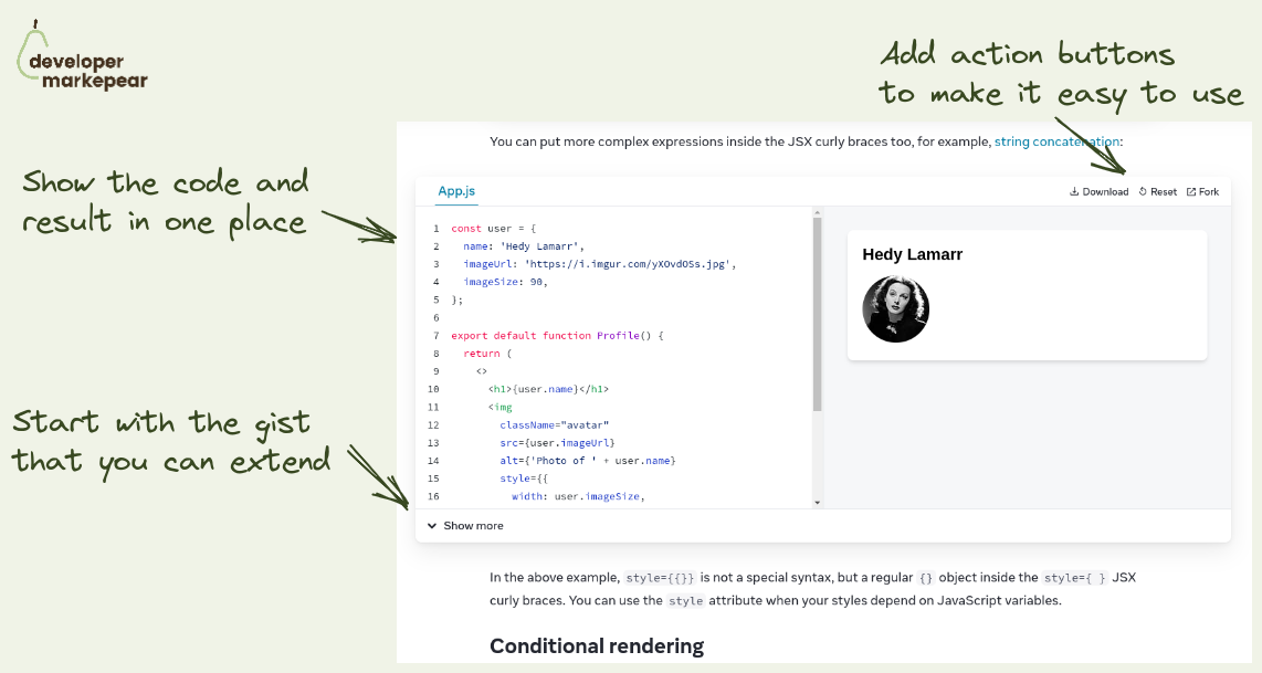
Nice way to show code and results straight from the React docs that people love.
And this pattern can be used outside of the docs for sure.
Anyway, a classic situation:
And folks behind React docs solved it nicely by:
Not groundbreaking maybe but a beautiful implementation that is just a delight to use.
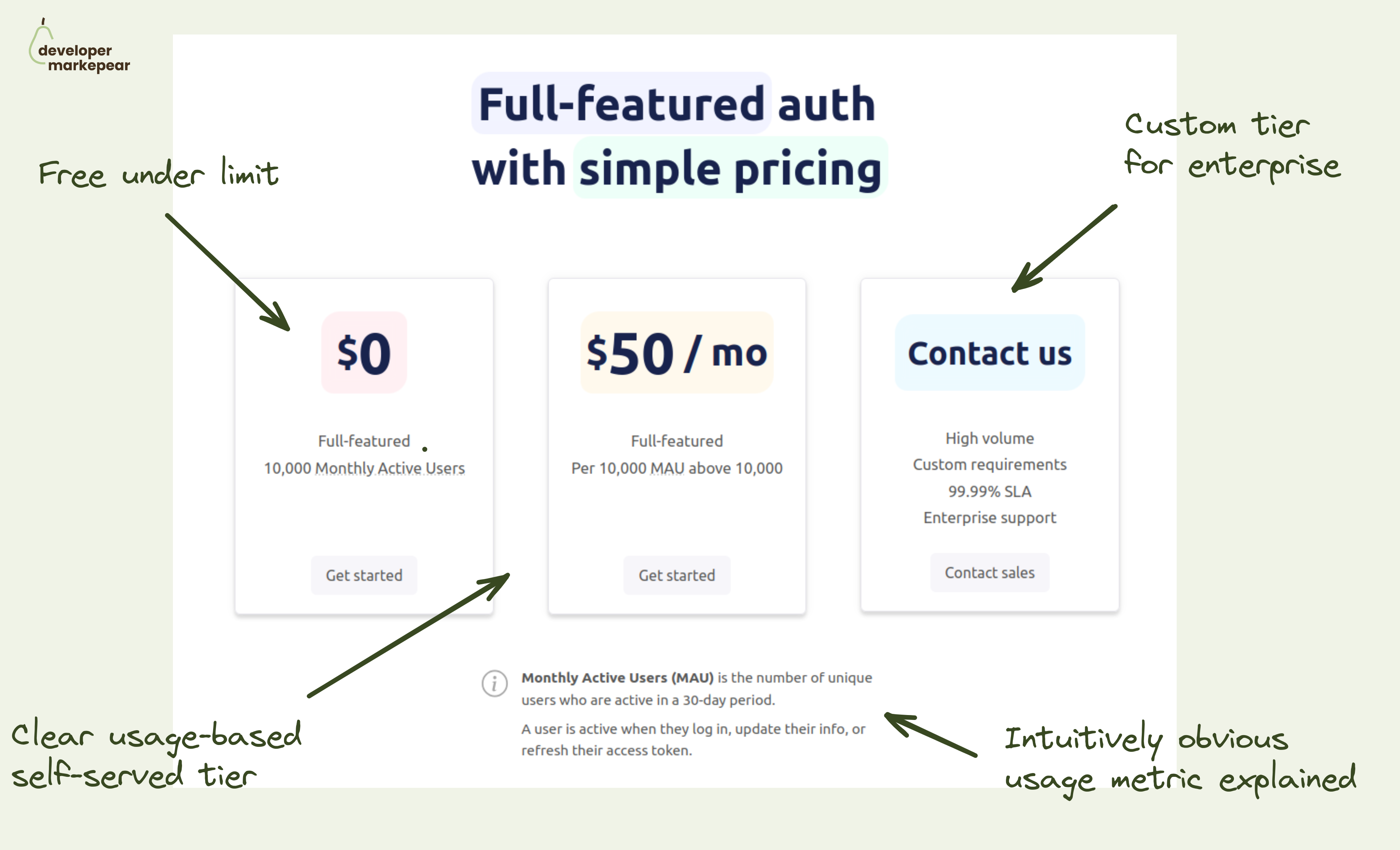
How do you make your dev tool pricing simple?
I really like this one.
Saw someone share a pricing page from Userfront some time ago and really liked it. They changed it now but I really like the thinking behind the older version.
It is just remarkably simple while hitting all the boxes:
Just a very good baseline.
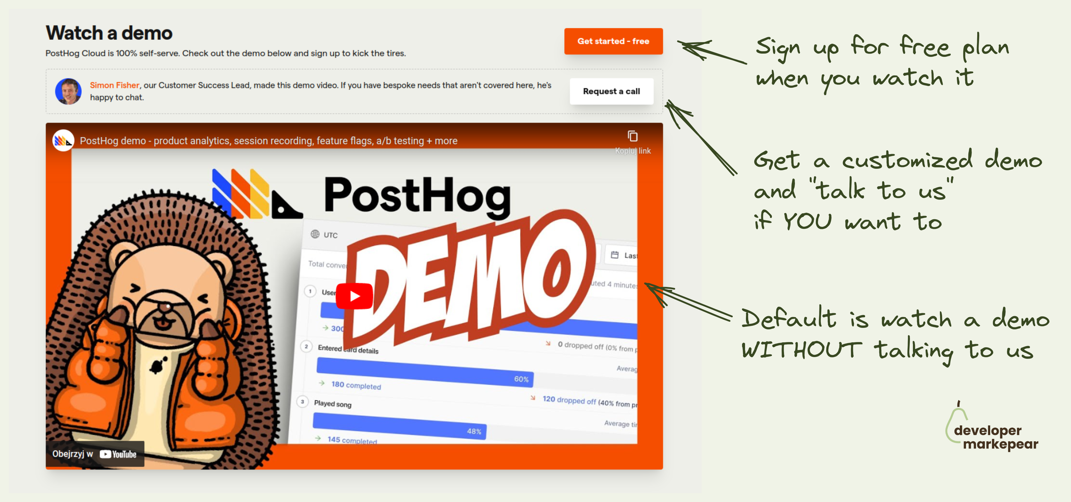
Devs have a love/hate relationship with "Book a demo" call to action.
Mostly hate though.
Especially if what they want is:
Let's just say that sitting through an hour demo call with a salesperson just to get the pricing is not what most devs love to do with their time.
But there are moments in the buyer journey when devs do want to have that live session:
Then, having a live session/demo is the fastest way to move forward.
@PostHog handles this dev journey reality nicely with:
This approach solves both scenarios really nicely.

What CTAs should you choose for your open-source project homepage?
Was always wondering what is my default.
There are many options: "See docs", "Get started", "Sign up", "Start X"
But in open-source you want people to start playing with it, install it.
So what should you choose?
Recently came across Astro homepage and loved what they chose.
"Get started"
Install code
Whatever I choose I will actually get my hands dirty.
I think this will be my default from now on.

There are a lot of boring vendor t-shirts at conferences.
And they get boring results.
I like this bold design from GitGuardian:
Nice.

I like the simplicity of this announcement.
What: "Vercel Edge Middleware"
Why: "Start delivering dynamic, personalized content without sacrificing end-user performance."
Visual supports this but is super minimal.

I like that this is both strong and subtle.
It comes right after I've delivered a smell of value with a technical intro.
And I can see that there is more value to come after thanks to the table of contents.
The CTA itself feels like an info box in the docs rather than a typical subscribe CTA.
Good stuff.
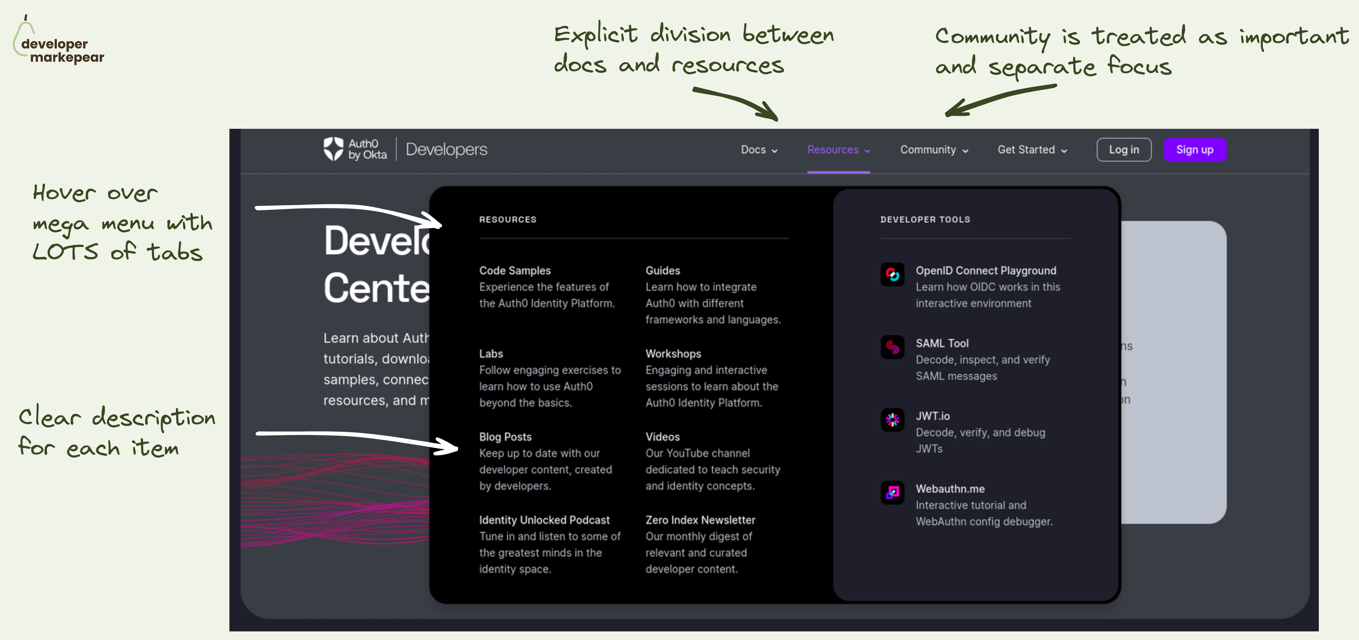
Navbar is a hugely important conversion lever on the dev-facing website. I saw it move the needle by x times in some cases/conversion events.
So, what does a good one look like?
Auth0 did a great job on their developer portal. But the learnings can be applied to your marketing website too.
What I like:
That makes it easy for devs to explore. Without having to click out to see what each tab/item means. And when devs know what you mean they are more likely to actually click out. And convert.
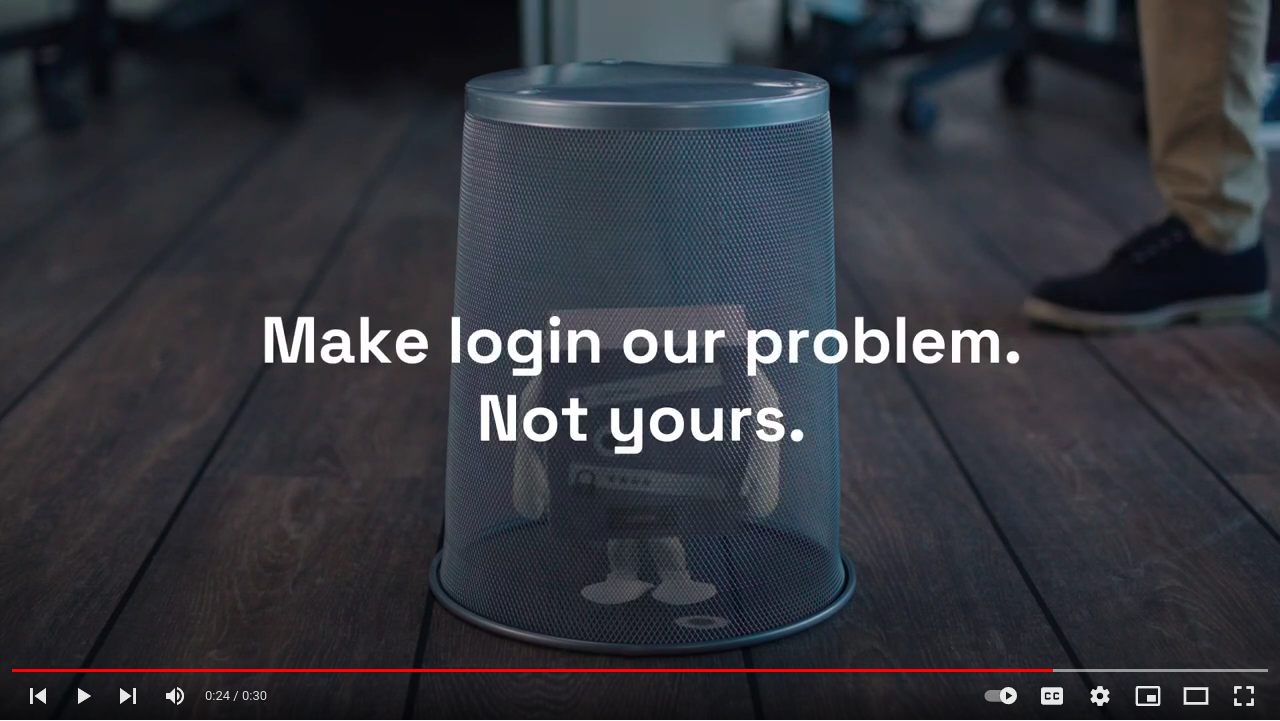
Make login our problem. Not yours.
This is a beautiful messaging of Auth0 solution.
Login
Simple explanation of what it does/gives you.
Simplified of course
Our problem. Not yours.
You "outsource" this boring but important problem to someone else.
It also has a feel of SaaS in there.
They will take care of it.

How to do a dev-focused brand video and get 10M+ views?
Making a memorable brand video is hard.
Doing that for a boring tech product is harder.
Doing that to the developer audience is next level.
Postman managed to create not one but three of those brand videos that got from 4M to 10M youtube views.
The videos I am talking about are:
So what did they do right?
Honestly, I am not exactly sure what special sauce they added but those are just great videos that you watch.
And I definitely remember them and the company which is exactly what you want to achieve with brand ads.

I love that it is static and it blurs everything I don't need to get the concept.
For the dev audience, static graphics, when done well, are better than
Tell me what you do in 1 sec, not 60

I like how this starts with a [WHAT IT IS ABOUT] scroll stopper.
That is coupled with a big block of code that has:
(presumably) when you click "See more" you get the rest of the text post.

How to bring attention and trust to a feature section?
Add a testimonial.
Ideally, it should talk about that feature to make your message even stronger.
I like how Appsmith made it animated and it just makes you look.
And you read the testimonial and look at the feature above it.
Good stuff.

Streamlit has an amazing explainer.
They show how to go from:
In 42 seconds.
No audio, just code and a simplified result window.
Amazing stuff.
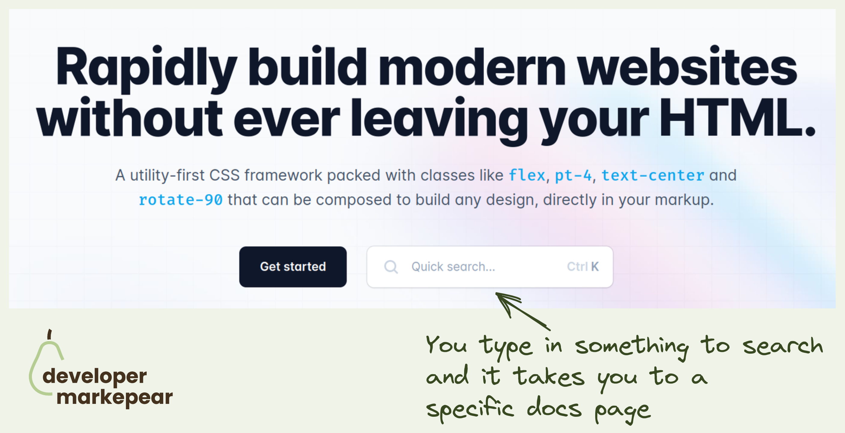
"See docs" is one of my favorite secondary CTA on dev-focused pages.
TailwindCSS takes it to the next level by inserting docs search right into the header CTA.
This takes devs directly to the page they are interested in rather than have them try and find things for themselves.
They could have searched the docs in the docs, of course.
But this is just this slightly more delightful developer experience that TailwindCSS is known for.

How easy it is to get started is a big conversion factor for any dev tool.
Devs want to test things out and if it is hard to do they will be gone testing a competitor that made it easy.
And so a good how-to section on your homepage can make a big difference in getting devs to that first experience.
Appsmith does it beautifully with their 1-2-3 How-to section:
It is so engaging and just beautifully designed. And the CTA to additional resources like integrations, widget library, and docs make the message land. I do believe it is easy to set this up.
Great pattern to copy-paste imho.

I like how this post shows:
All in one visual post.

When selling dev tools you typically have 3 "buyer" levels:
Individual dev:
Team lead:
Org lead:
How does Postman solve it?:
They even go the extra mile. Something I didn't see too often.
They understand their customer's reality and identified one more level between Org and Team.
Basically a department-level unit that probably has multiple teams but is not at the organization/enterprise level.
I really like what they did hear. Solid.

Devs are builders.
Make your home page for builders.
Go directly into the "how" instead of the way.
Many devs when they land on your home page, already know the "why".
I love that it:

A freaking developer TV.
They took this "be a media company" to the next level.
They created entire TV around their company, audience, and products.
I respect people really going all in.

One of the top-performing conversion flows in dev-focused articles.
"Aside CTA" in the "How to do {jobs to be done}" article.
You know the drill:
And Export SDK executes it (almost) perfectly:
One thing that could be tested and changed is putting this "Aside CTA" mid-article and not at the end (tip from Martin Gontovnikas).
A good thing to try if you are running the "How to do {jbtd}" article strategy.

Memes that resonate with your ICP (in this case website backend devs who use PostgresSQL).
Content like this helps people find their tribe.
And then those memes can get folks to follow your account.
If you mix your content well you can then push them further down the funnel.
Memes are good top-of-funnel, awareness-type content.
Many companies use them on socials as they can "go viral".
But.
You need to either:
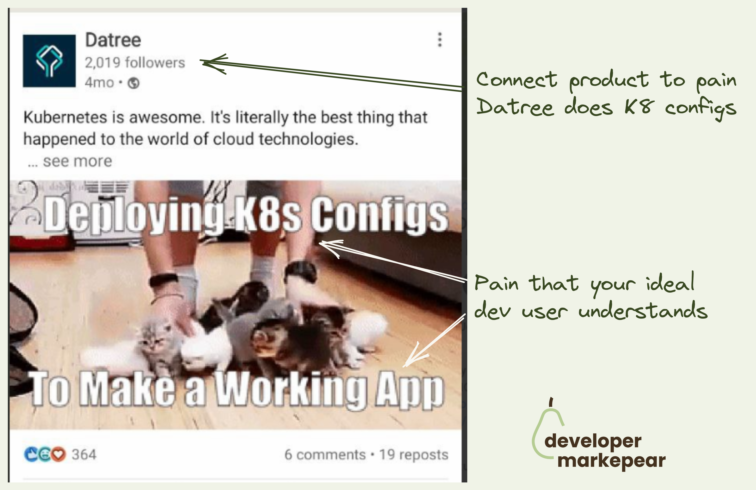
I like how Datree connects it to the product here.
They are a Kubernetes configuration tool and talk about exactly that here.
They do that with jargon too "k8", "config". When used well it can help you belong to the tribe you are marketing to.

Dorky joke right?
But it does two very important things beautifully.
It gets a smirk (from some people) and when it does you know you just moved someone closer to your brand.
It has a clear CTA which is hard to do with joke-format ads.
This subtle call to conversation/check us out does the job.
Love it!

I like those sidebar CTAs from Auth0.
They go with a sticky Table of Contents which gives a better reading experience.
They put two CTAs below that TOC:
Solid job.

An interesting option to push people to read the next article.
You use a slide-in triggered on a 75% scroll with a "read next" CTA in the bottom left.
On the aggressive side for sure but when the article you propose is clearly technical it could work.
And if your articles are not connected to the product explicitly you do need some ways to keep people reading and see more of your brand.

Mux does a few things beautifully in this header.
Value proposition:
Animated visual that is really good for dev tools:

I like how they use the black dot to show the mouse movements in the UI.
Simple but powerful and clear.
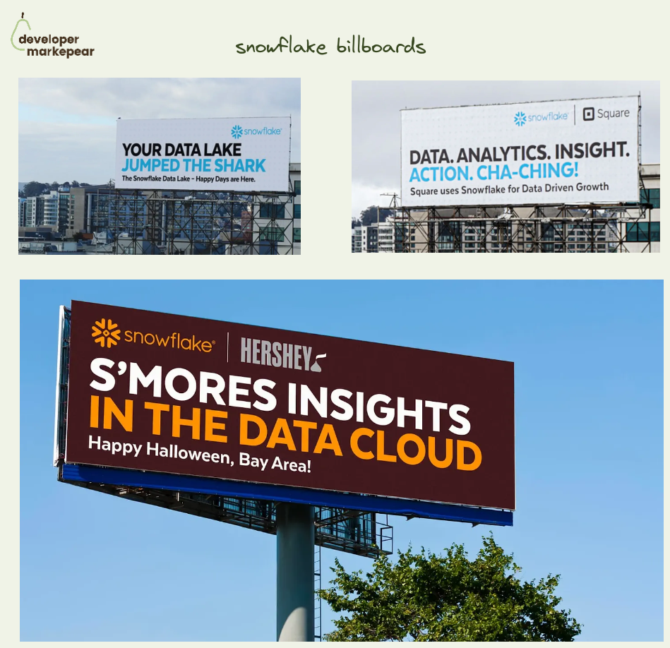
Ideating how to do dev tool billboards?
I like these from Snowflake.
Especially the customer showcase ones as the format can almost be copy-pasted ;)
One more interesting thing about those billboards though:
By doing that they seem to have billboards everywhere, fight ad fatigue, and stay top of mind.
Love it.

This has to be one of the better dev-focused headers I've seen in a while.
Headers should deliver your core product message and get people interested. That is true at any stage but early stage especially.
💡You want everyone, even those folks who just take a look and leave to remember. You want them to recall it in their next conversation around this topic.
There may be supporting messages for sure but there is always that one core thing. Make sure it lands.
In the case of Clickhouse, that core message is that they are a database that is fast at a huge scale.
Their supporting messages are:
💚And they deliver that beautifully with:
Headline
Clear as day headline speaking to value delivered at a level that builds rapport with their audience.
Not "Give users seamless web experience at scale" but "Query billions of rows in milliseconds". I like that little touch with "rows" which makes who they speak to obvious
Subhead
Subhead supporting it with "fastest and most resource-efficient DB"
+ talking about the use cases "real time apps and analytics" and it being open-source
Calls to action
These CTAs make the audience feel at home. There are docs in there + clear "we are open-source" CTA
Visual
That supporting visual is just amazing.
It shows the value in the most believable way you could deliver it here imho. Query and an Output that shows the size of the database and speed of the query
Social proof
Social proof in the navbar, almost 34k stars and a GitHub icon.
+ a way to get people to that repository, check it out and leave a star.
There is more social proof below the fold with big logos and stuff but the GitHub icon and stars make it immediately clear that this is a project that people care about.
It is remarkable how brilliantly simple it is all presented. Just a fantastic work IMHO.

Most dev tools have two deployment options:
And then companies present it on their pricing page with some flavor of two tabs.
And you need to name them somehow.
And how you describe those things sometimes adds confusion for your buyers:
I like how nice and simple solution Retool used on their pricing page:
Explicit, obvious and to the point.
Love it.