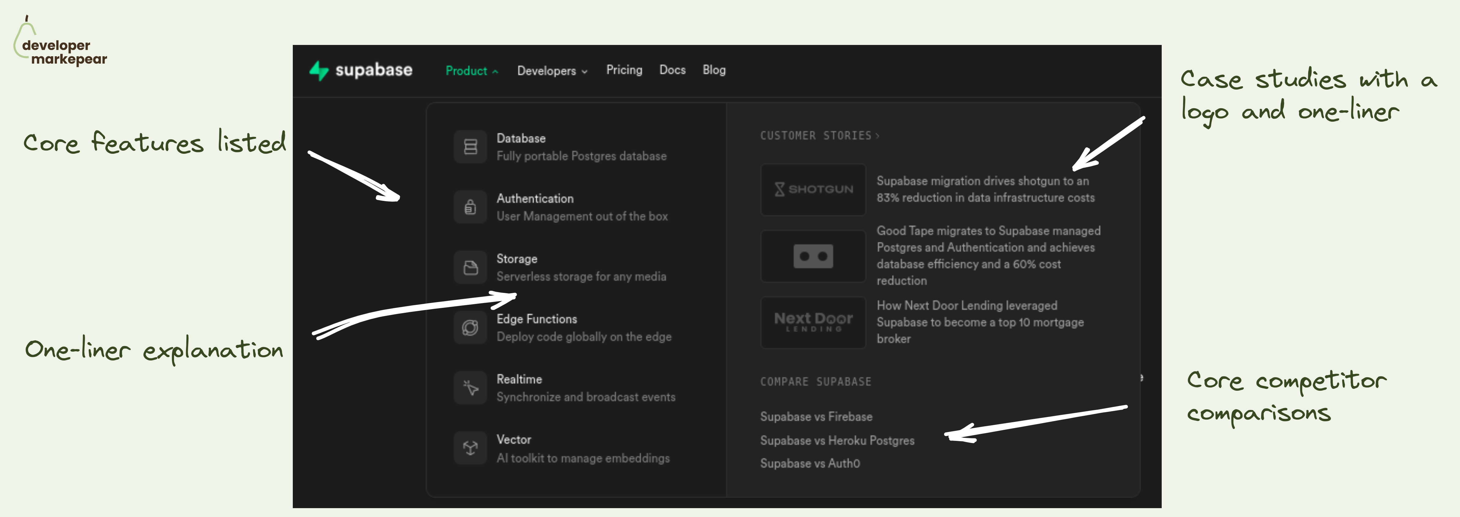
Really good product navbar tab from Supabase.
The product tab in your navbar is likely the most visited one on your site.
And there are a million ways of organizing information in there.
But ultimately, you want to help people understand what this product is about at a glance.
Even before they click. Even if they never click.
And how do you explain your product to devs?
By answering common questions:
- "What are the capabilities/features, specifically?"
- "What do people use it for in producution, specifically?"
- "Ok, so how is it different than ... I used before/use now?"
Supabase does it really nicely:
- They show features + give a one-liner explanation
- They show customer logos + a one-liner on what they got from it
- They list the most common competitors with links to deeper comparisons
Very solid pattern imho.
What I'd improve:
- Make the third testimonial copy more dev-centric, more specific -> It reads "... to become top 10 mortgage broker"
- I'd add a link to a page with all comparisons -> what if I don't see mine?
