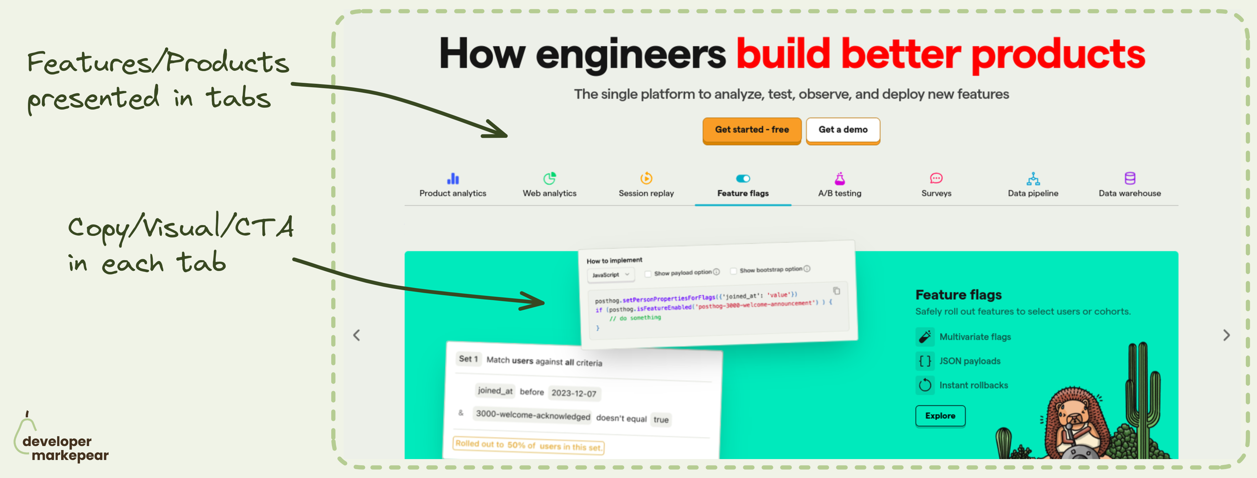
Feature tabs header pattern from PostHog

Developer Markepear testimonials

Which feature/product to show in the header?

How about all?

Many dev tool products are feature-rich. And you want to show those awesome features.

But it is easy to overwhelm the reader when showing so much info.

That is why I really like the header tabs pattern that @PostHog uses:

  • You have clickable tabs with product names + descriptive icons
  • Copy + Supporting visual (UI, code etc) and a call to action in each tab
  • Supporting visuals are in vastly different colors to make it obvious you switch tabs.

This pattern is especially powerful when you want to communicate completeness.

Posthog definitely wants to do that. If you are on that train I'd strongly suggest considering/testing it.

  • See website
Browse 100+ examples like this ->
developer experience
github
hero section

GitHub Repository Readme.md design from Prisma

pricing
developer experience

Very simple pricing from Userfront

landing page
developer experience
call to action

Benchmark section on homepage from Astro

developer experience
pricing

Cost calculator from Mux

developer experience
call to action
blog

Newsletter subscribe CTA on Interrupt blog

developer experience
pricing

Pricing plans structure from Postman

developer experience
landing page
hero section

Algolia developer portal design

developer experience
copy
docs
landing page
hero section

Header search docs CTA from TailwindCSS

developer experience
copy
blog
call to action

Developer-focused blog CTA from Snyk

developer experience
copy
call to action
landing page
hero section

Auth0 developers portal header