Great navbar design from Auth0

Developer Markepear testimonials

Navbar is a hugely important conversion lever on the dev-facing website. I saw it move the needle by x times in some cases/conversion events.

So, what does a good one look like?

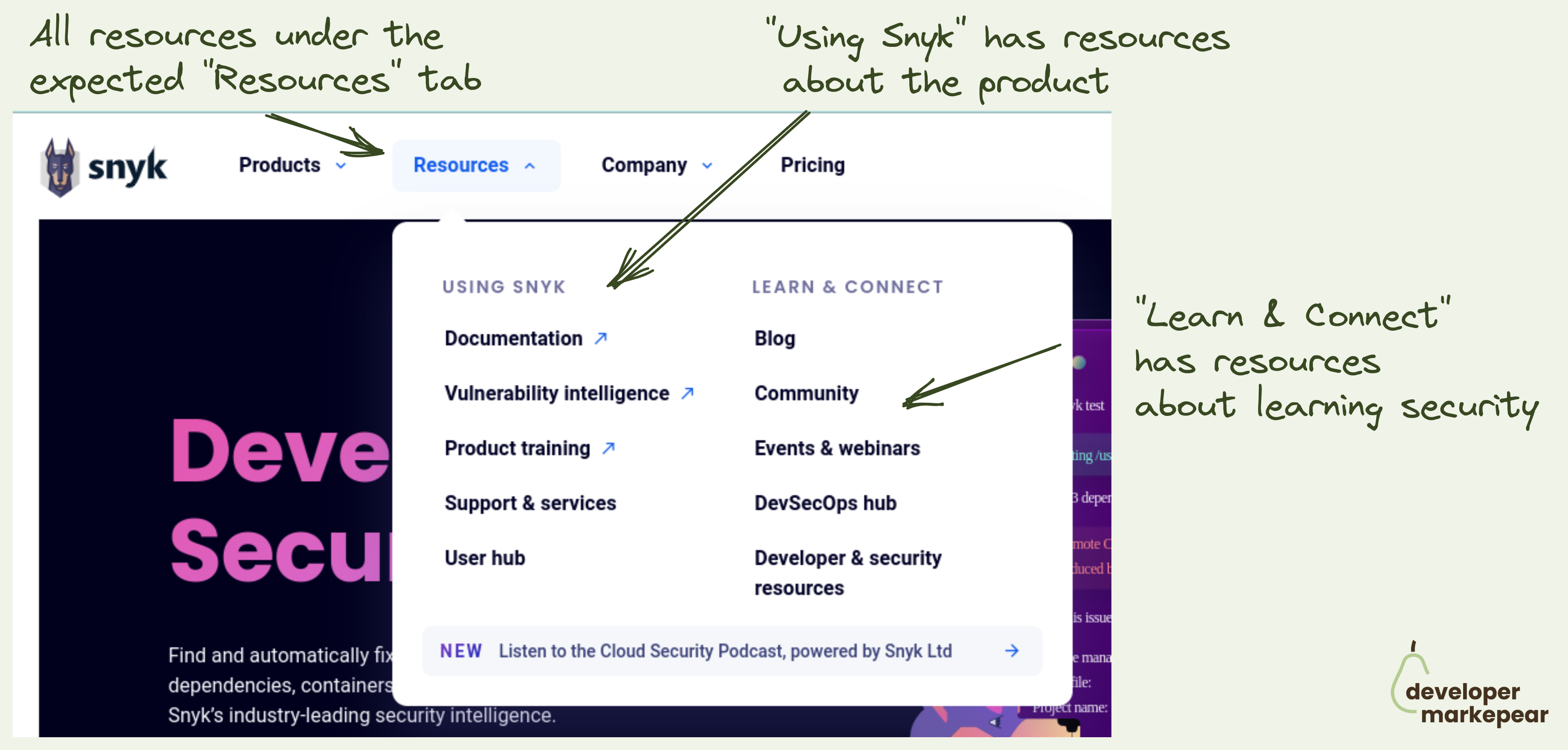
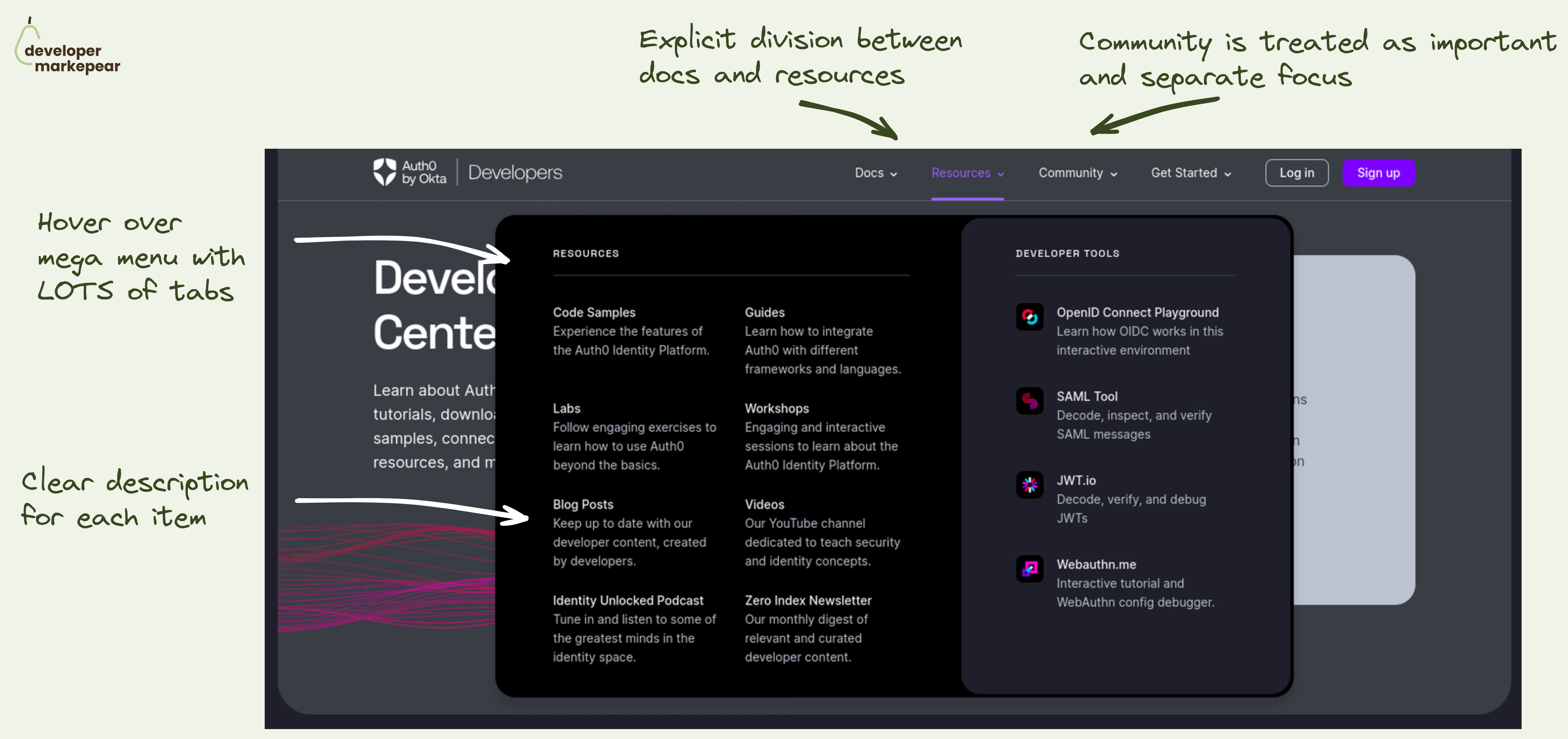
Auth0 did a great job on their developer portal. But the learnings can be applied to your marketing website too.

What I like:

  • They have an explicit division between docs and resources (you can do without it but I like it)
  • Community (with all the events, forums, support etc) is clearly emphasized and discoverable
  • When you click on the navbar tab you get an extensive mega menu with many options
  • Each item in the mega menu gets a one-sentence description of what you'll find there

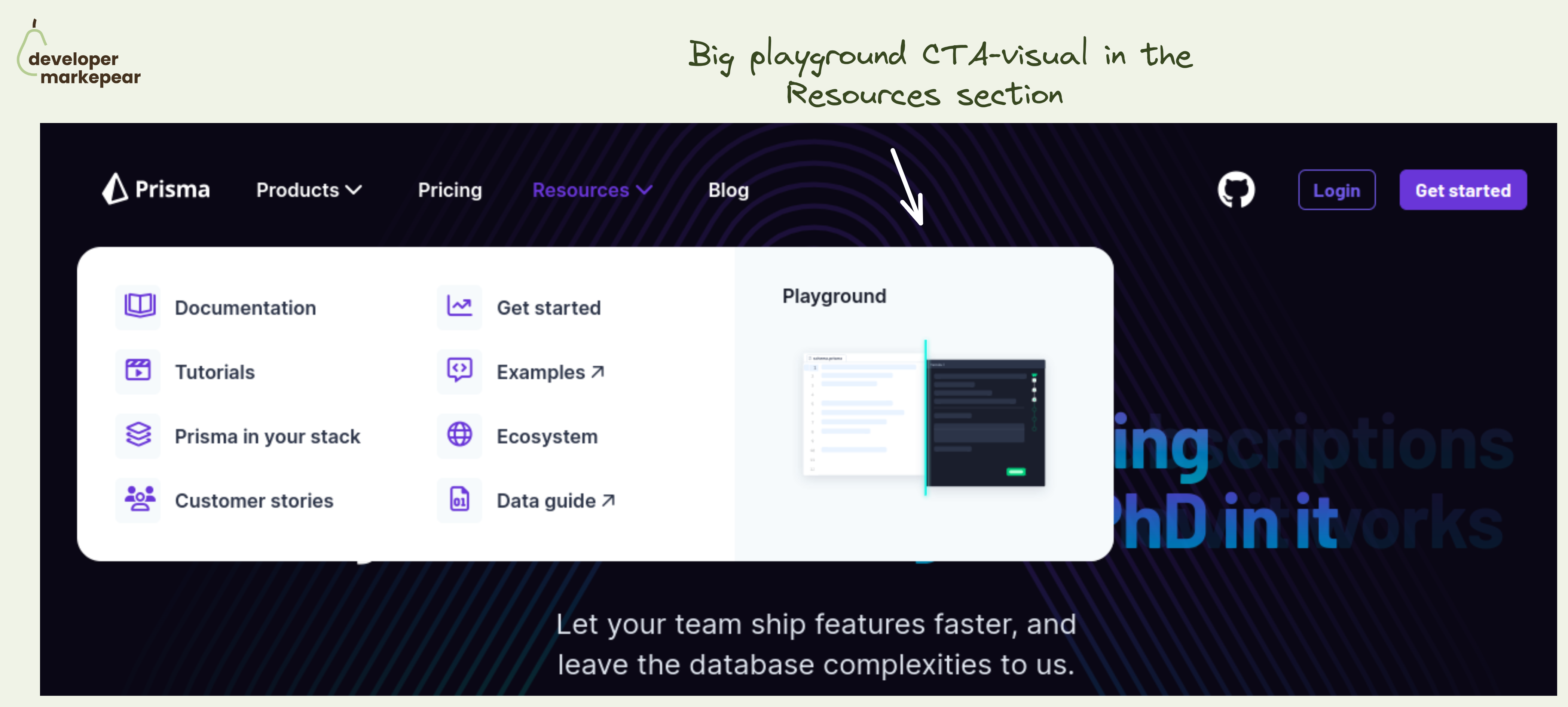
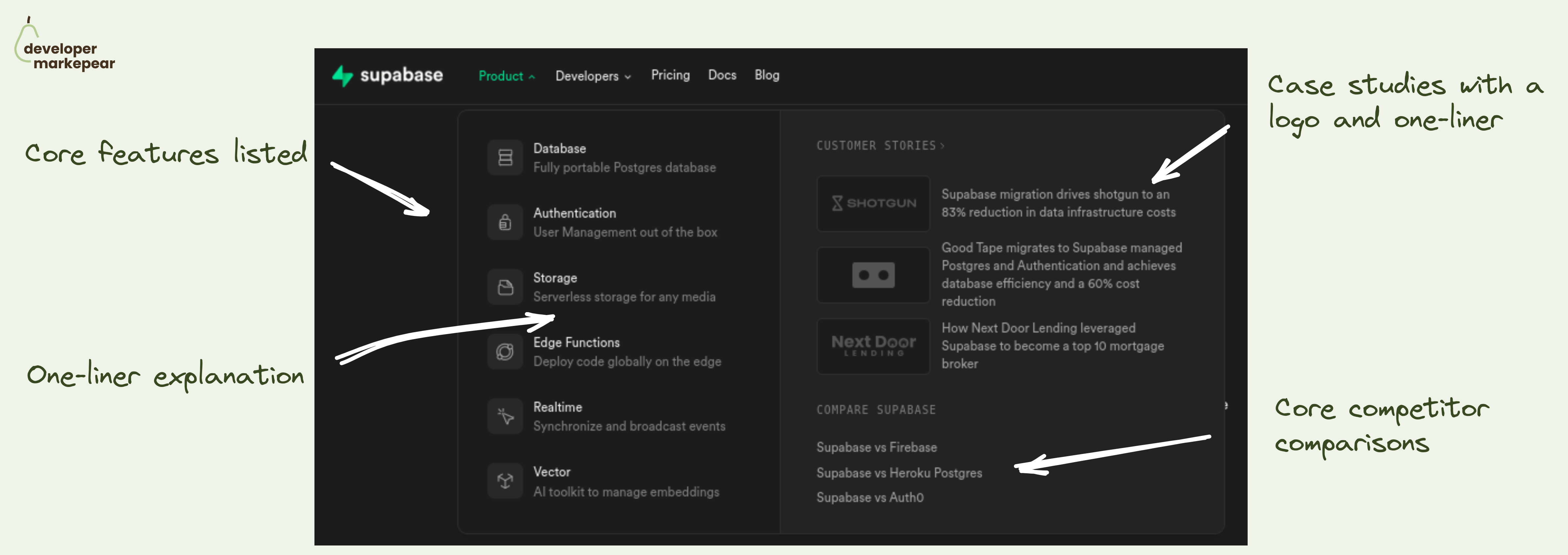
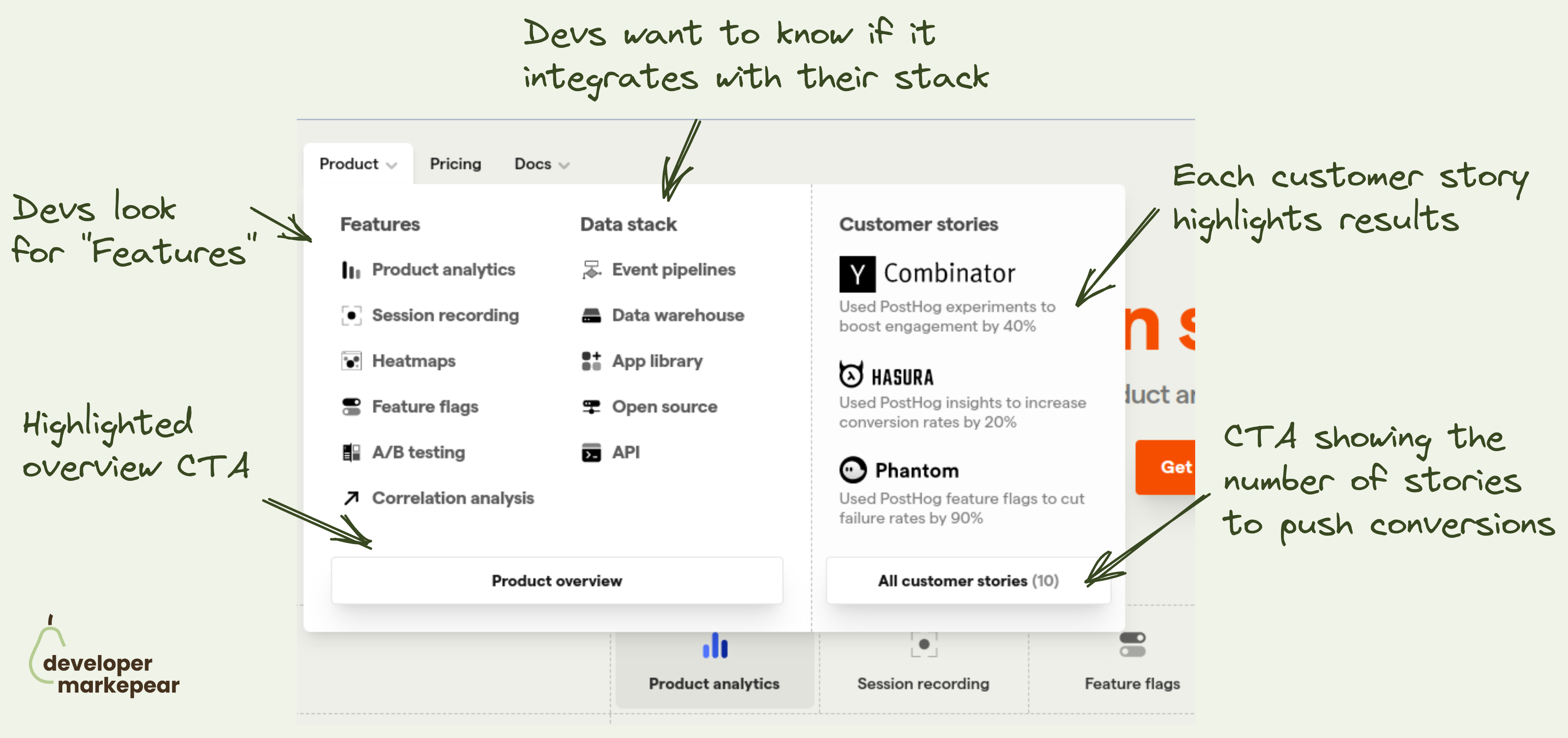
That makes it easy for devs to explore. Without having to click out to see what each tab/item means. And when devs know what you mean they are more likely to actually click out. And convert.

  • See Auth0 developers portal
Browse 100+ examples like this ->
developer experience
github
navbar

Subtle GitHub CTA in navbar from Aporia

navbar
developer experience
blog
copy

Snyk navbar resources tab design

navbar
landing page
call to action
product tour

Playground CTA in the navbar resources section from Prisma

developer experience
navbar
github

"Star us on GitHub" navbar design from Supabase

navbar

Supabase product navbar tab design

developer experience
navbar

Navbar product tab design from Posthog

navbar

Great navbar design from Auth0