How to design the navbar product tab? This is what @PostHog does 👇
Figuring out what to put in the navbar is tricky:
- How should you name tabs
- What should go where
- Should you have "resources" or divide it
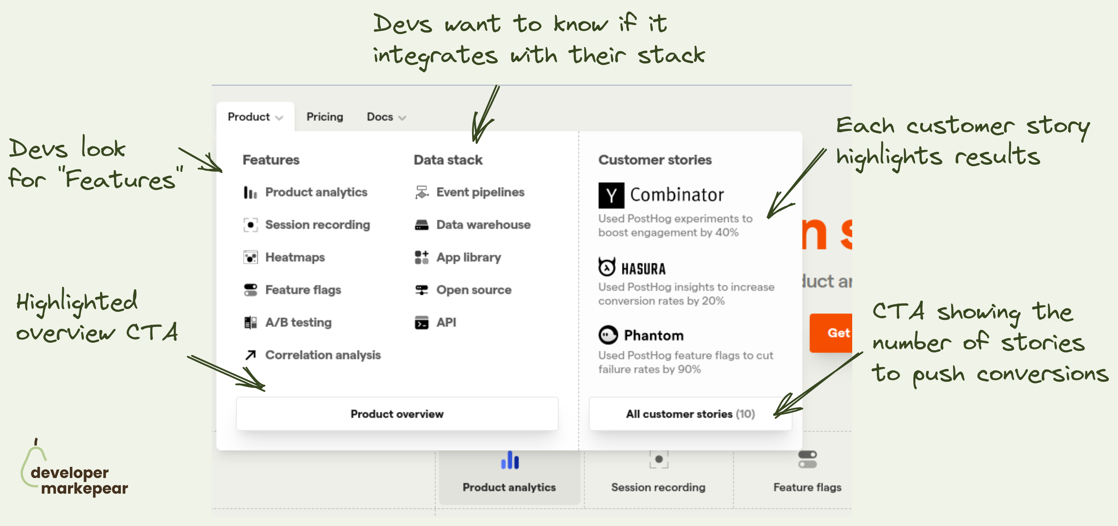
The "Product" tab is especially tricky.
It can get overloaded with a ton of content.
- Some teams put docs, and product videos there.
- Some show features, integrations, and code examples.
- Some go with solutions and per person per industry pages.
- Some just put everything in there ;)
I like how Posthog approached it:
- They use the word "features". Most devs like it more than other options.
- They show the data stack with which the tools integrate. That is an important obstacle handler pretty much always.
- They include customers in the product tab. Most devs want to see the product and may not go to the "customers" tab. This is a nice way to add social proof and increase conversion to user stories pages.
- They show customer logos and the results they got from the product. Again more social proof without clicking out.
- They use "customer stories" rather than "case studies" which again feels more devy .
I like it.