
Contents

How to create a landing page for developers (learnings from Auth0 developer portal)

I was looking for inspiration for our homepage and found Auth0 developer portal.
This is one of the best examples of a landing page for developers I’ve seen so far.
And so I’ve decided to go through this page in detail and share the learnings with you.
If anyone from Auth0 is reading this, huge respect. Job well done.
For the rest of us, this is the level we should aspire to but may never reach :)
Either way, let’s jump right to it!
Page structure
I love how this page flows like a conversation yet remains very developer-focused.
.png)
The way I see it:
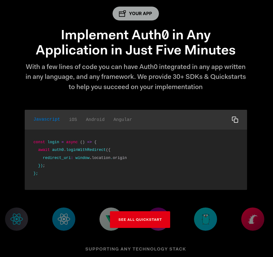
- Header and subheader: Starts with what Auth0 is and why it is different.
This alone is very clear and will be enough to get many devs to take action. Action to do what? - Call to action: It gives you not one but three developer-focused options: start building, see docs, see examples.
Many devs don’t want to read through “marketing website” and would rather just go to the technical stuff. With those CTAs they are covered.
But if they don’t yet get what auth0 does they show it next. - Supporting visual: It explains what the tool does with a great static visual. No happy customers 'faces or a 2-minute video. Just a simple, clean, well-thought-out graphics.
At this point most people know what it is, some will need to know if others like them use it? - Social proof: It is very subtle, not braggy. And they show companies developers know and like.
Some devs need to know how does this ACTUALLY work.
It is answered in the body. - Body: They go through how Auth0 will work with your app and in your code.
They show code and integrations, they show the resulting login box, they show screenshots.
They finish up with a nice animation that puts everything together (but the static graphic is enough to see the full picture).
Now, most devs can picture how this will work in their situation. They are ready to take action. - Final call to action: Remember for many devs “take action” means going to the docs but some are ready to “Start building” right now.
Finally, there is a “transitional CTA” for those who are not ready to sign up but would like to understand the problem space better and read more about authorization and authentication.
This is just a beautiful example of the components of high-converting websites from the book “Websites that convert” by Claire Suellentrop.
She explains that the readers need to answer the following questions on a website to convert:
- What do you do?
- Why should I care?
- Am I alone in caring, do others care?
- How do you do what you say you do?
- If I believe you, how will my life improve?
- Why is it safe for me to believe you?
- Okay, I think I believe you. Now, what do I do?
Auth0 developer portal website answers all of those beautifully.
I mean if I wanted to implement authentication and landed here I’d know everything I needed to move forward (I think).
Ok, let’s go through this thing of beauty piece by piece.
Hero

This is very interesting:
- Header: doesn’t talk about what the tool does
- Subheader: doesn’t talk in values but features
- CTA: not one but three CTAs here
- Visual: No video, no screenshot just a static viz of what it does
- Social proof: not even visible above the fold
Yet, I think this is just a great execution that really speaks to devs. Here is how I see it.
Value proposition

The value proposition is explained in the subheader with:
- what it does: “out of the box authentication & authorization”
- what is different about it: “any application”, “out-of-the-box”, and “extensibility”
One thing I am not sure of is using the market frame “platform” as it makes it feel big and heavy whereas the entire page speaks to how lightweight the tool is.
But using the market frame “tool” has other consequences, for example, people will expect a lower price of a “tool” vs “platform” so market frame positioning is by no means obvious here.
Let’s get back to the header though.
It doesn’t talk about “authorization” or the value that comes from implementing it:
“Simple to Implement, Easy to Extend”
It is a slogan more than a value prop but it does speak to what is different about it:
- “out of the box” = “simple to implement”
- “easy to extend” = “extensibility”
After reading this I expect:
- excellent developer experience
- a lightweight tool I can plug-in in minutes
- that I can customize it however I like
Ok, take a look at it again and tell me where the “value” is actually explained.
There are features, benefits but where is the value?
There is none. It is implicit.
I think that with devs there is no point adding “and save time and effort”.
It can actually alienate people because it feels like marketing.
When explaining Auth0 to your dev friend would you add “and save time and effort”?
I wouldn't, as it is just so obvious.
Devs are builders, your goal is to make them understand what your product does, how it works and inspire them to build.
They can usually figure out the value part for themselves.
Ok, so say I want to move forward, what do I do now?
Call to Action

Let’s look at those calls to action and there are three of them!
The common marketing knowledge would say that you should do one CTA, two maximum.
But in my opinion, this is where dev-specific things happen:
- many devs, when they evaluate products want to see docs and examples first.
They don’t believe the website unless it is a docs page or a GitHub repo. - some devs don’t even believe docs pages :) and want to see how it works for themselves right away
- most devs appreciate navigation that will take them where they want to be
If your target developers can find the path they want quickly they don’t mind 5 buttons IMHO.
Moving on.
So the devs who want to see docs, examples, and those who want to try the tool right away are gone to other pages.
Who is left on the page? People who either:
- don’t quite understand how it works just yet
- are not sure if they should believe you
- want to see some product details while they are on this page (otherwise they would have gone to the docs).
Auth0 does a great job continuing the conversation with those folks.
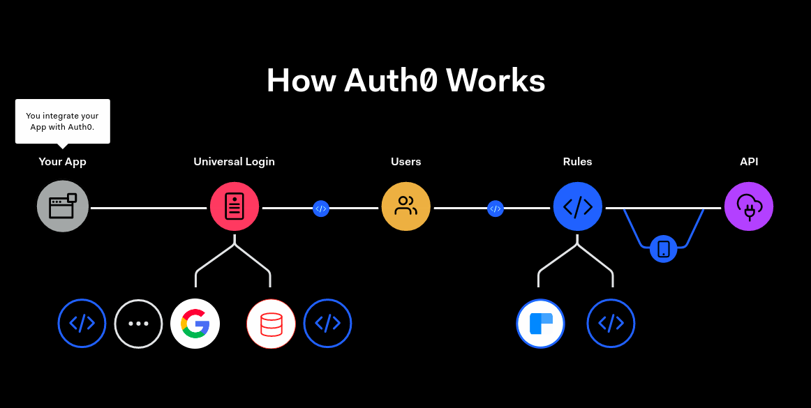
Visual

This viz makes me understand the concept right away:
- when users sign up on your app or website they are redirected to Auth0 which handles the signup and returns a token
- I love the simplified UI and icons
- The explanations below make this visual very clear
- I love that this is a static graph and not a video. It gets me all the things I need to understand without the bells and whistles of a video.
I get the point in 1 sec, not 60. Many devs really like static graphs, tool stack architectures etc
Social proof

Logos, classic social proof. But there is a twist.
Many SaaS companies have the logos right there at the top, above the fold.
What I like about it is that it comes later, after you’ve explained what it is and how it works.
For devs social proof is important but only once they understand what the tool can do for them.
It feels like marketing to a dev audience when it comes before the “what” and the “how” IMHO.
Another thing that is great about it is that the logos are from companies developers know.
This is something that is not easy to do, especially if you are an early-stage startup, but you should always think of the developer reading this page.
Think about what is social proof to them?
Is it really 5 logos from companies they’ve never heard of? Actually, it is a little bit.
At least they know somebody is using it but it is not strong social proof.
So go for companies they know, go for quotes or use Tweets from devs.
Auth0 has many clients yet they chose not the biggest names but the companies devs know.
Body
So at this point people who are still reading believe you, understand what it is you do and how the tool works.
They want to:
- know how do you actually do what you say you do
- see the features.
- see your tool in their workflow solving their problem
That is why people will look for detail.
They will scan the page and read the parts that are important to them.
Auth0 does it beautifully.
They tell a story in 5 parts and then connect them together at the end.
The story starts with how do you integrate Auth0 into your workflow quickly.
I like that:
- The copy tells you that you can integrate Auth0 with any language or framework
- The visual shows it in code
- There is also a moving carousel of frameworks that makes me feel safe (this is additional social proof)
- The use of eyebrow copy “Your App” for readers who scan.
Now that you know how to implement Auth0 you can customize how it looks.

Customization probably is one of the major concerns for users of tools like Auth0.
They wonder if the authorization box will look like the rest of their website or app.
Auth0 handles it perfectly by letting you type the name of your website in and see the customized colors and logo in the authorization box.

It makes it feel real. It makes people imagine that this can be their life.
I like that:
- the login box updates dynamically as you type your company
- copy explains what this “universal login page is” and
- they use eyebrow copy “Universal App” to make it easy to scan.
- the CTA for this section is relevant: “Launch Auth0 flows” and “Learn About Advanced Customization”
Now let’s say people signup through Auth0. How do they manage those users in the product?

I like:
- this design pattern as it combines a few features into one neat cross-over section. You can see some app screenshots for every feature
- the CTA is very relevant here “user management docs”
- the body copy explains what user information is kept and what you can do with it (block and delete users for example)
Now say it all works nicely in the “golden path”. How do I extend it?

Let’s start with the header copy.

Words “control”, “customize”, “extend” make it obvious it is about that, customization.
Then in the body, they talk about “hooks” and “rules” which make it clear that you should be able to customize it for your use case.

I like that they again use a static graphic.
But this is the only place on the page where it is not so obvious and clear to me.
I think it tries to explain everything in this code rather than just show the basics and inspire me to dig deeper.
In that code, there are concepts like “callback” and “context” that were not mentioned anywhere. Maybe this is obvious if you are a Javascript dev, in which case forget I ever said anything :)
Also, this section feels a bit too big. Now that I think about it, maybe it is some formatting bug that makes this code component so big.

I like that this copy explains what Rules and Hooks are and where they will be executed (not on my side).
I have a bit of a problem with using the wording of “They empower you to control” as it feels a bit fluffy, not something a dev would say.
I’d rather use something like “You can control...” or “It lets you control”.
I like the CTA button copy as it makes it obvious what to see on the other side of this button.
Now, how do I use the Auth0 token in my code?

I love that they go into how to use the token in users' applications, even though this is not really a part of Auth0.
It is an important part of the users’ workflow.
To give people great dev experience you have to think about the entire experience, not only the piece your product solves. Folks from Auth0 do just that.
Messaging here makes sure that people understand the whole experience. They want people to experience the first “aha moment” just by reading this page.
Now that the user knows all the components that Auth0 touches they put everything together with this great interactive visualization.
With that, the whole product usage flow is clear to the user, and they can picture how this works in their use case.
I like this design pattern of using the same colors to explain different components. It is also visible as the sidebar navigation.

Ok, now let’s go to CTAs.
Calls to action
They start with transitional CTAs that don’t convert right away but push users closer to converting.

I like how simple this is and that there are so many options. Depending on the needs I can go wherever I want.
Spoke to a senior ML engineer the other week and he said:
"Show me the options, then let me chose"
Imho devs like navigation and “choose my own path” more than other audiences.
They finish up with a simple “Start Building For Free” call to action.
.png)
Now the blocker for some folks may be the price. They may want to engage with sales.
And so they make it obvious that you can “start for free” but you can also “Explore Pricing” to understand what happens later.
I think this is very thoughtful as this is exactly the moment where I want to go and see the price.
General notes
Overall I think this is an absolute world-class developer-focused page.
It combines great design, awesome storytelling, and great copywriting.
And it really speaks to devs.
Kudos to the entire Auth0 team.
I liked:
- the flow, the layout, the design
- CTAs where most of them go to docs. They use actionable copy like “start building” or “extend Auth0”
- the visuals were really great, explaining how it works super clearly
- developer-focused feel. Because of the dark colors, the general feel of the design is almost IDE-like
- header copy as it really spoke to the particular section values
- great use of eyebrow copy for people to scan the page looking for particular features
I didn’t like:
- (this is a nitpick) the use of the word “empower” when you can just use “you can”, “lets you”.
I don’t know, it felt more corporate than dev-focused. - the visual in the “Rules” section. I think it could have done a better job explaining what do those rules do for me.
Ok, that’s it from me, I hope you enjoyed going through this page as much as I did.
Don’t know about you but I will steal those ideas and use them in designing our homepage.
Want more insights? Got more questions?
Subscribe to my newsletter -> get 3 dev marketing insights and 1 thing about pears every week.
Join our marketingto.dev slack -> talk to me and 1500+ developer marketing practitioners.
Work with me -> I do dev marketing advising, teardowns, and on-demand workshops.
Reach out on Linkedin-> I answer every question and share insights daily.