CircleCI code and UI presentation in video ad

Developer Markepear testimonials

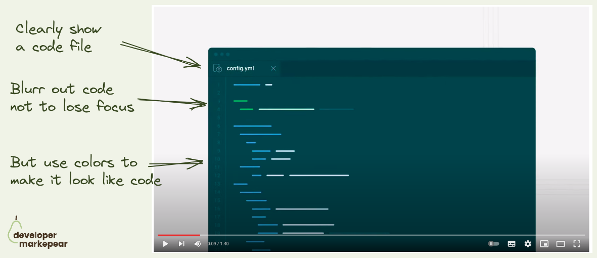
Showing code and UI in an explainer video is always a dance and rarely ends well.

You want to show the code to make it devy.
But you don't want to show everything not to overwhelm.

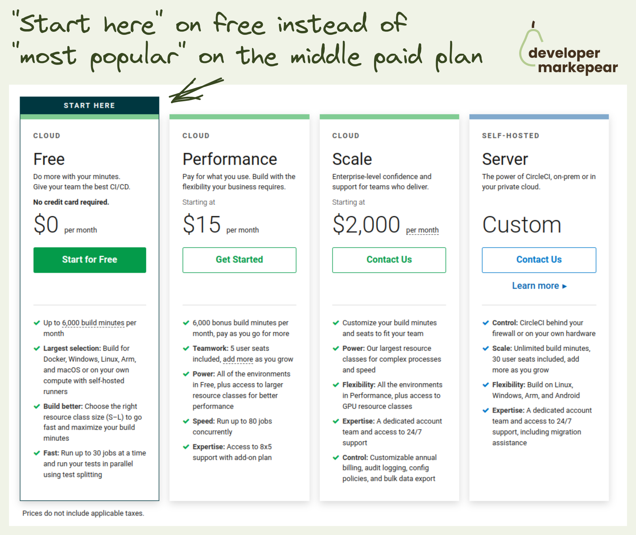
The same goes for UI which should look like your UI.
But show only what is necessary.

It's a struggle but CircleCI does it really nicely in this explainer:

  • They blur out all code
  • But use colors to make it really look like code
  • And the file sits clearly in a text editor (as it should)

They do the same for the UI later in the video.Just a really clean way of explaining things. Nice!

  • See the video on Youtube
Browse 100+ examples like this ->
developer experience
product tour
product led growth

Sandbox experience from Sentry.io

developer experience
copy
pricing

Start Free Pricing plan from CircleCi

brand
campaigns
billboards
ads

"Ask your developer" billboards from Twillio

developer experience
call to action
blog

Auth0 blog sidebar CTA

copy
developer experience
call to action
landing page
hero section

Header content CTA from Plaid

video

Explainer video from Algolia

campaigns
developer experience
copy
vs competitor
landing page

VS page format from Ably

developer experience
docs
hero section

Docs header diagram from Hopsworks

developer experience
landing page

How it works crossover from Mux

call to action
landing page
developer experience

Header with tabs from Appsmith